The worst kept secret of the Modernist Architecture movement was how much of its tradition eradicating dogma was based on ancient Japanese architectural practices. Architecture based on spatial problems rather than the art of ornamentation signaled the modern shift away from the decorative forms that for so long had been held in high esteem in the West, a move that’s tremors can still be felt today. Taking cues from Japanese residences, known for their ingenious utilization of small spaces, architect Andrew Simpson’s design of his own home in Island Bay, New Zealand captures the best of both Western and Eastern worlds of thought.
Andrew Simpson’s design of his own home in Island Bay, New Zealand captures the best of both Western and Eastern worlds of thought.
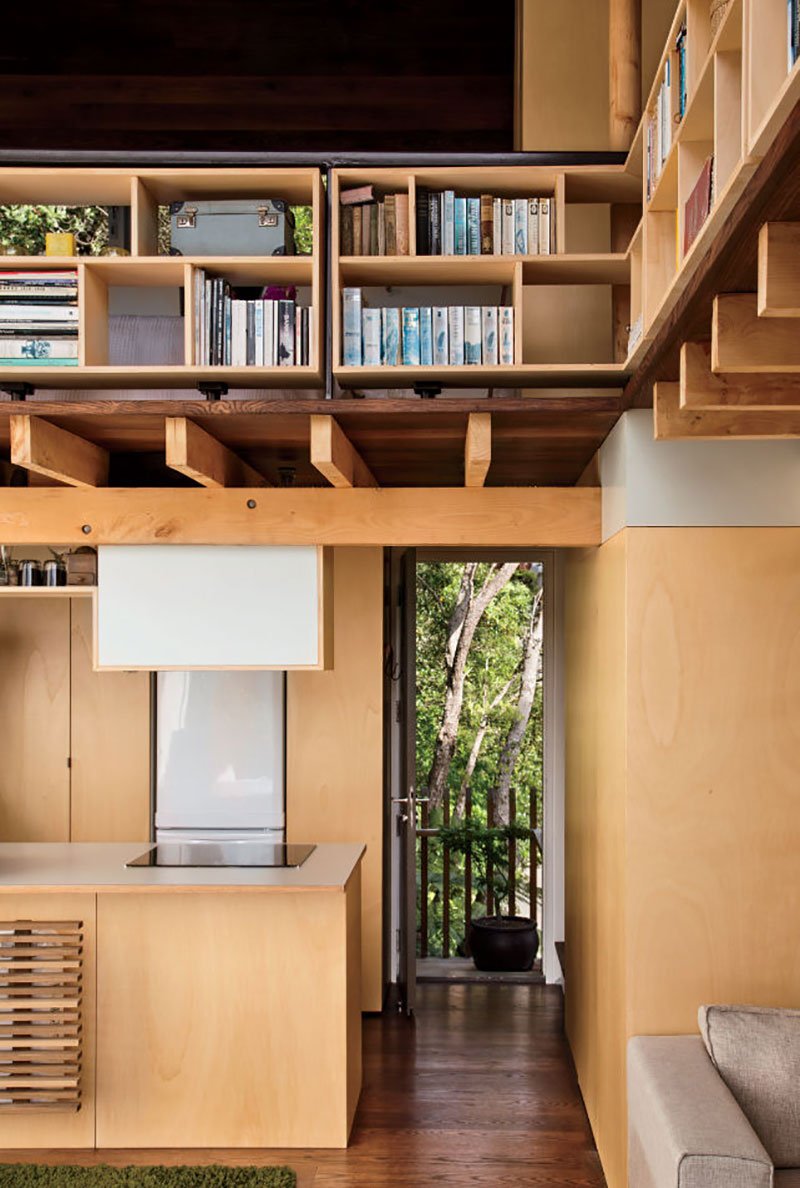
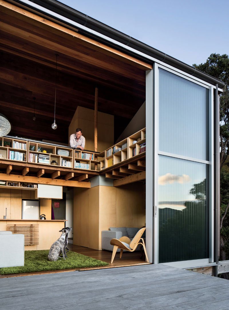
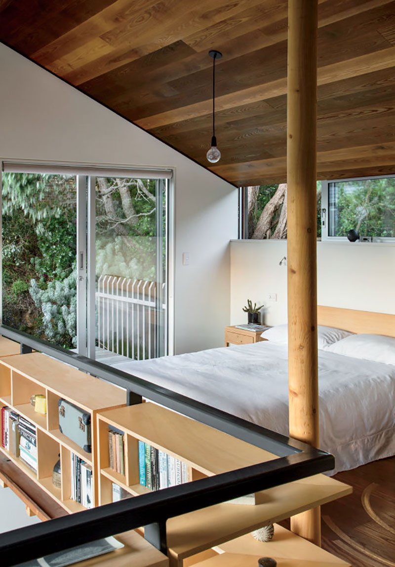
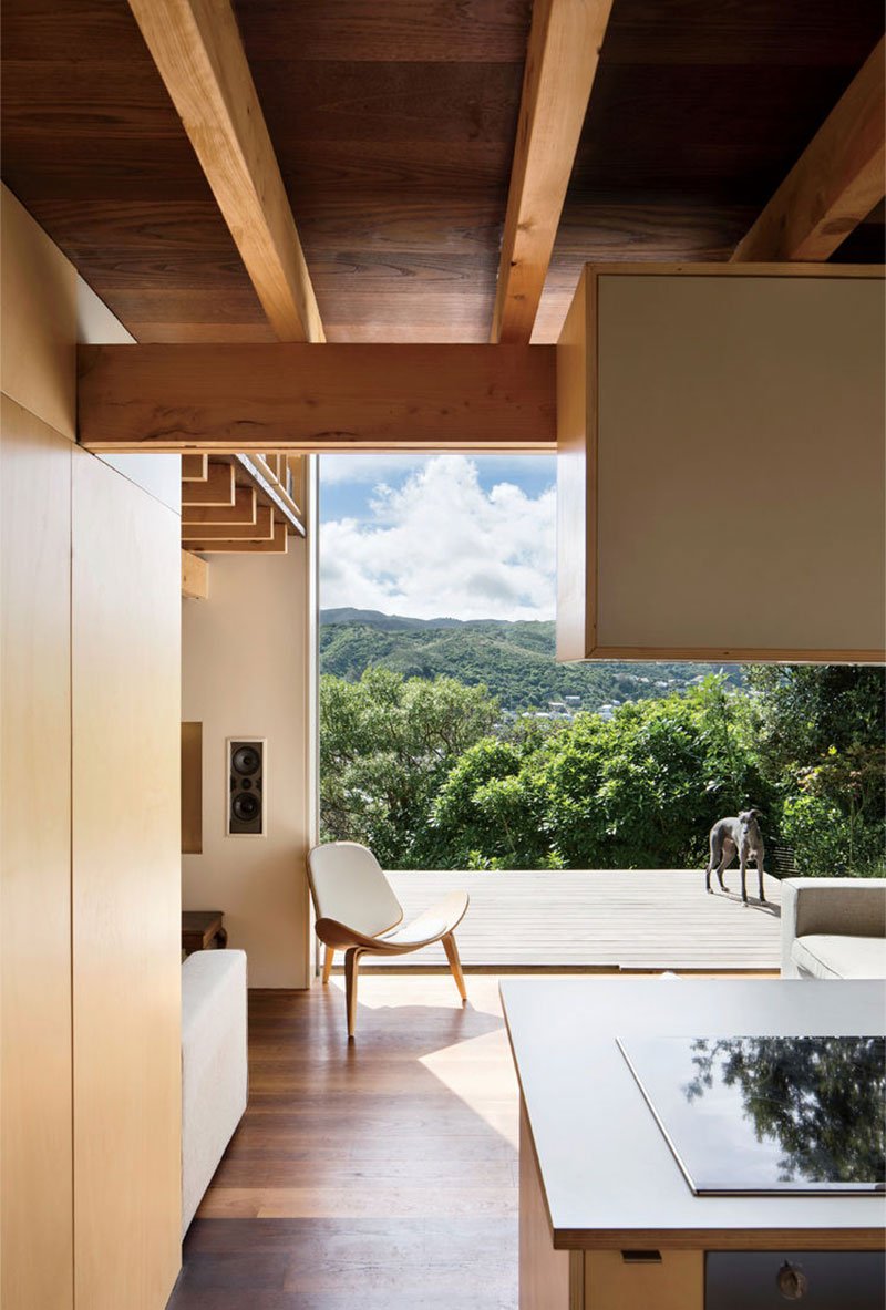
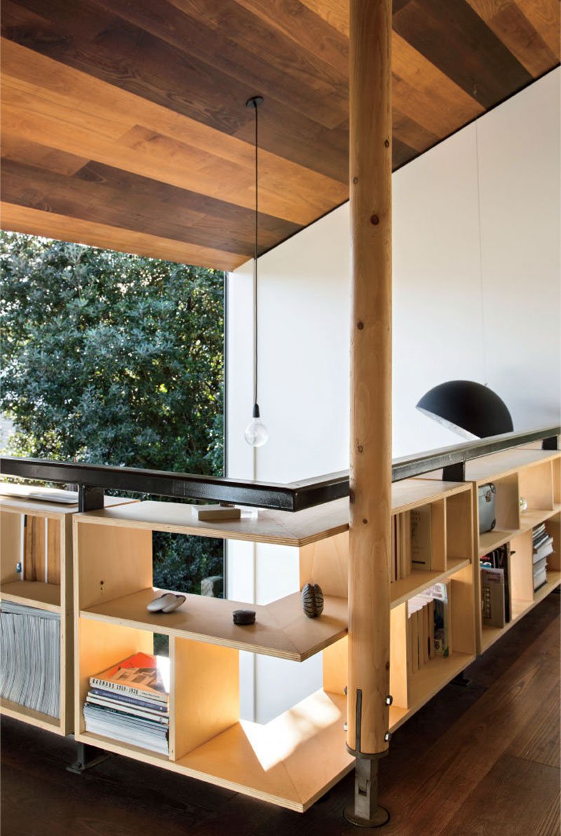
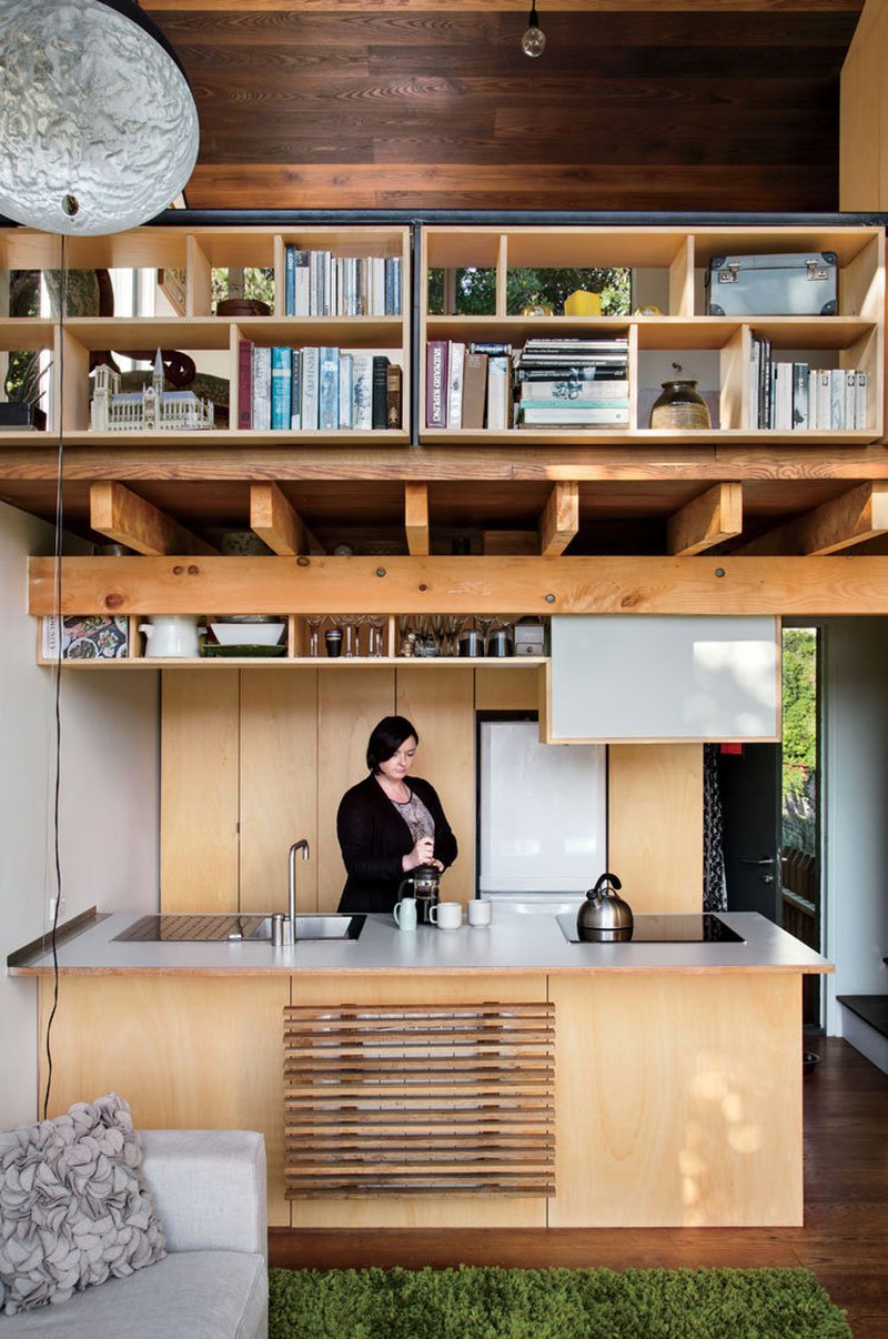
With only 538 square feet to work with, Simpson used innovative moves to make the space feel larger, rather than squeezing usage out of every square inch. One enters the home through an unassuming back door, preparing the entrant for a cramped, poorly lit home. But this is all cast away when one first sees the most enchanting of the moves that make this home so unique; the double-height spacing of the living room area, which lets light flood over the simple wood construction of the dwelling. This space is the centerpiece of the work, and achieves a feat none of the micro-houses featured on sites like Buzzfeed every get close to; make a small home seem enjoyable to live in. This move combines with a full-height glass doors to open the space onto a deck overlooking the wonderful surrounding nature. This move from darkness to light, from small to large space is a natural entropy, and makes it hard for guests to accept that at some point they’ll need to leave the house when their visit ends. The ground floor, like a game of Tetris, is able to house alongside the living room a kitchen, den, bathroom/laundry and exterior deck, while the mezzanine floor houses the bedroom, a study and has access to an upper deck. The economy of these spaces is minimized by the seamless integration of the decks, which feel more like extensions of the interior than sovereign spaces. The work was a true passion project for Simpson and his wife, as they moved into the home once its initial construction was done to spend their weekends crafting all the internal joinery, shelving and bookcases by hand. Despite being built on a small budget, the interior boasts materials such as Lawson cypress and white ash, radiating the qualities of warm and inviting home. And this warmth is maintained year-round thanks to the huge glass doors and tightly insulated building envelope, eliminating the need for heating in the winter. This home shows that the quality of a home isn’t tied to the size of its footprint, and by stripping away the excess of a typical construction they prove that big things often come in small packages. Photographs © Paul McCredie via Dwell.


