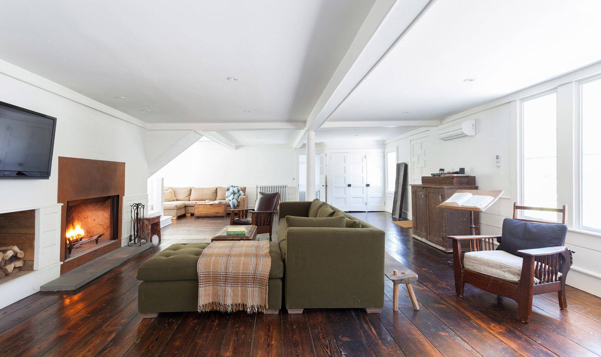
Architecture is a game of juxtapositions. Even new constructions can’t avoid the context of existing buildings and landscapes, and as an architect it’s important to not only accept this reality, but also embrace it. Many articles on this blog have featured projects that renovate old structures into snazzy new dwellings, often reprogramming industrial spaces into residential ones. For architectural designer Tom Givone though, it isn’t simply a matter of keeping an old brick wall here or there. He described his renovation of an 1820 farmhouse in the Catskills as a “study in contrasts,” and it’s clear that this study plays out at almost every scale of the project.
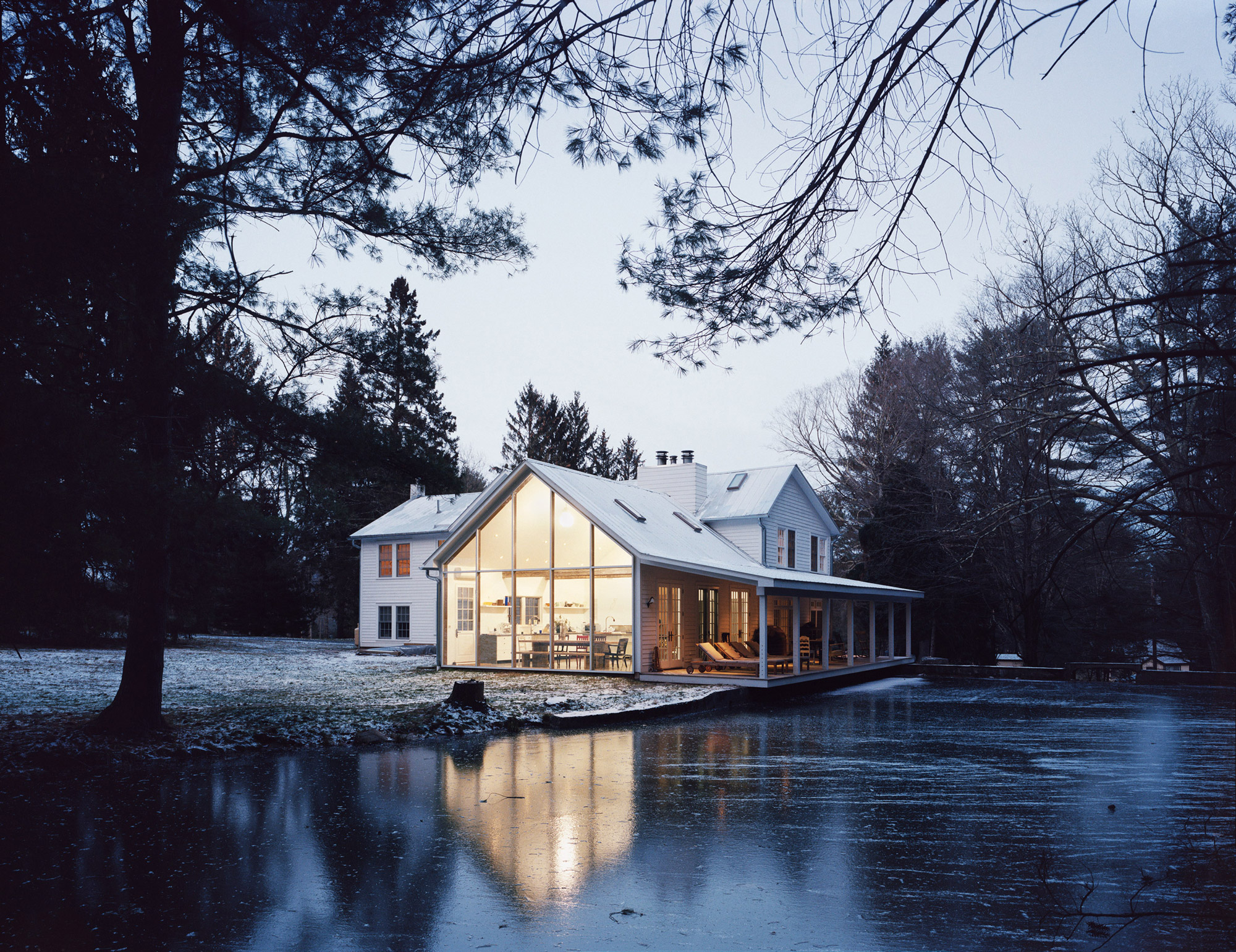
The stunning porch extending over the river is one of the main reasons the project is named the “Floating Farmhouse”
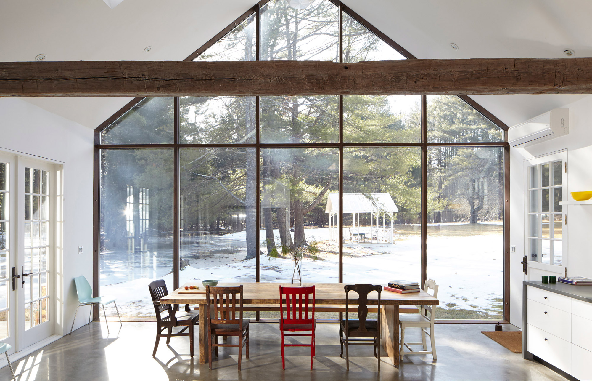
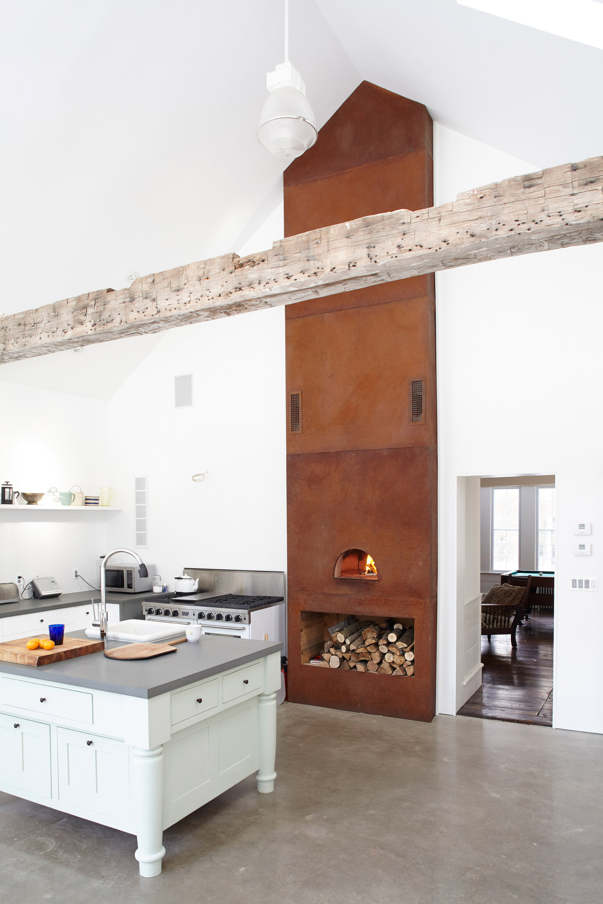
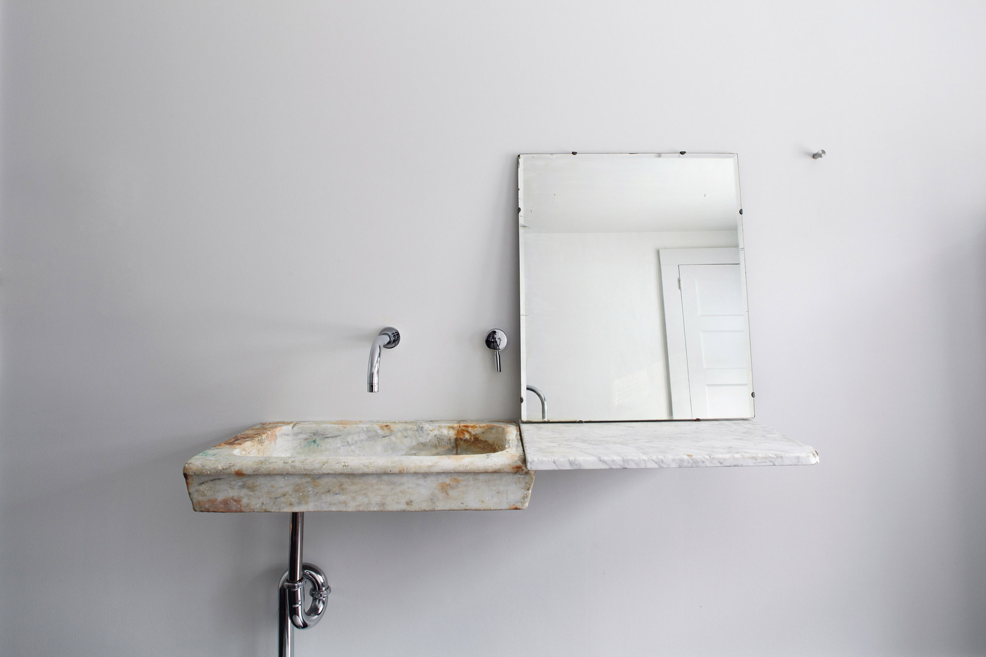
To show so in brief I will call attention to some of the finer examples present in the work, starting with the siting and massing. The home’s original position near a waterfall that flows into a quiet river already lends it an otherworldly quality, but through an cantilevering addition over the river Givone brings the most out of this facet. In creating this massing he maintains the pitch of the home’s original roof but covers the exterior with a large glass curtain-wall to identify it as new and also give it the weightless feeling modern construction practices can create. The cantilevered part of this massing then features a porch finished in the style of the original home (and even featuring antique rocking chairs) to build this contrast of new and old within even a part that is solely new. This stunning porch extending over the river is one of the main reasons the project is named the “Floating Farmhouse,” but examples are seen of this even in the tiniest details. The installation of an 18th century Italian marble sink in one of the bathrooms provides a good case, as it’s floating nature is accomplished thanks to a modern support system hidden in the wall, akin to some of Scarpa’s work in the renovation of the Canova Museum in Possango, Italy. Across from the sink is a 19th century wood and zinc tenement bathtub that has been wrapped in stainless steel, feeling as if the room’s original flooring has been extruded to make a tub. The final point of contrast I’d like to highlight is in the wonderful space of the addition; a large kitchen featuring supporting roof beams salvaged from a dairy barn in Pennsylvania. Though the addition is a new construction, these beams provide a feeling of comfort in the new space by linking its charm to the originals. This pursuit of new features to mimic and match old ones makes this project more than a historic renovation; it encapsulates within its walls features from such a broad range of places and periods that it transcends one particular time. Rather, this home is a contrast of the present and the past as vague concepts, showing that perhaps the things we take for granted now may become relics of an encroaching future, and it’s vital that we appreciate the beauty of our passing designs within the context of past designs.
