A minimalist restaurant inspired by churches and Italian dining halls.
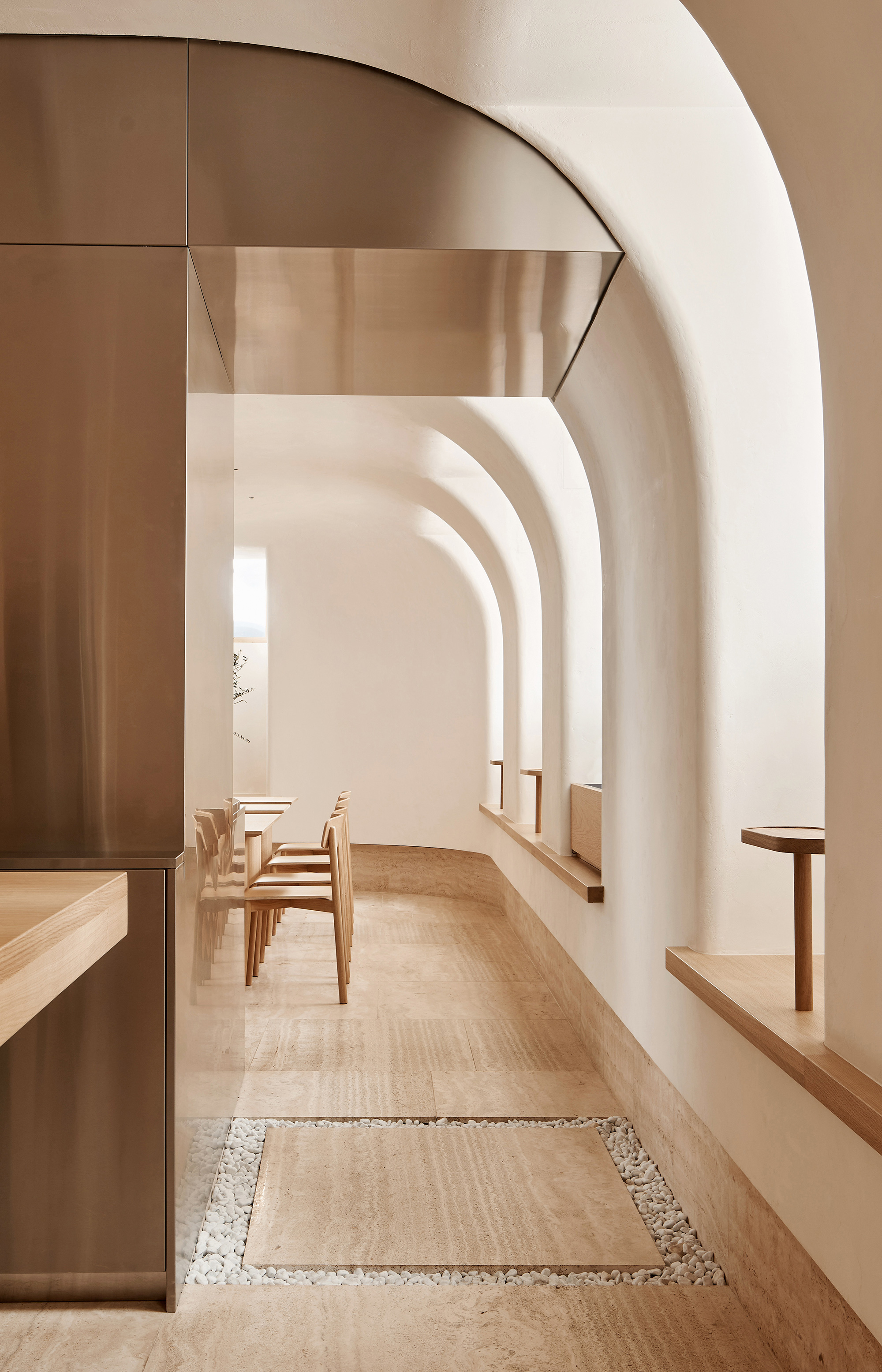
Opened in Saint Petersburg, Russia, Osteria Betulla is the second restaurant of celebrated chef Arslan Berdiev. While his popular Birch restaurant serves a pan-European menu, Betulla focuses on Italian cuisine. As a result, architecture and interior design firm DA Bureau turned to Italy for inspiration to create the restaurant. More specifically, to traditional Italian dining halls and Catholic churches. The architects wanted to design a space that conveys the idea of a “food temple” but one that also reflects a more contemporary Italian spirit, albeit with traditional roots. Minimalist and warm as well as built with natural materials, the interiors resemble a light-filled chapel.
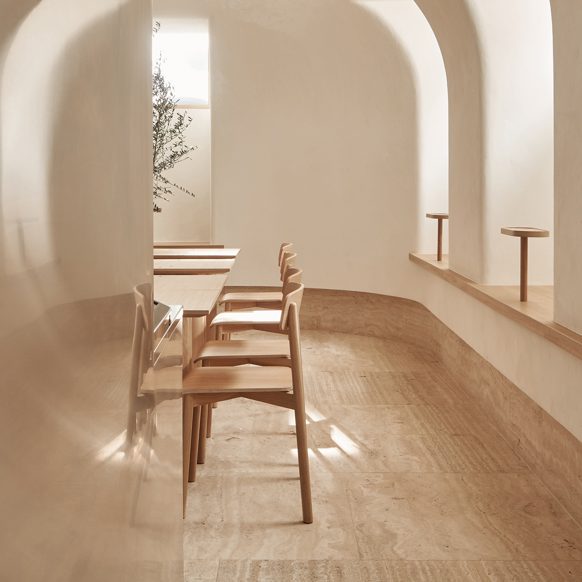
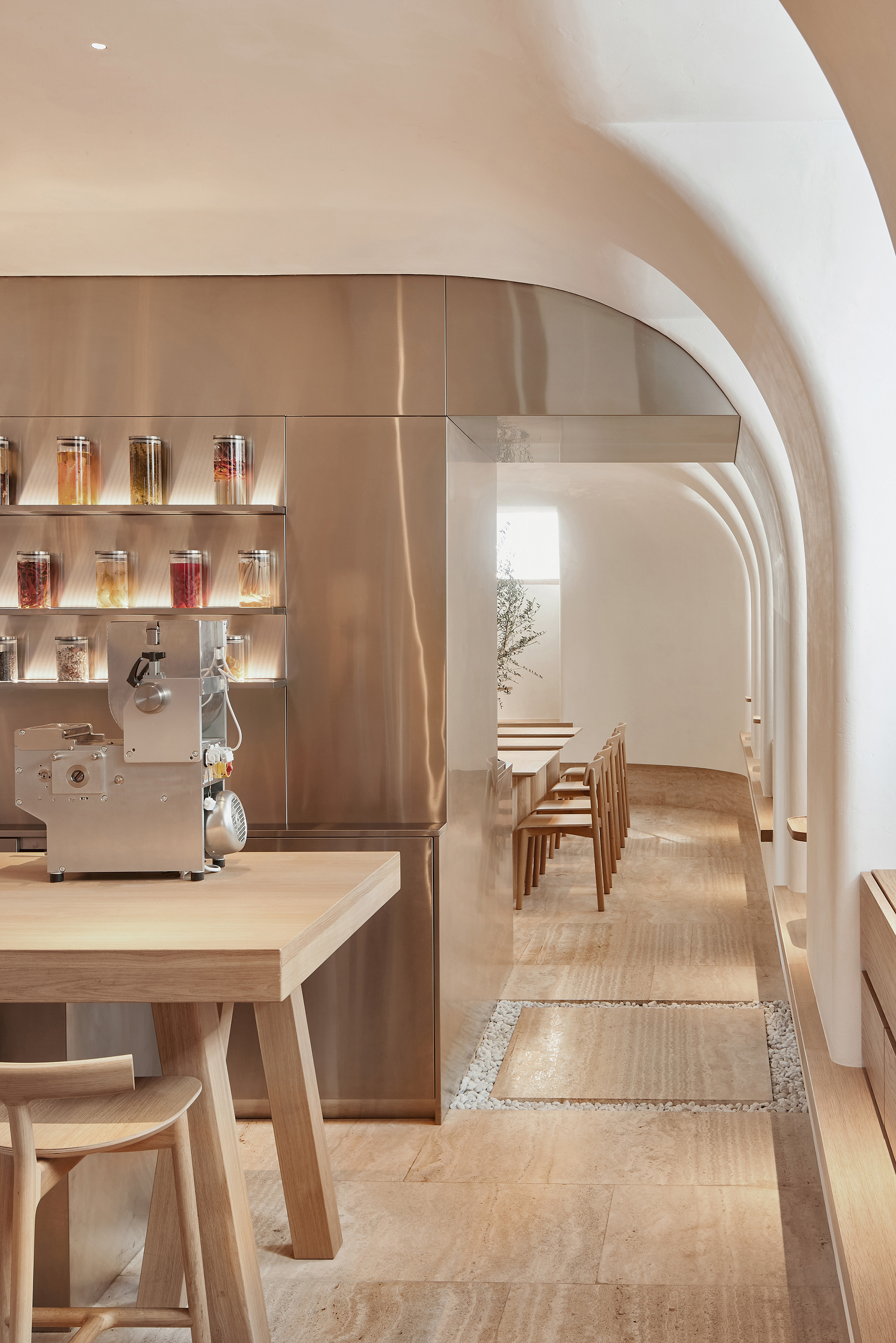
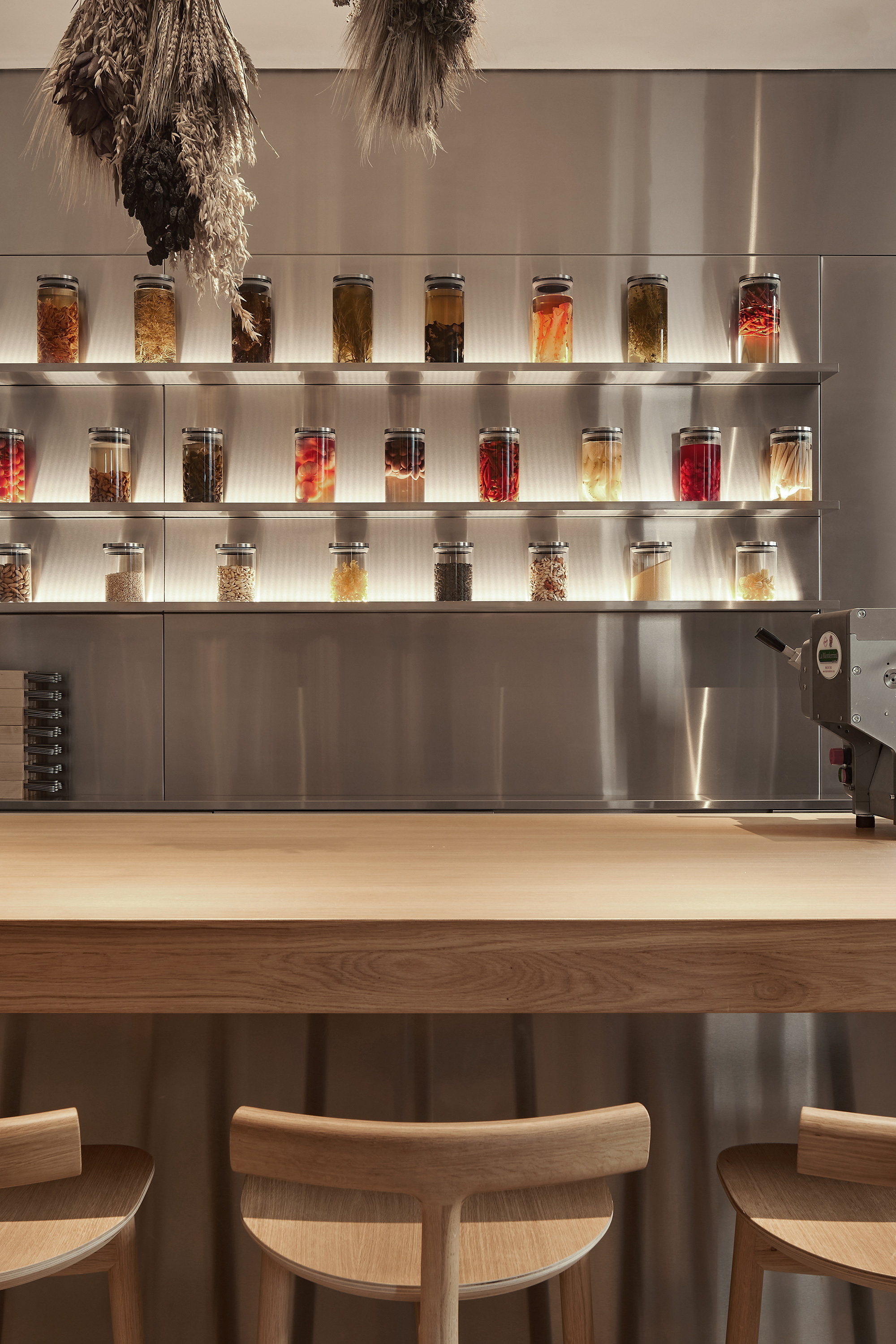
The dramatic sequence at the entrance prepares guests for the experience of dining at Osteria Betulla. A tapered, covered and shaded entryway with walls made of rugged rock leads guests to a smaller hall with soft lighting. Beyond this first space, they discover the second hall, a spacious room flooded with light. To optimize access to sunlight in this basement location, just below the ground level, the architects lowered the windows to the seating level and then enlarged them. At the center of the first room, a table acts as a symbolic altar that offers guests the opportunity to see the pasta chef at work.
Creative and refined details that celebrate Italy.
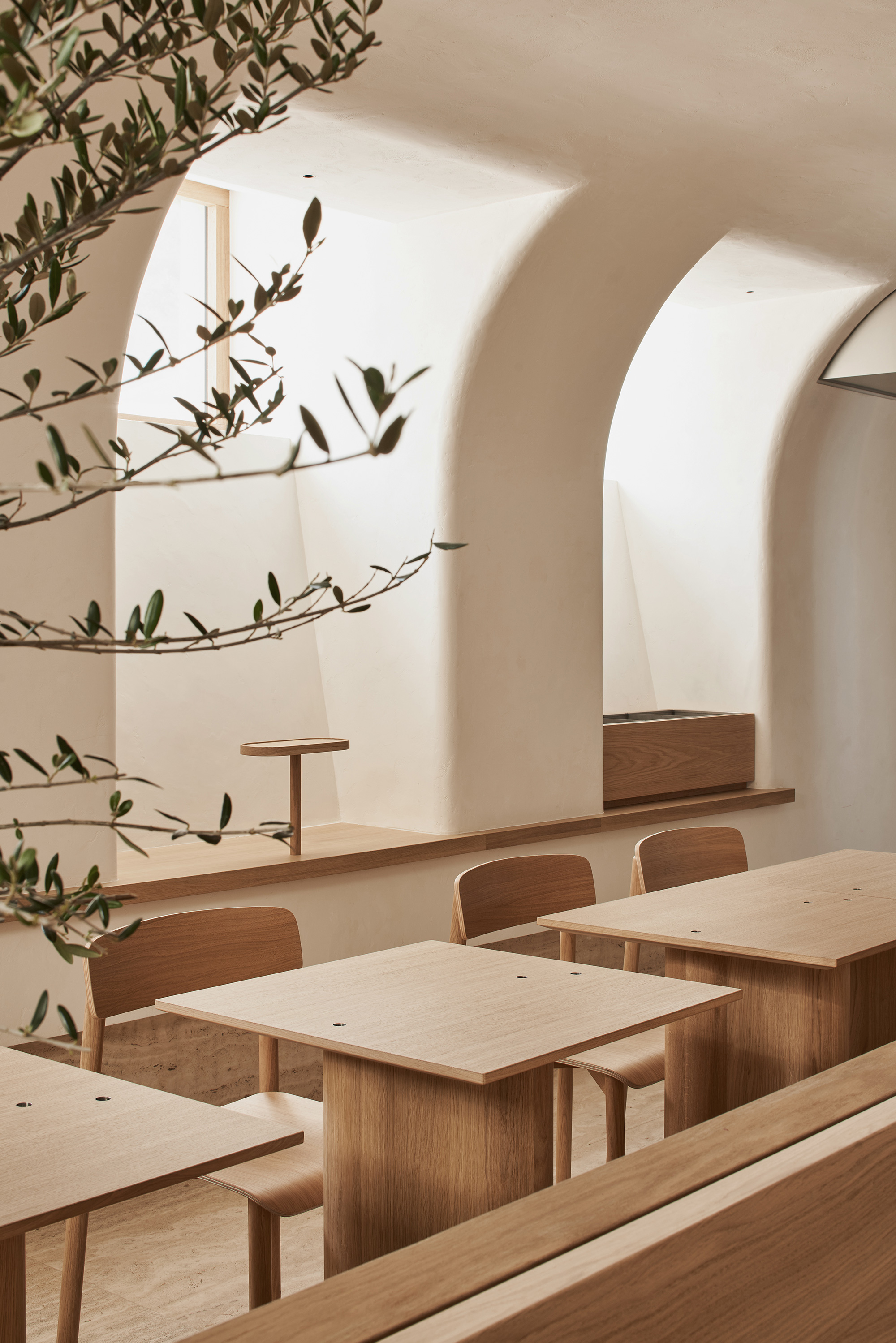
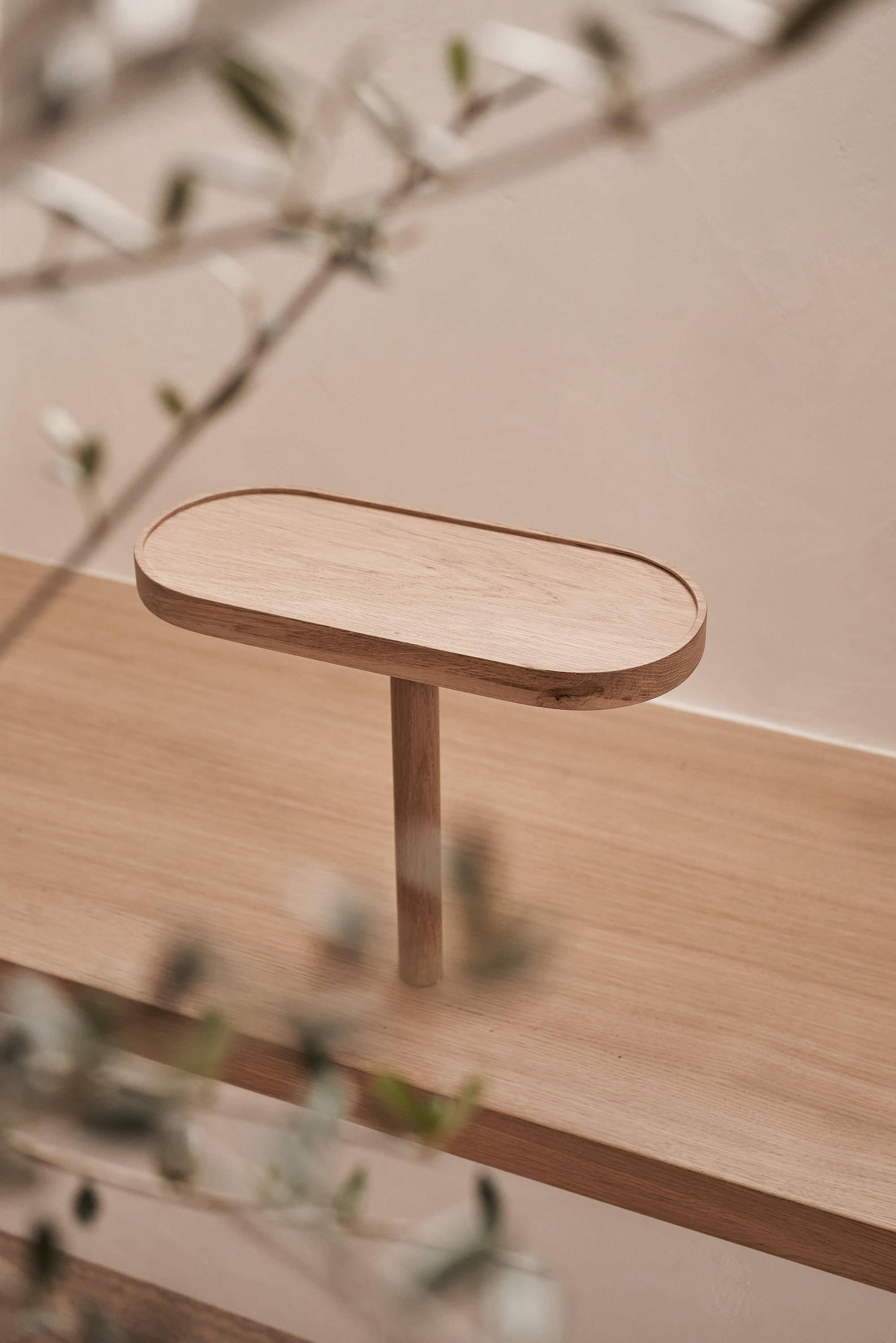
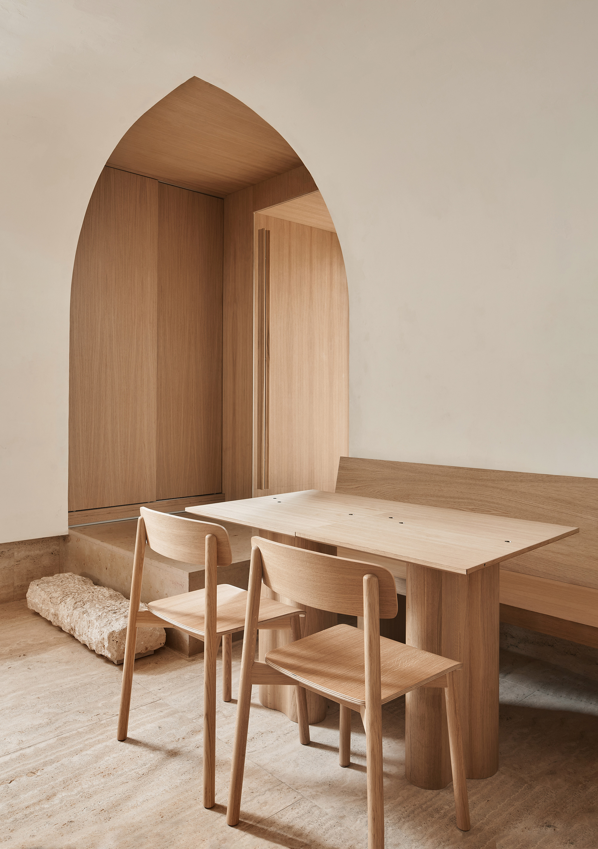
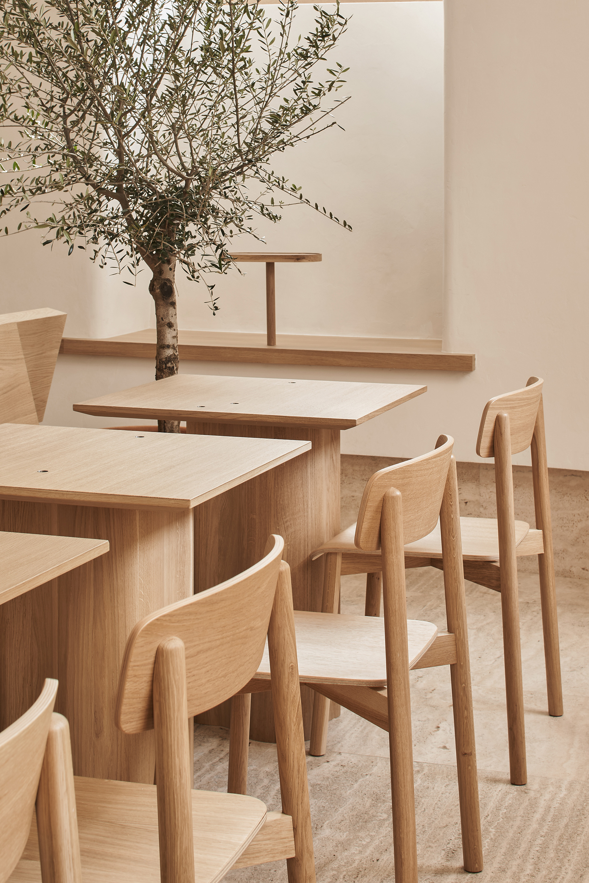
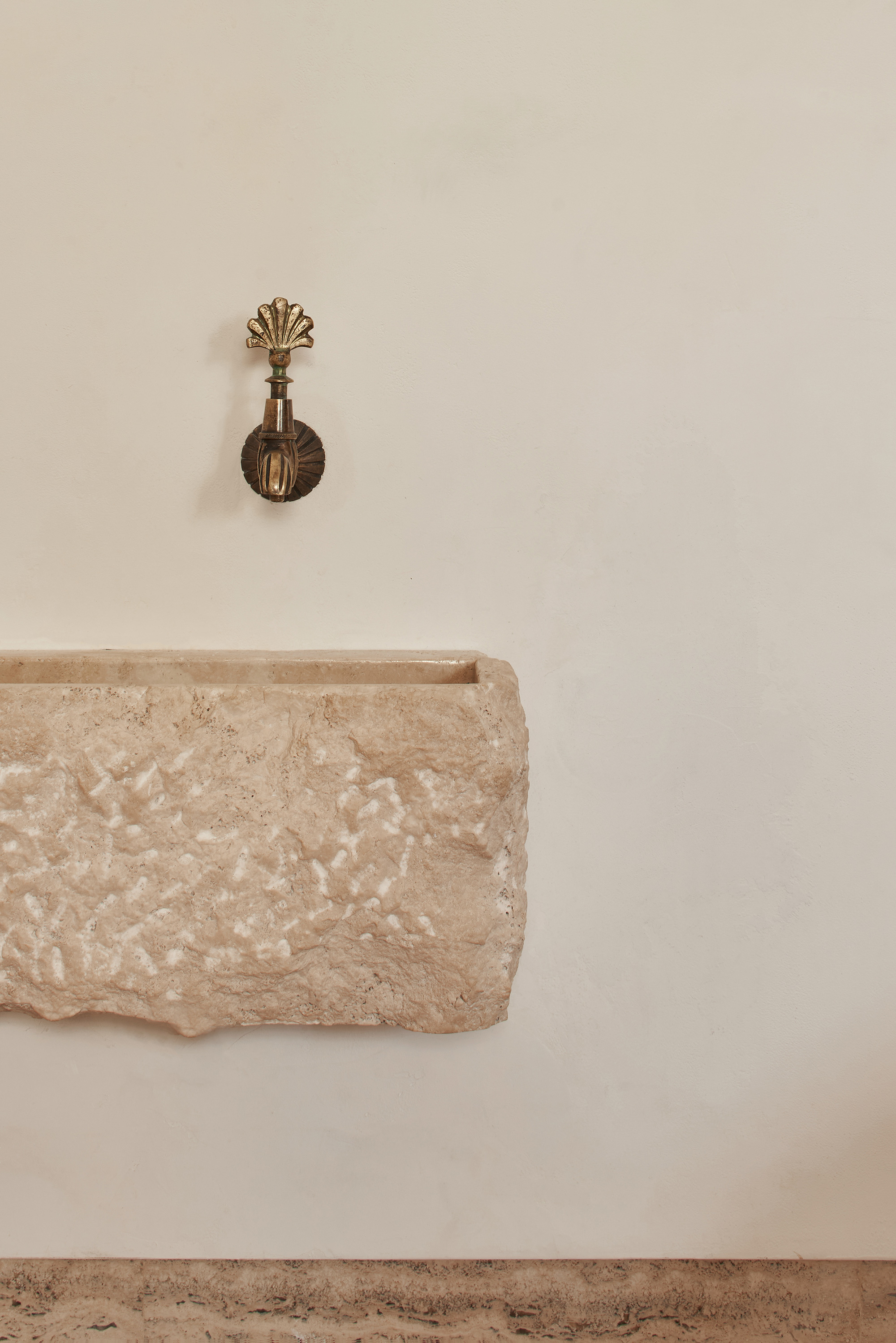
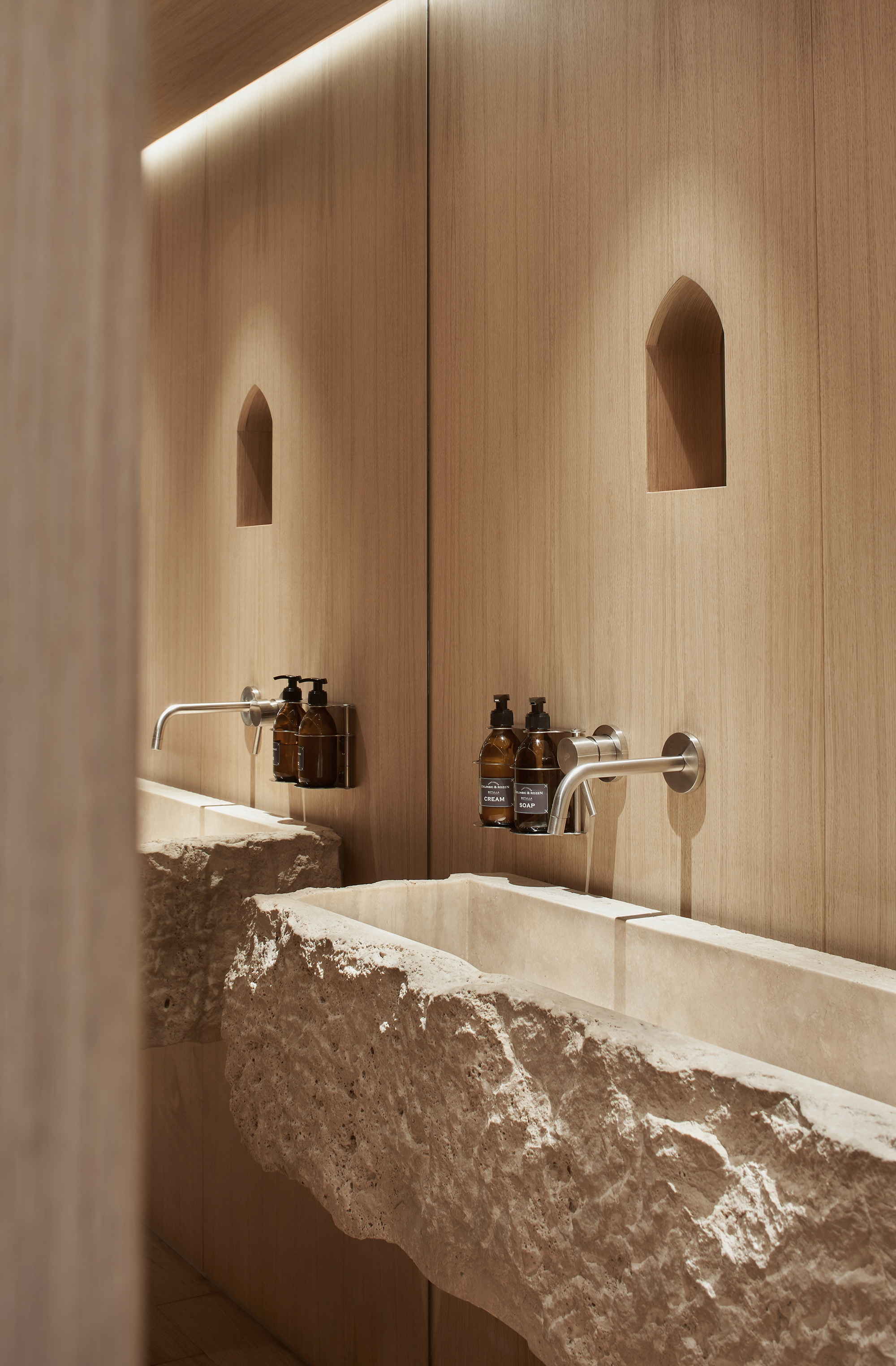
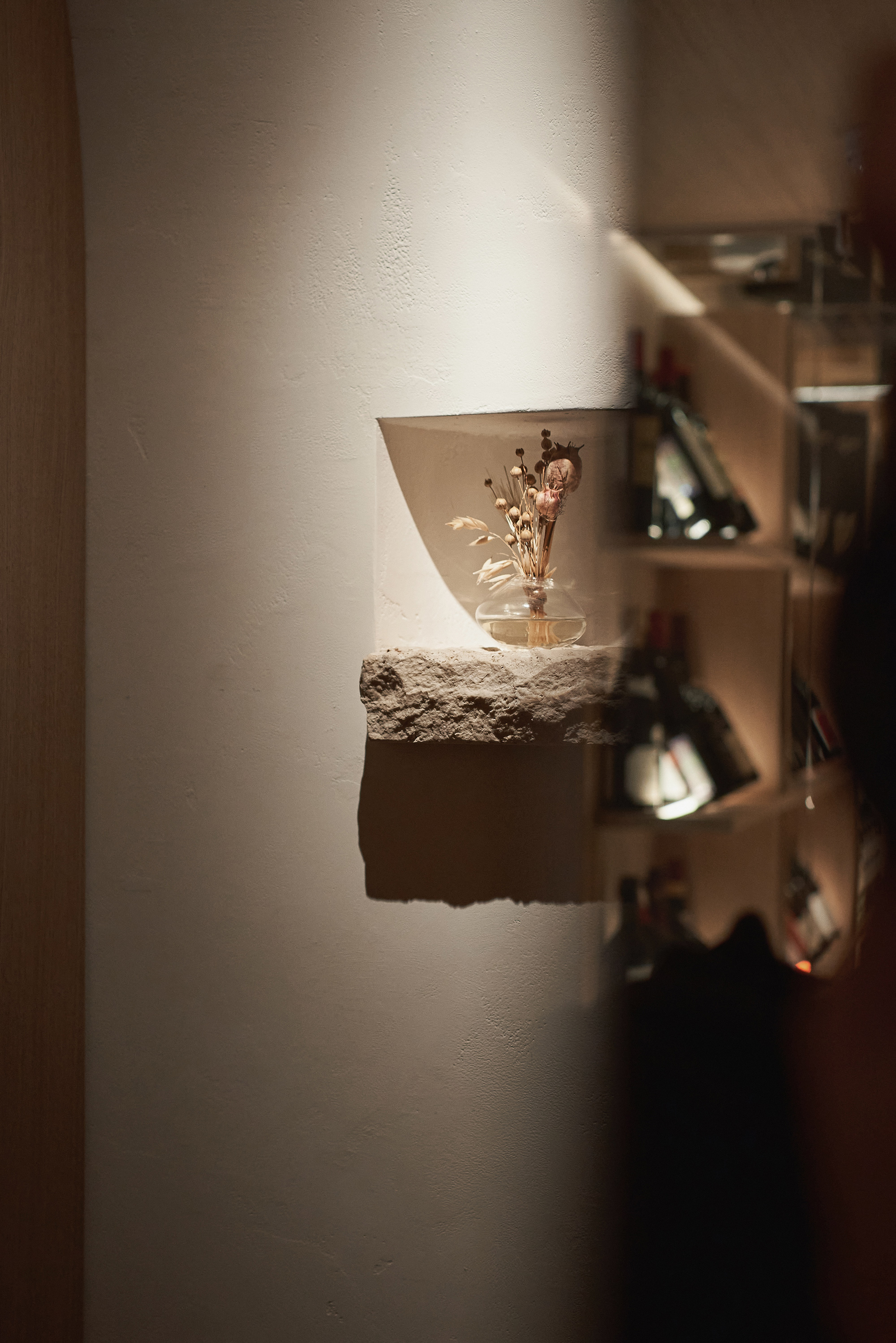
Tables and chairs reminiscent of church pews create the centerpiece element of the second hall. Here, the studio designed niches that hold not statues or icons, but the “holy trinity” of Italian cuisine: olive oil, thyme, and wine. The quintessential drinking fountain, common virtually everywhere in Italy, also appears in a creative way in the interior. In the first room, it takes the form of a wine cooler. In the bathroom, it becomes a stone sink. The restaurant also has a wine cellar, placed under the staircase.
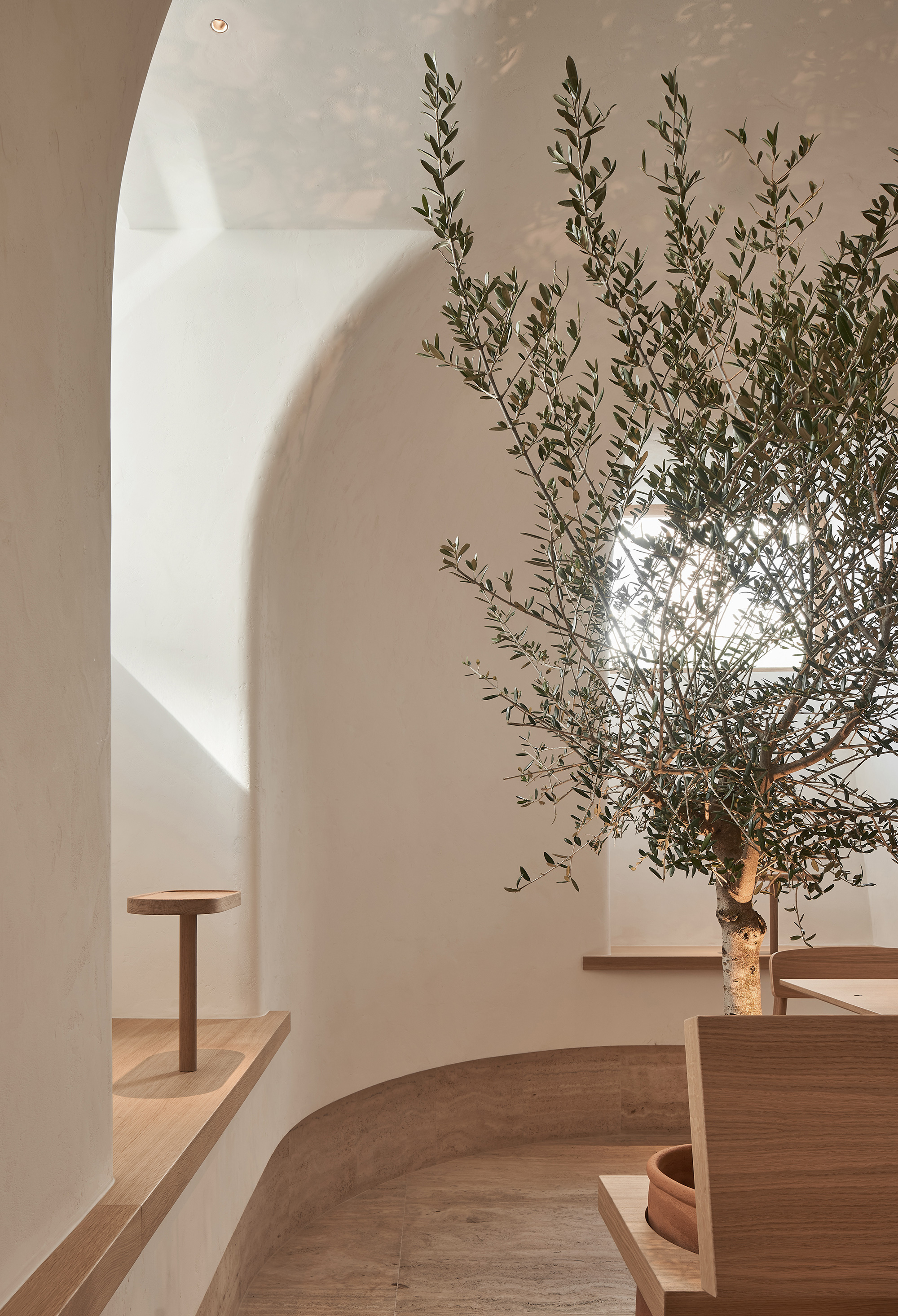
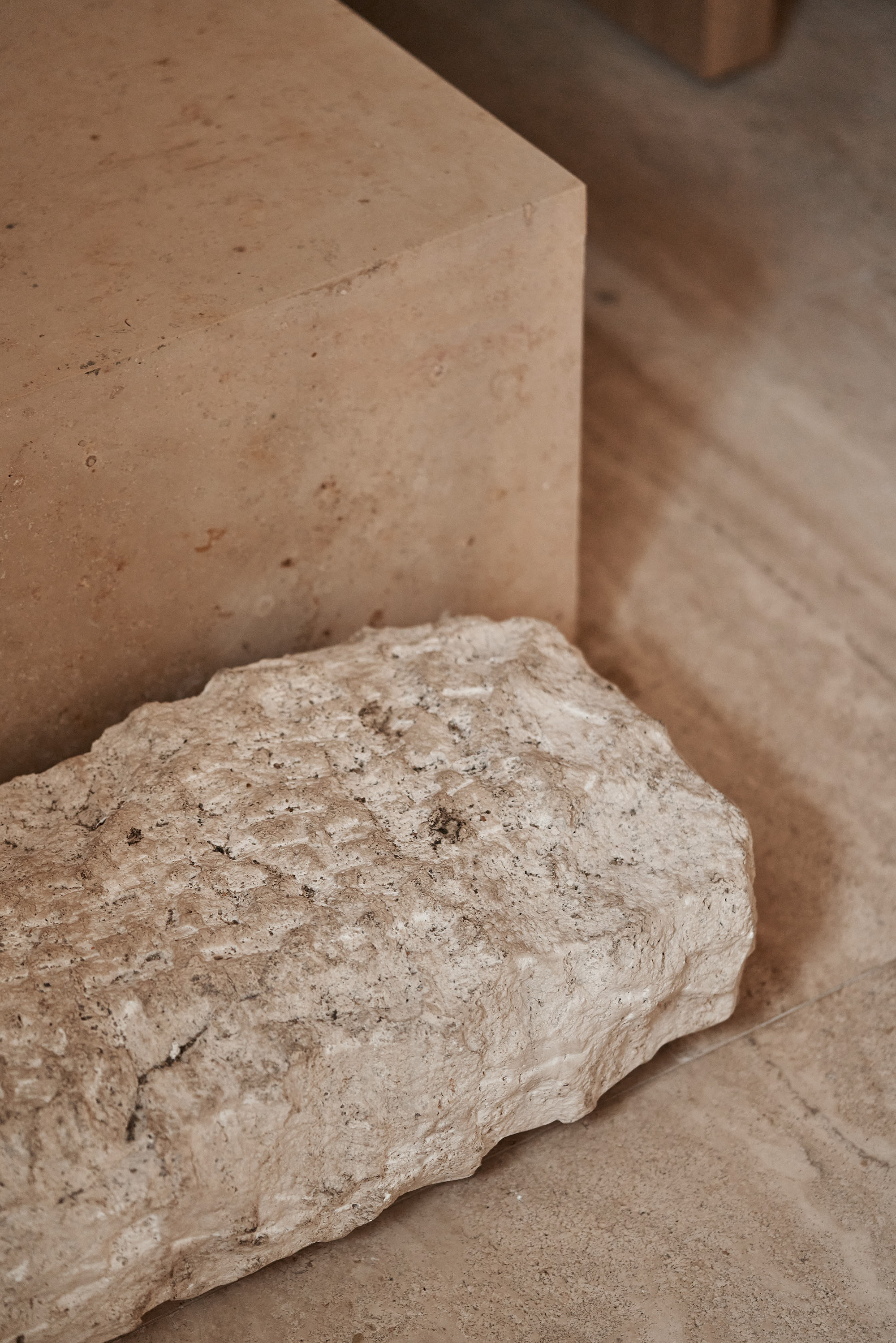
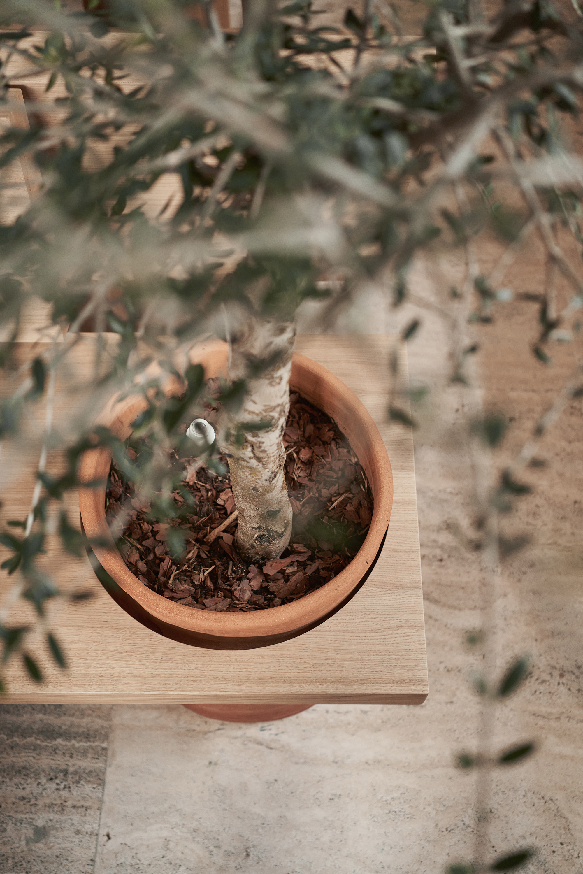
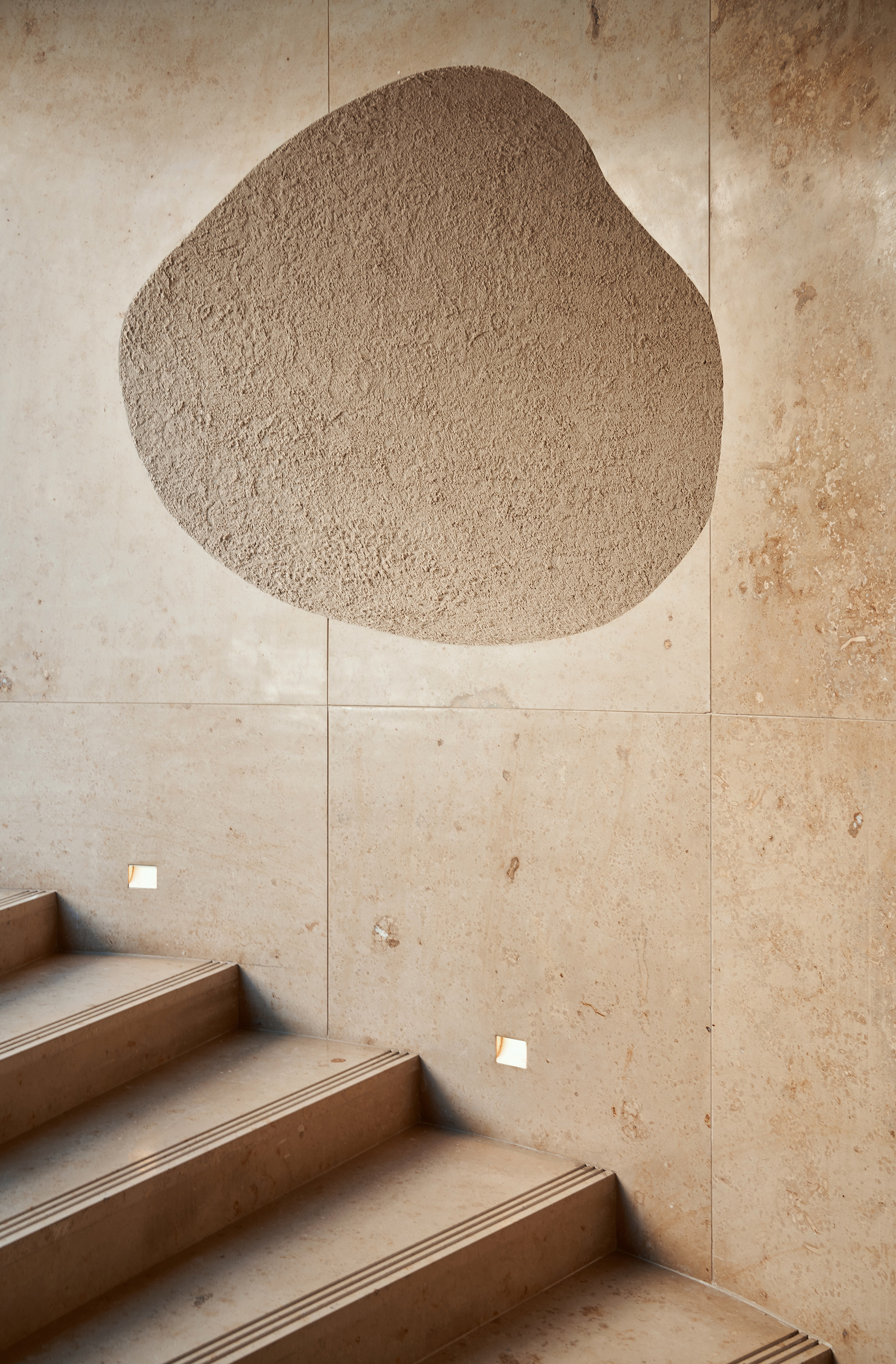
To enhance the amount of natural light reaching the interior, the studio designed high vaulted ceilings that reference church architecture. The team used three main materials for the interior; all of them are closely linked to Italian design and more traditional interiors: travertine, wood, and light plaster. Throughout the restaurant, soft curves and clean lines complement natural textures, creating a minimalist space that looks welcoming and warm. Photography© Sergey Melnikov.
