Mixed-used spaces designed for a local creative community in East London.
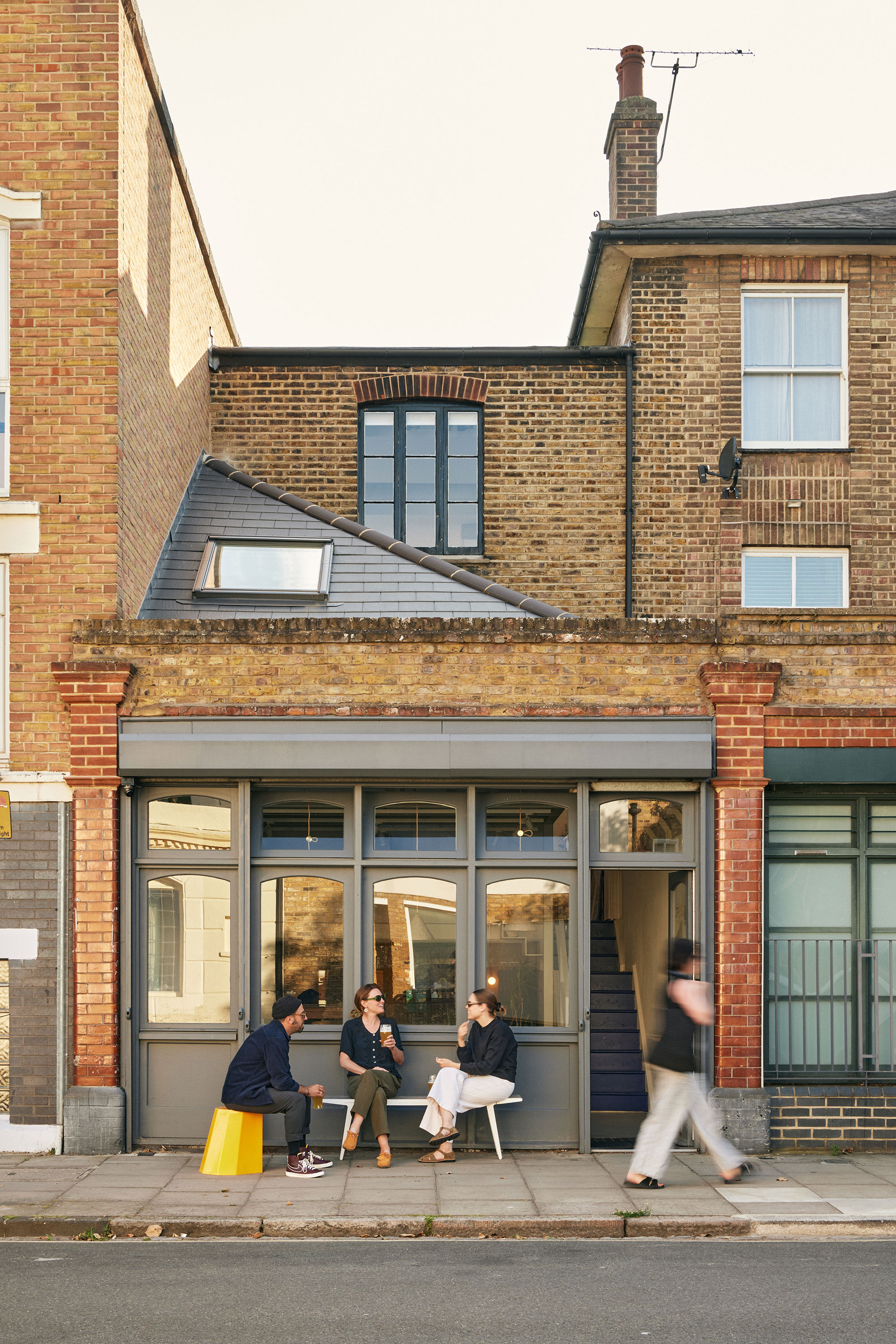
Located in Hackney, East London, UK, this former photography agent’s office was beautifully restored and transformed by architecture practice Trellik Design Studio. The firm’s founder, Jean Dumas, purchased the building in 2019 in order to create multi-use spaces that enable cross-disciplinary collaboration and foster deeper community connections. Named One and A Half Studios, this adaptive-reuse project involved not only the restoration of the Victorian building, but also the creation of private offices, a workshop, and a cafe open to the local community.
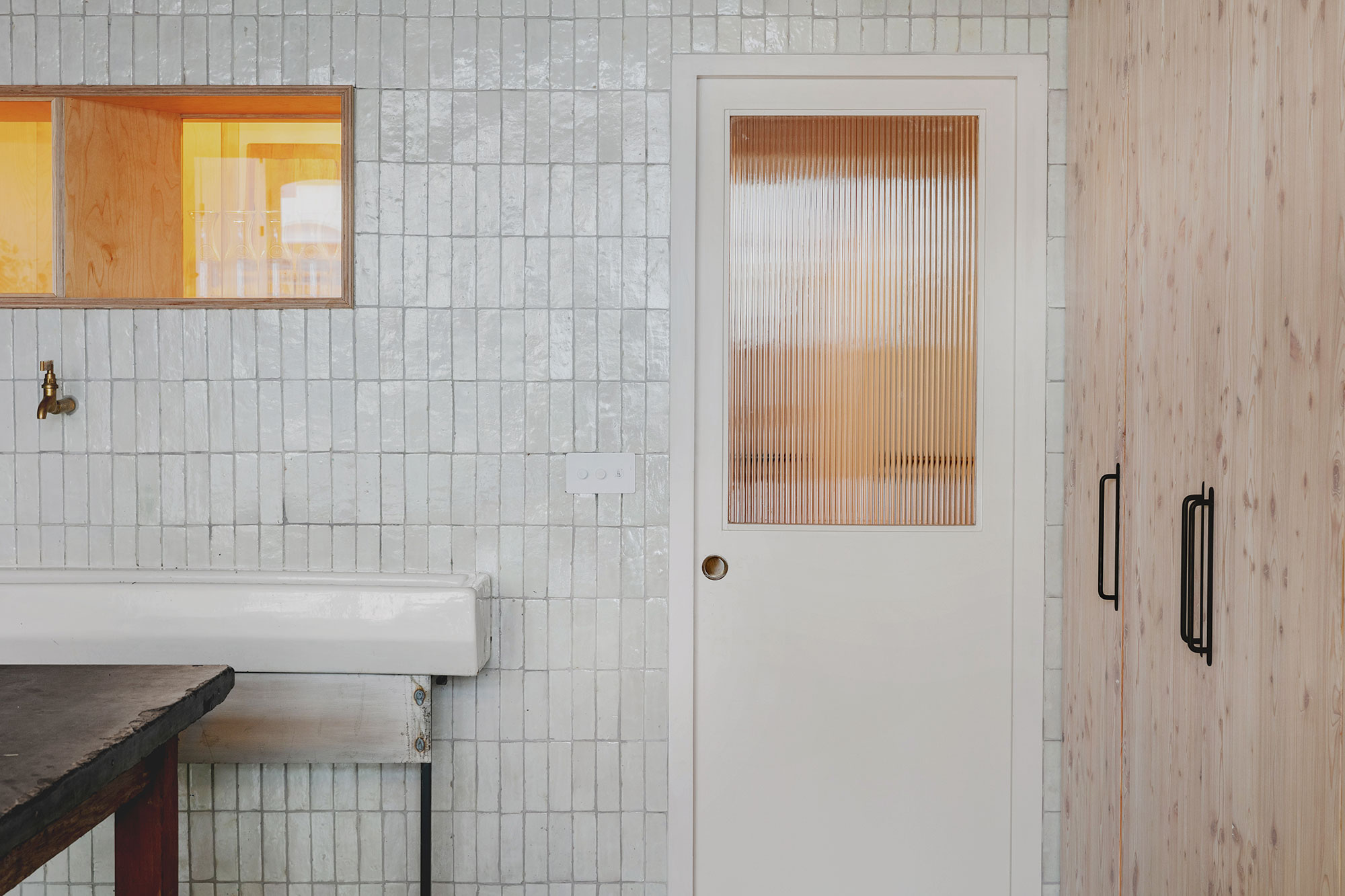
The mixed-used spaces are spread across three levels with a stepped plan, thus establishing different connections between areas and linking the interiors visually. The London-based studio carefully restored original features and also used a blend of recycled and reclaimed materials to finish the interiors in a sustainable way. Throughout the building, contemporary details complement traditional elements. Additionally, pops of color and creative details showcase the firm’s playful approach to architecture and interior design.
“We have intentionally kept the space intimate to reflect the typology that offers a dynamic, home away from home workplace. Post-pandemic working culture means that no one day is the same here in One and A Half Studios. This mirrors the energetic character representing various combinations of creatives in and out of the space. We want the place to flourish, with occupants using the spaces to host and launch events, and celebrate big or small achievements,” says Jean Dumas, Director at Trellik Design Studio.
A thoughtful blend of traditional and contemporary elements that bridge different eras and styles.
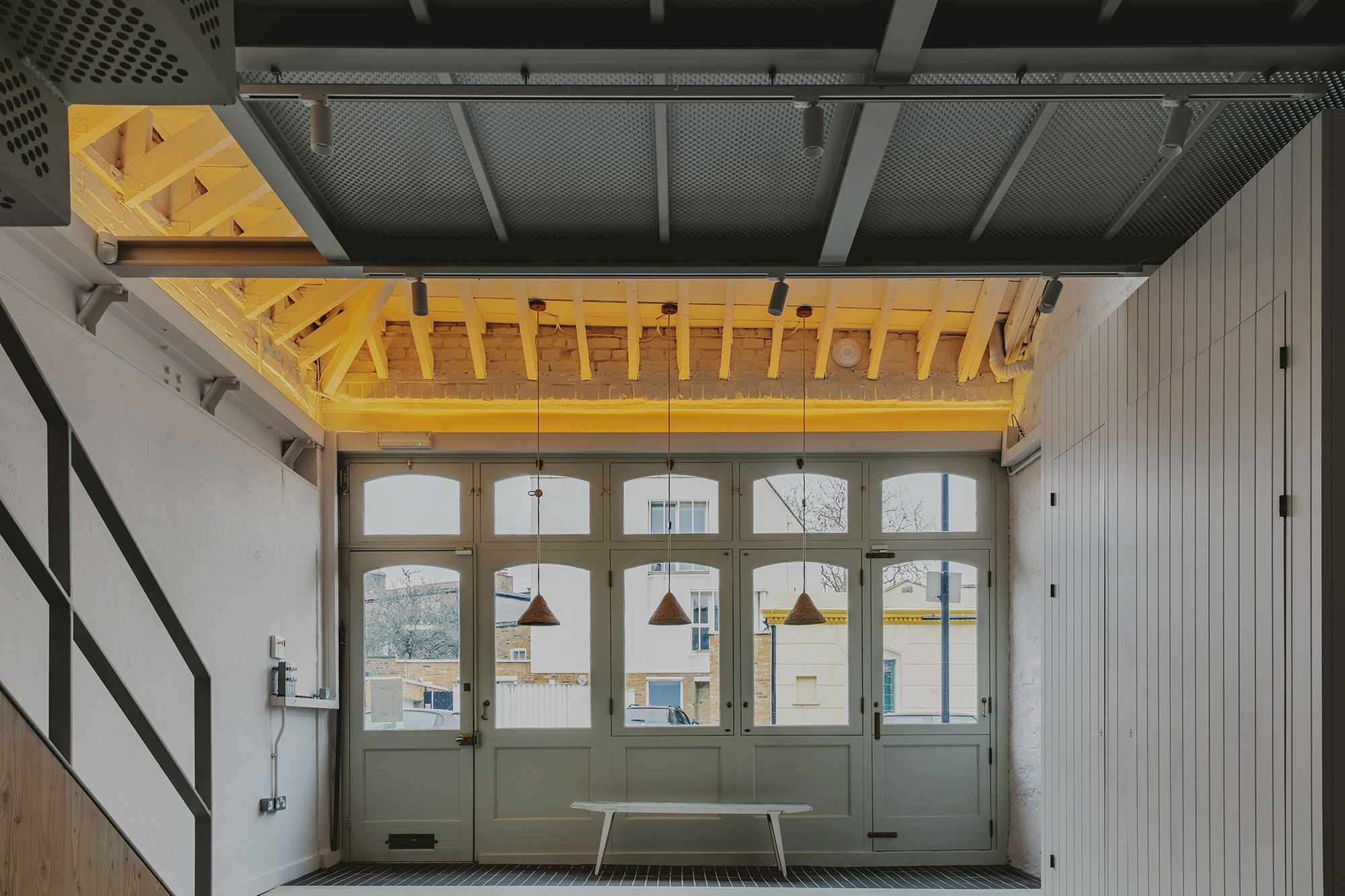
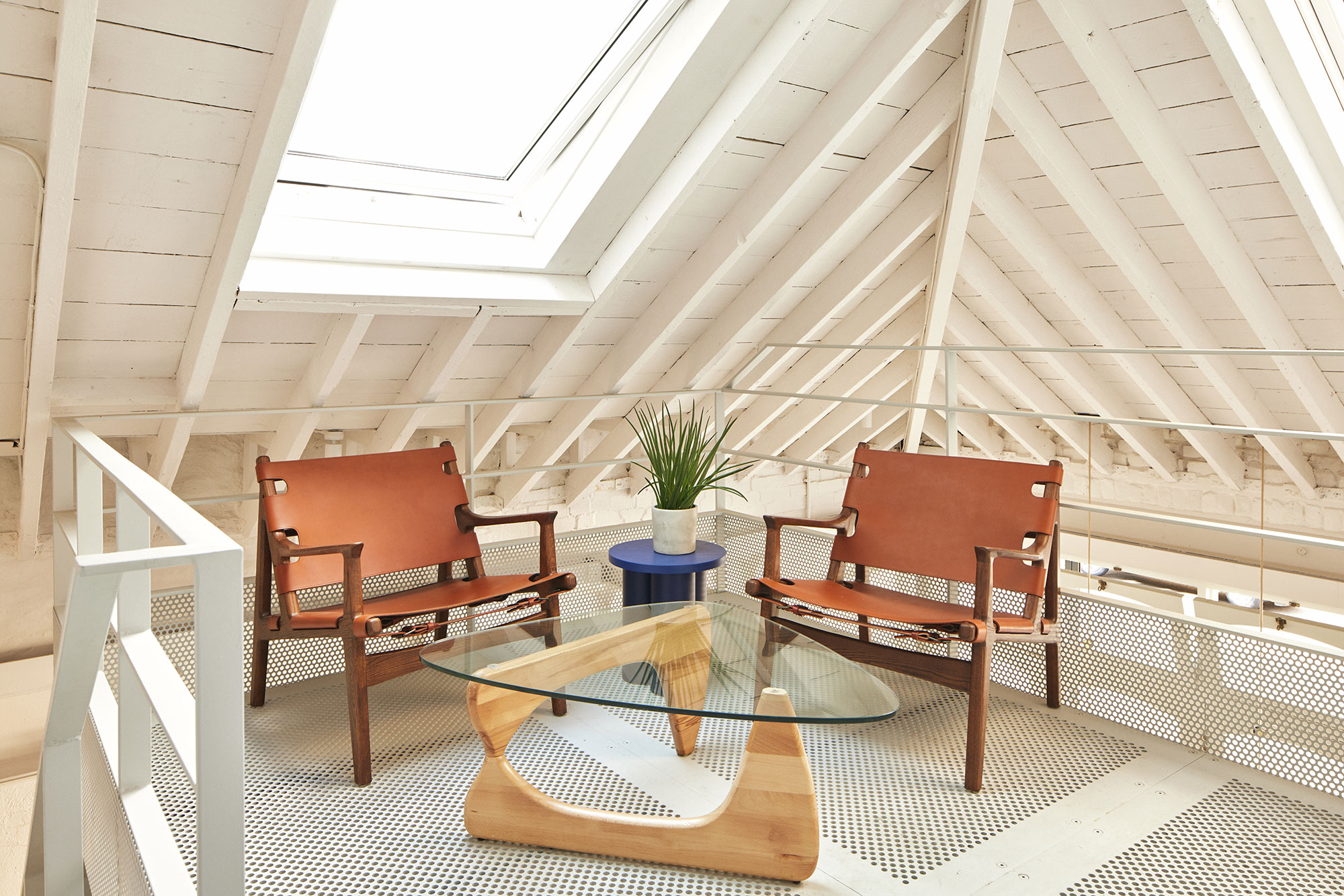
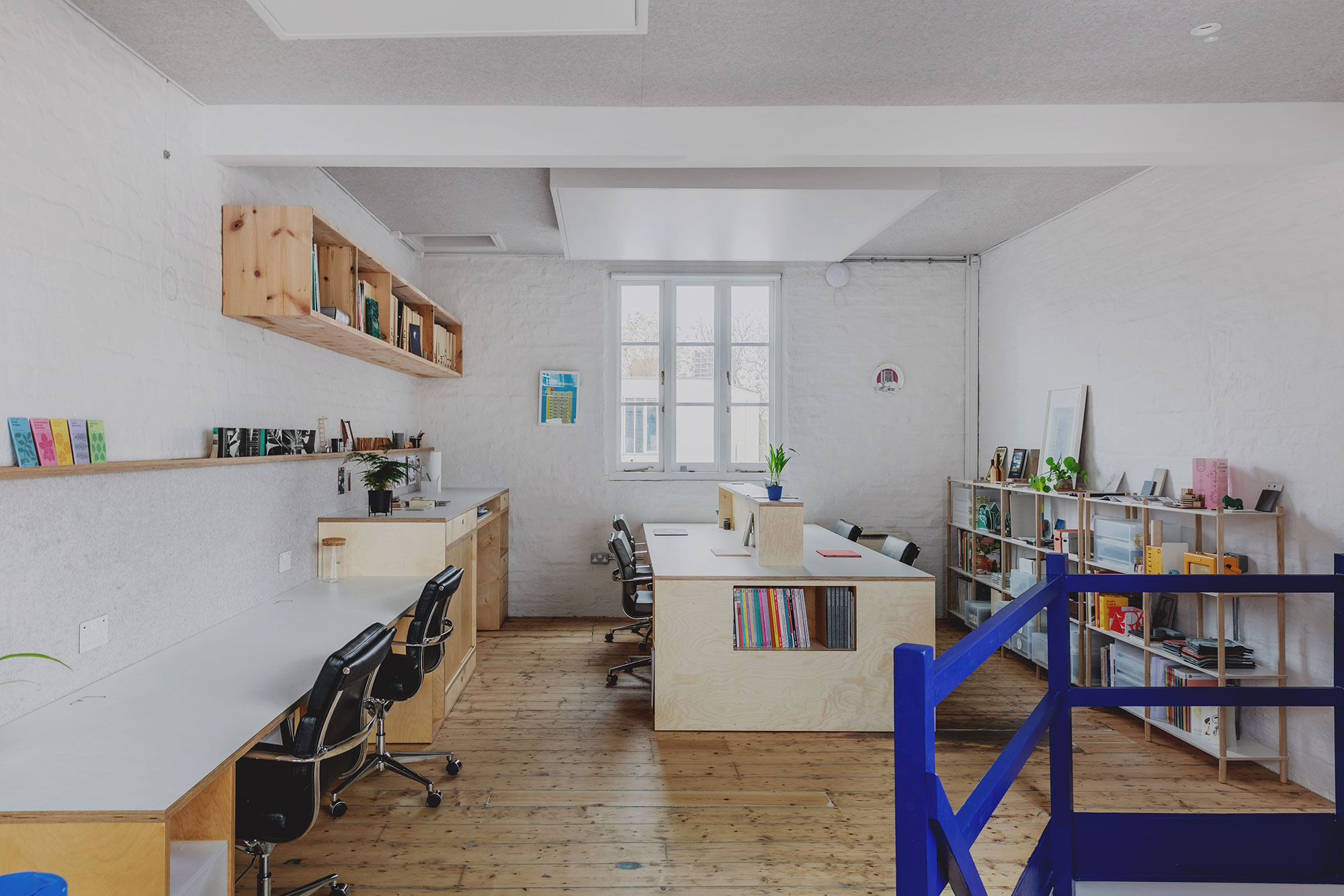
The team cleverly installed insulation from the exterior of the building, thus preserving the character and original features of the Victorian interiors. Furthermore, the architects uncovered the original timber rafters, now restored to their former glory. The interiors boast extra-high ceilings as well as new skylights that welcome natural light deep inside the building, chasing away the darkness from the previously deep floor plan.
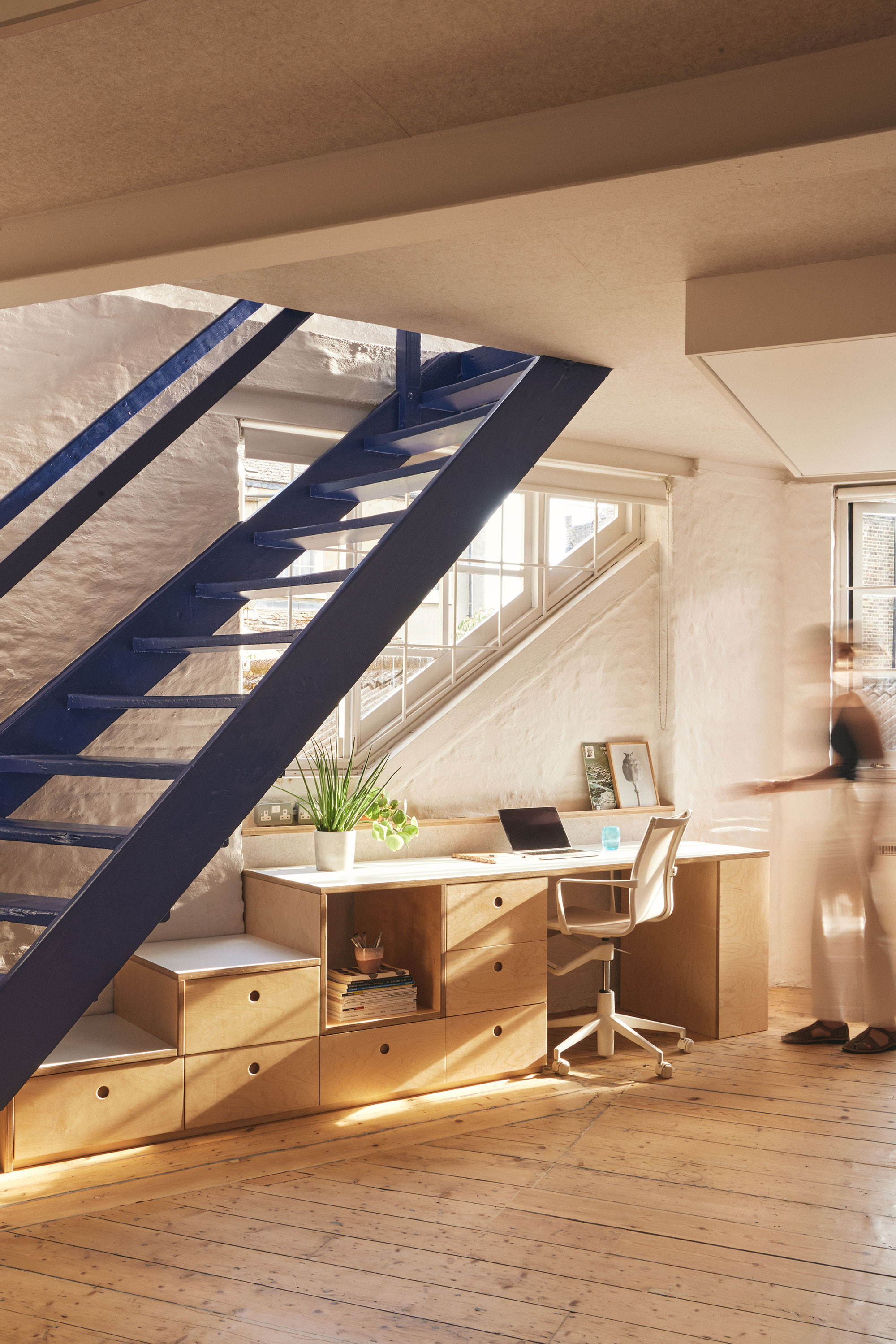
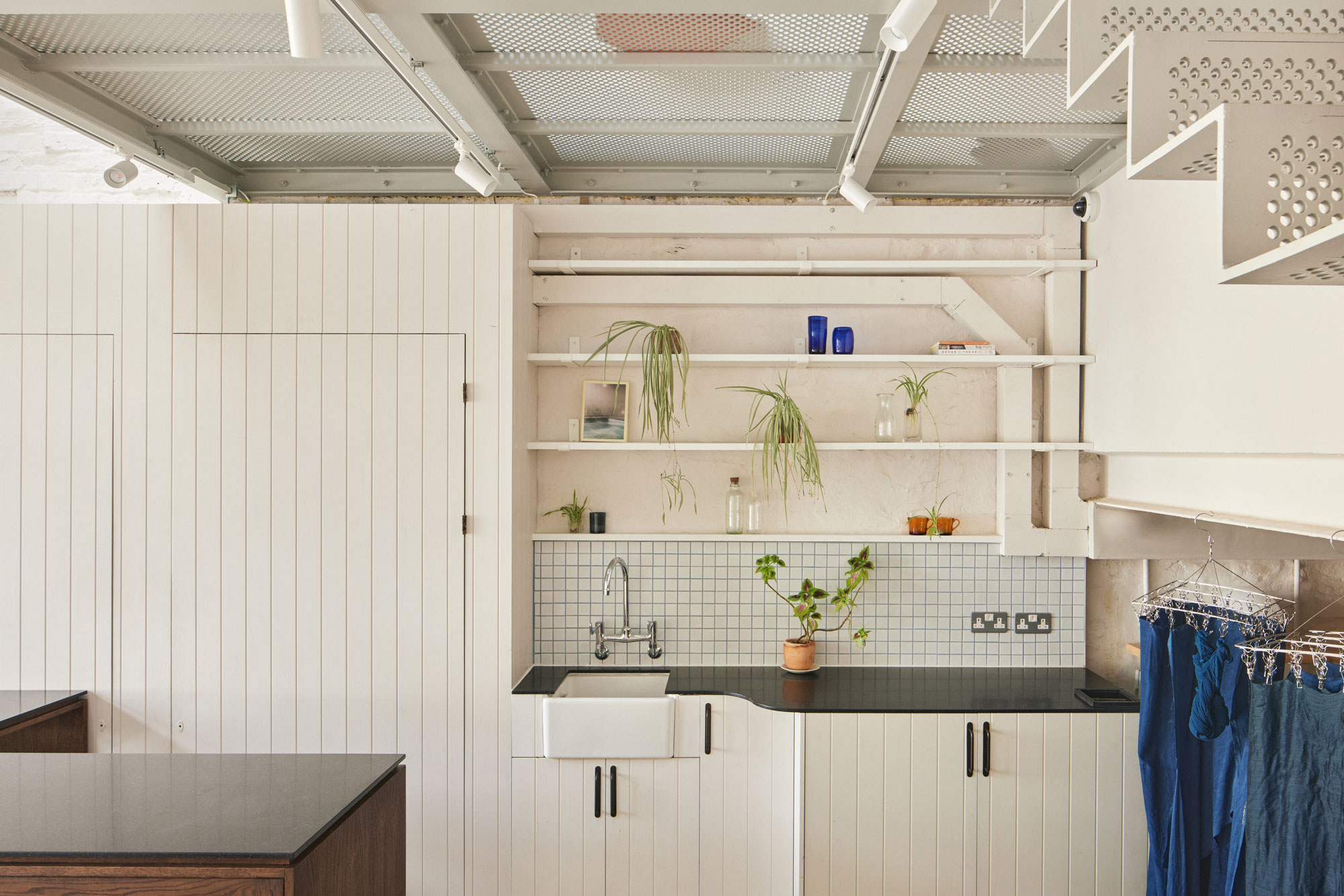
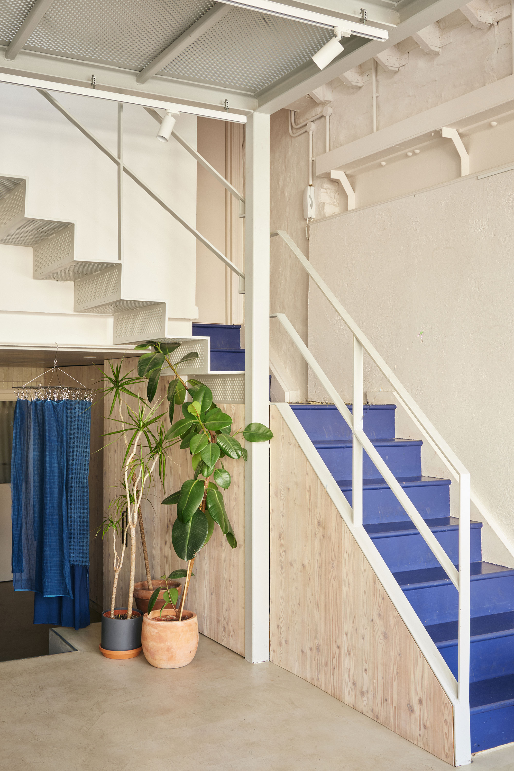
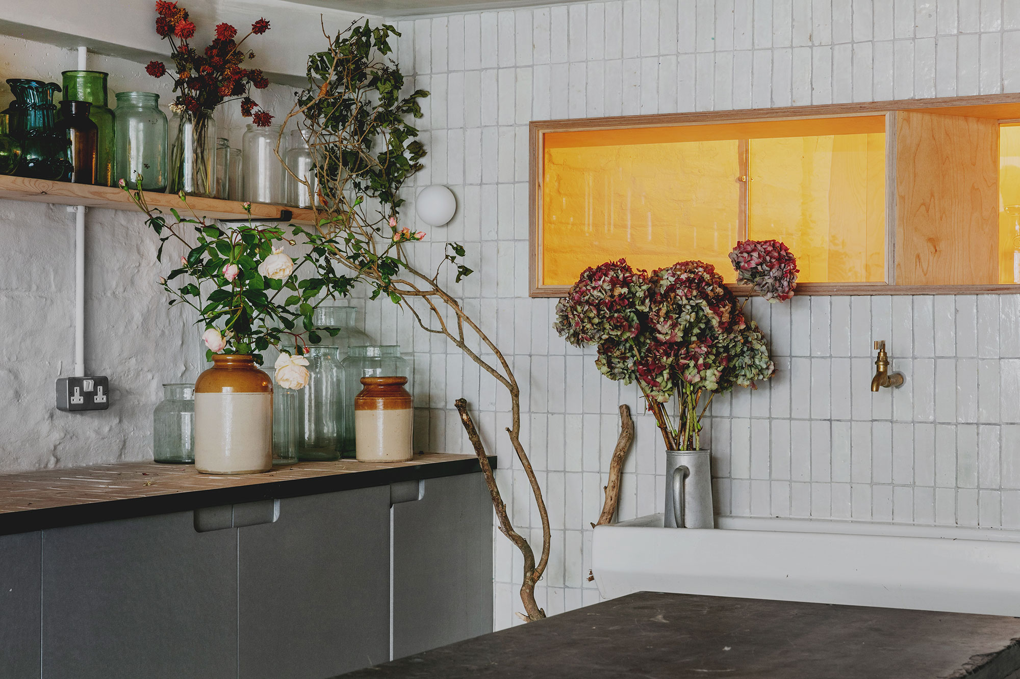
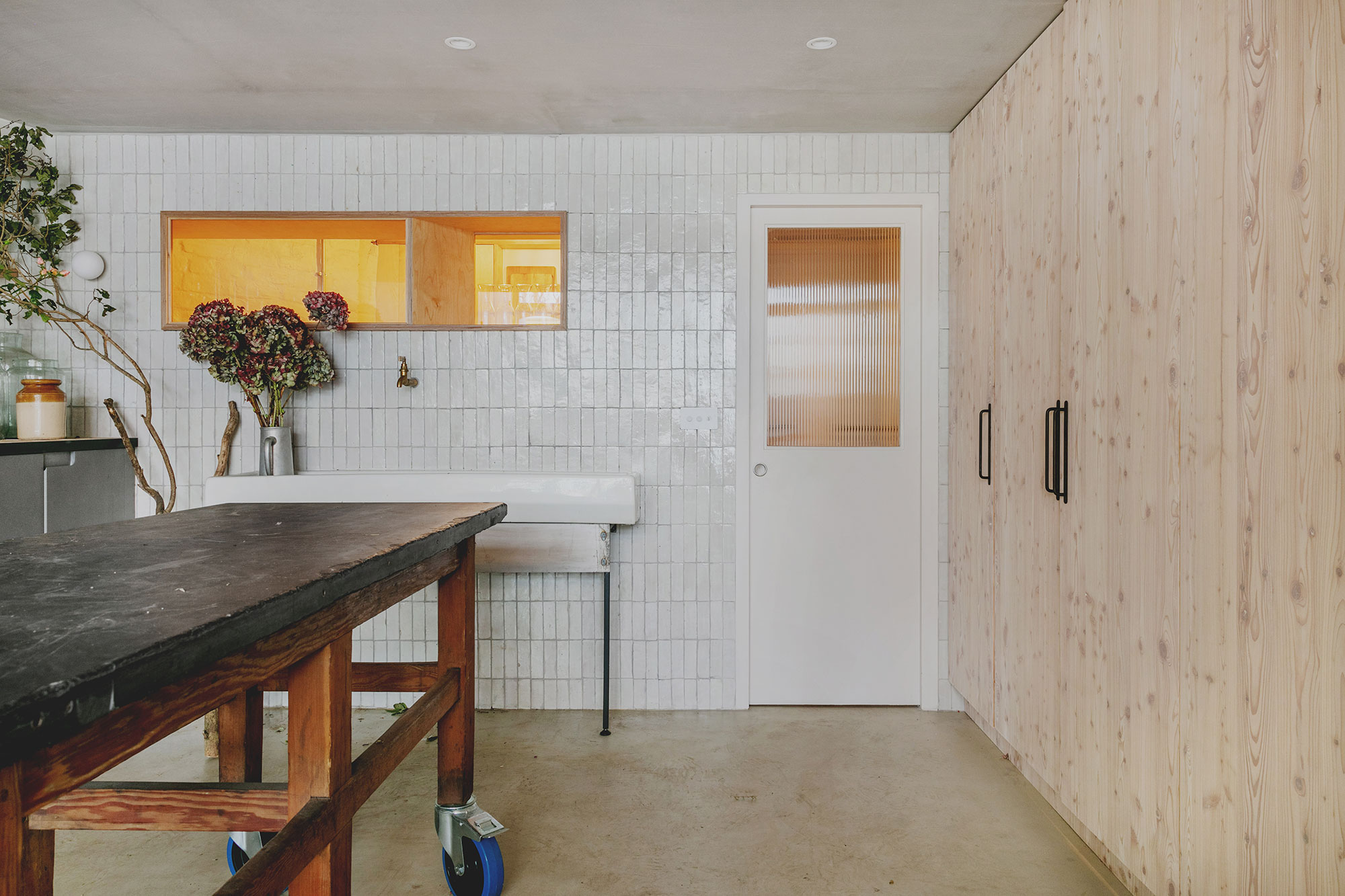
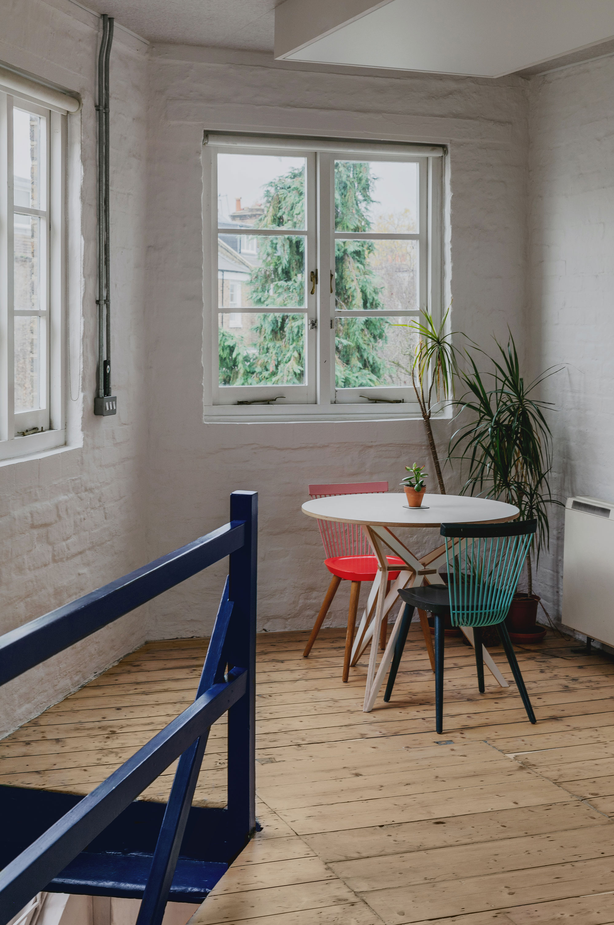
While the building contains three separate floors and a mezzanine level, all of them are conveniently flexible and easy to adapt to different needs. Beyond the entrance, visitors discover a welcoming cafe that also doubles as an events space. A step down, there’s a workshop which currently houses a fabric dye atelier. At the rear of the ground floor, there’s a communal kitchen and bathrooms. Above the ground level, a mezzanine area operates as a library and space for exhibitions or pop-up shops supporting local non-profit organizations. The mezzanine boasts a cornflower blue color that softens laser-cut perforated steel panels. These perforations let light to flow through the lower levels. A cobalt blue paint now covers the restored staircase that leads to the upper levels. Both the first and the second floor contain offices with secure doors that separate public and private areas.
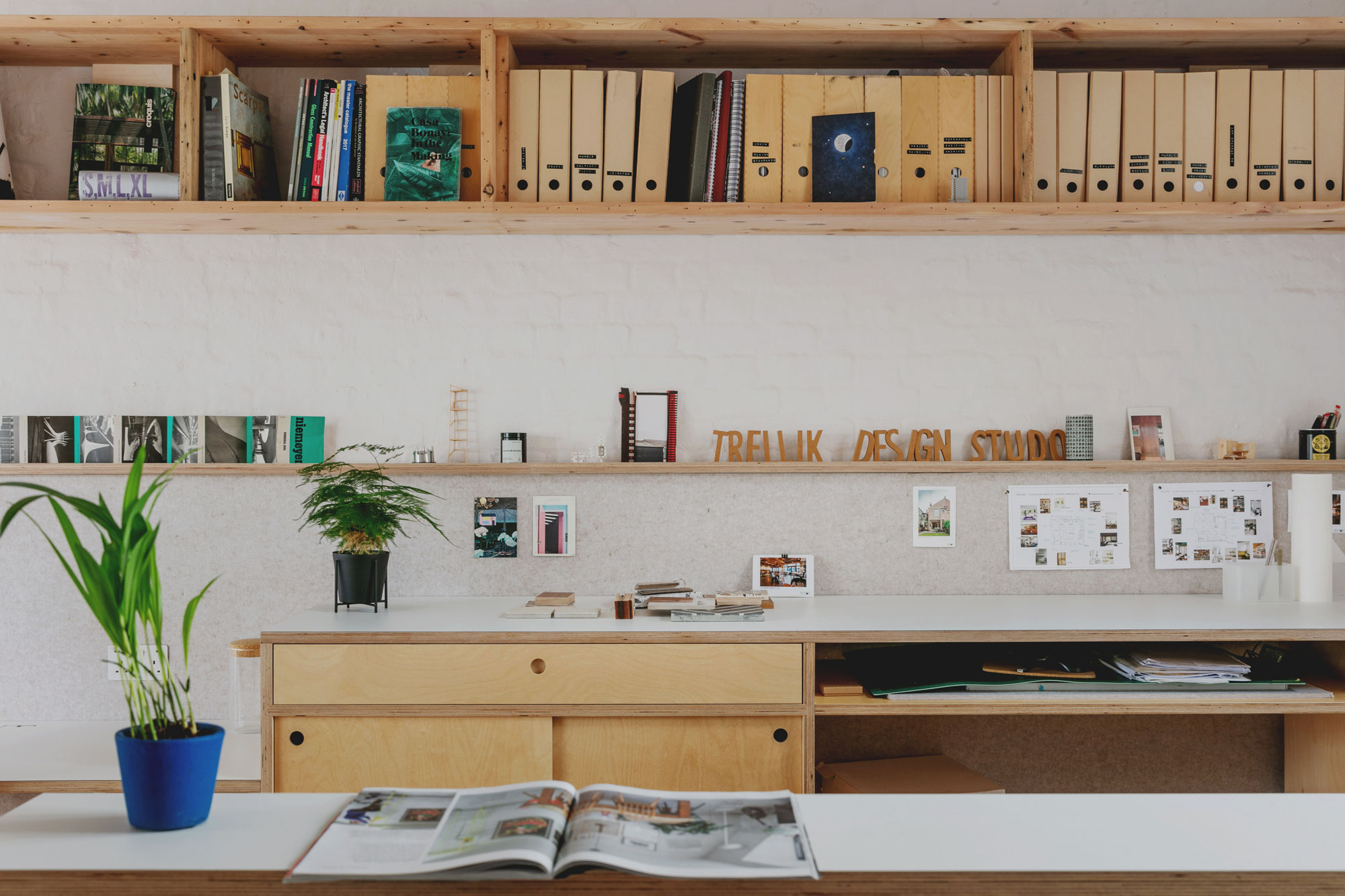
Throughout the interior, the studio paired recycled and pre-existing materials. For example, the walls and ceilings now boast acoustic felt panels made by ReFel from recycled waste plastic. Apart from dampening the sound in the open-plan offices, the felt panels offer a convenient surface on which to pin notes or photos. The team complemented the original wood floors with reclaimed floor joists that now serve as shelving. Old photographers’ light boxes now feature LED lights, brightening the offices and reducing energy use at the same time.
Interiors that celebrate the ingenuity and talent of local craftspeople, designers and artists.
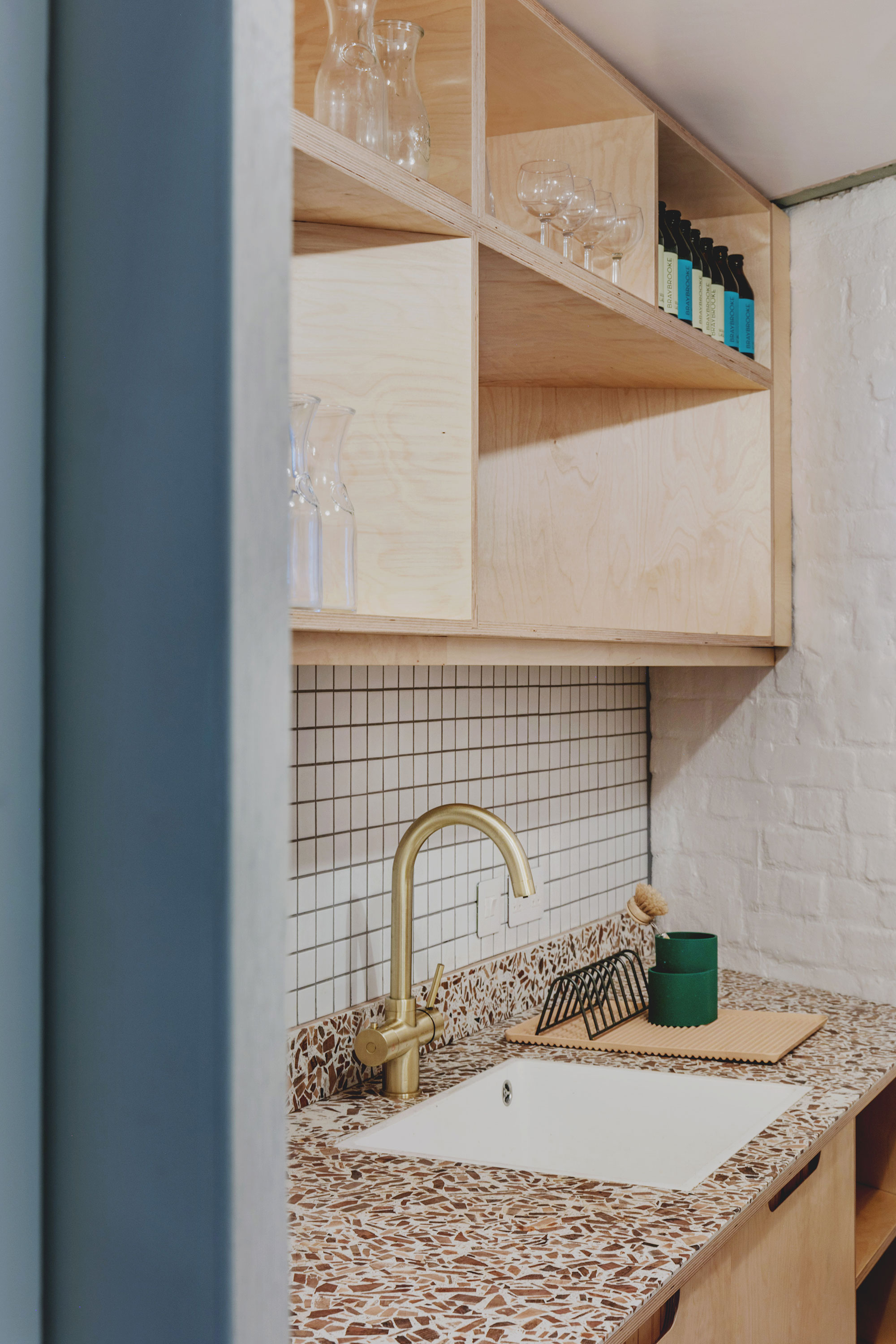
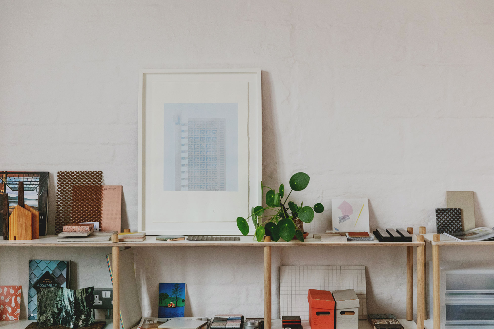
This adaptive-reuse project has a strong community focus, and this also applies to the choice of materials, furniture, lighting and decorative items. The firm has closely collaborated with a network of local craftspeople, companies, artists, and designers to complete the interior design. For example, local companies supplied furniture, doors, and kitchen worktops. The studio collaborated with lighting designer Hortense Duthilleux on the Mirror Halo Light in the mezzanine level, while a local joiner completed all the joinery. Eco-friendly details include seaweed pendant lights from Tŷ Syml and Potter’s Thumb glass lamp pendants ingeniously made from crushed wine bottles.
A gorgeous example of creative architectural design, the One and A Half Studios project shows how existing, old and dark buildings can become bright and social spaces that foster connections between local creatives and ultimately transform into community hubs that enrich the urban fabric of cities. Photography by Ed Dabney and Mariell Lind Hansen.


