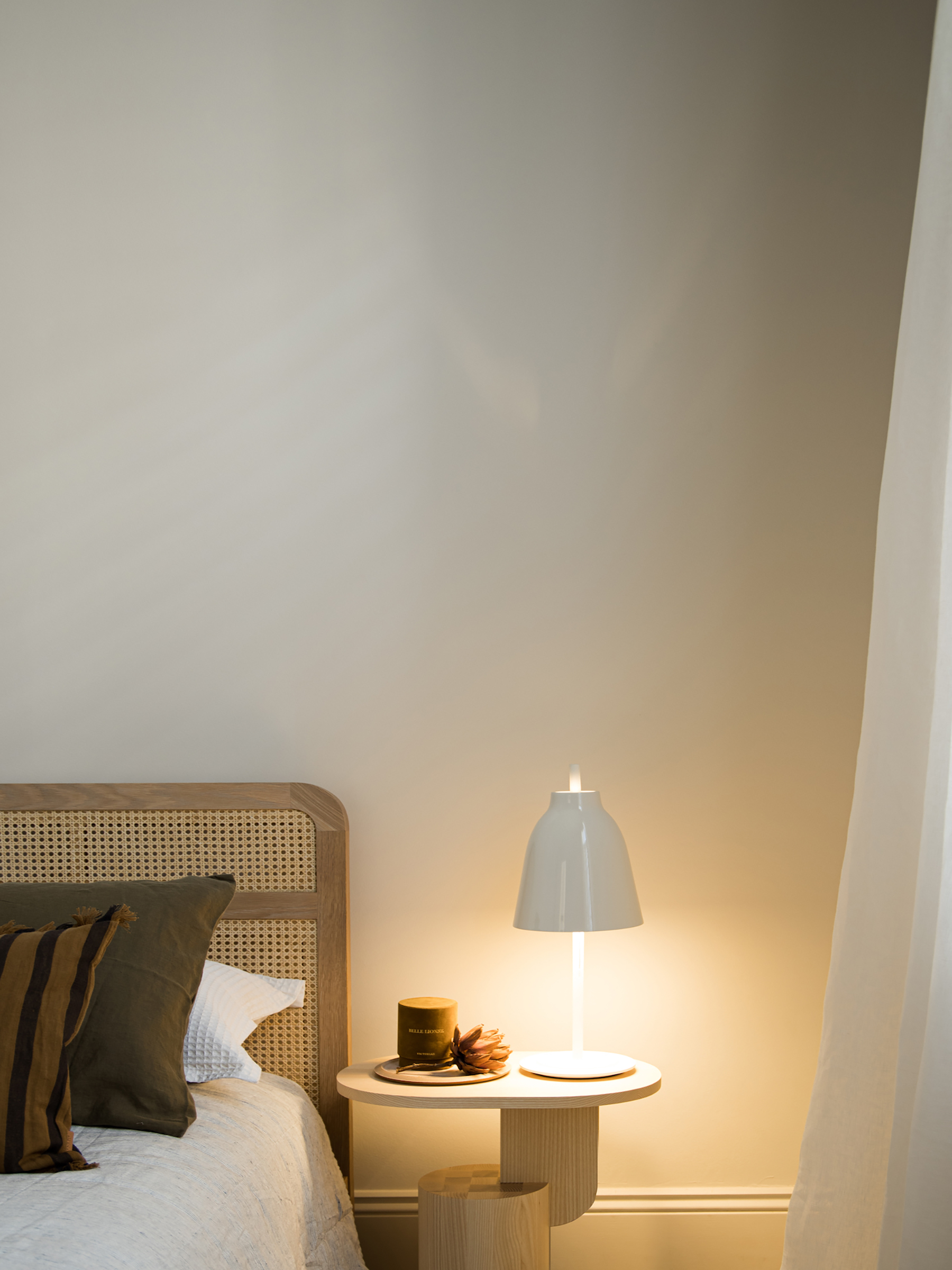
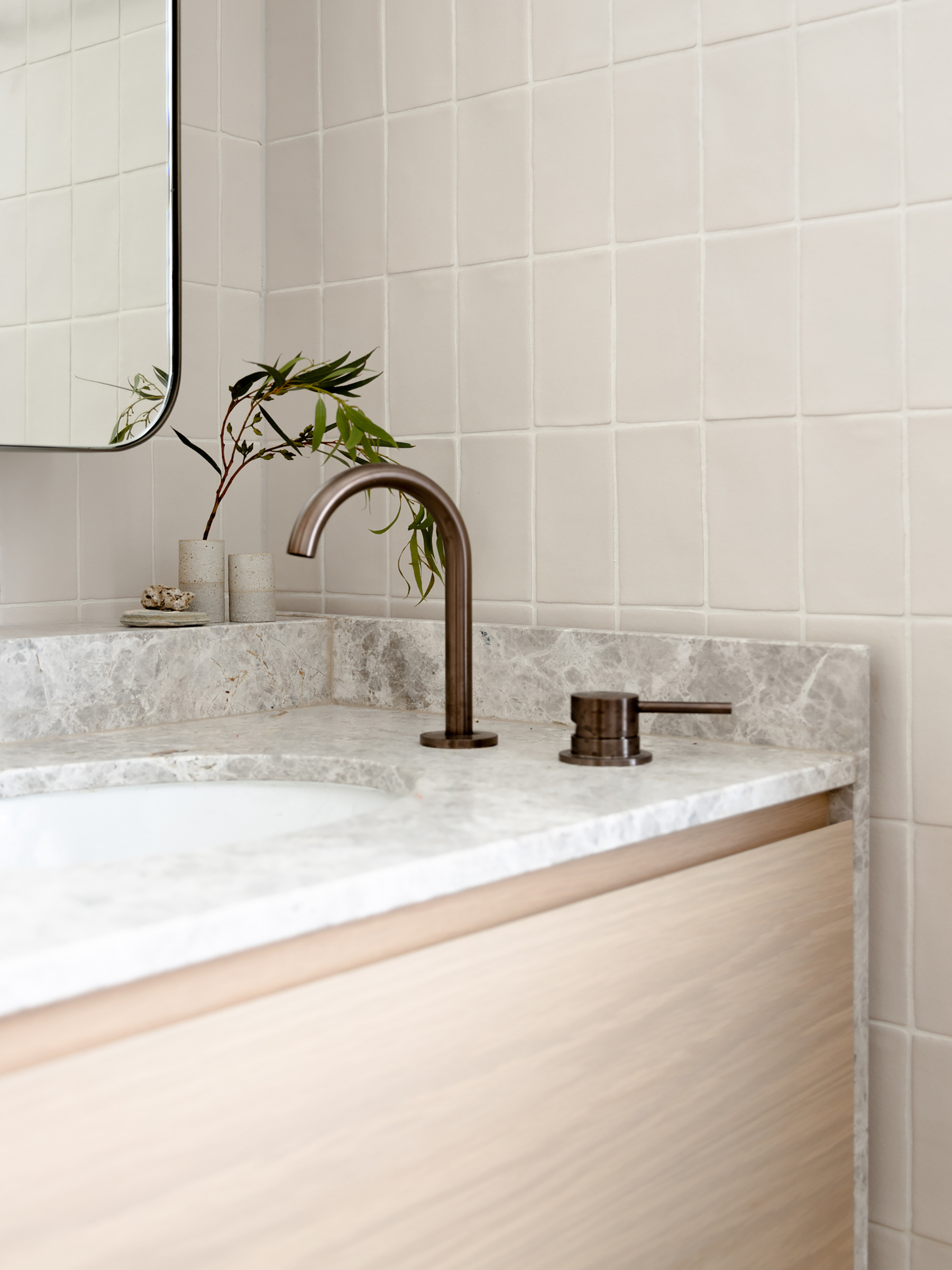
A redesigned volume that fills a historical cottage with light and refined minimalism.
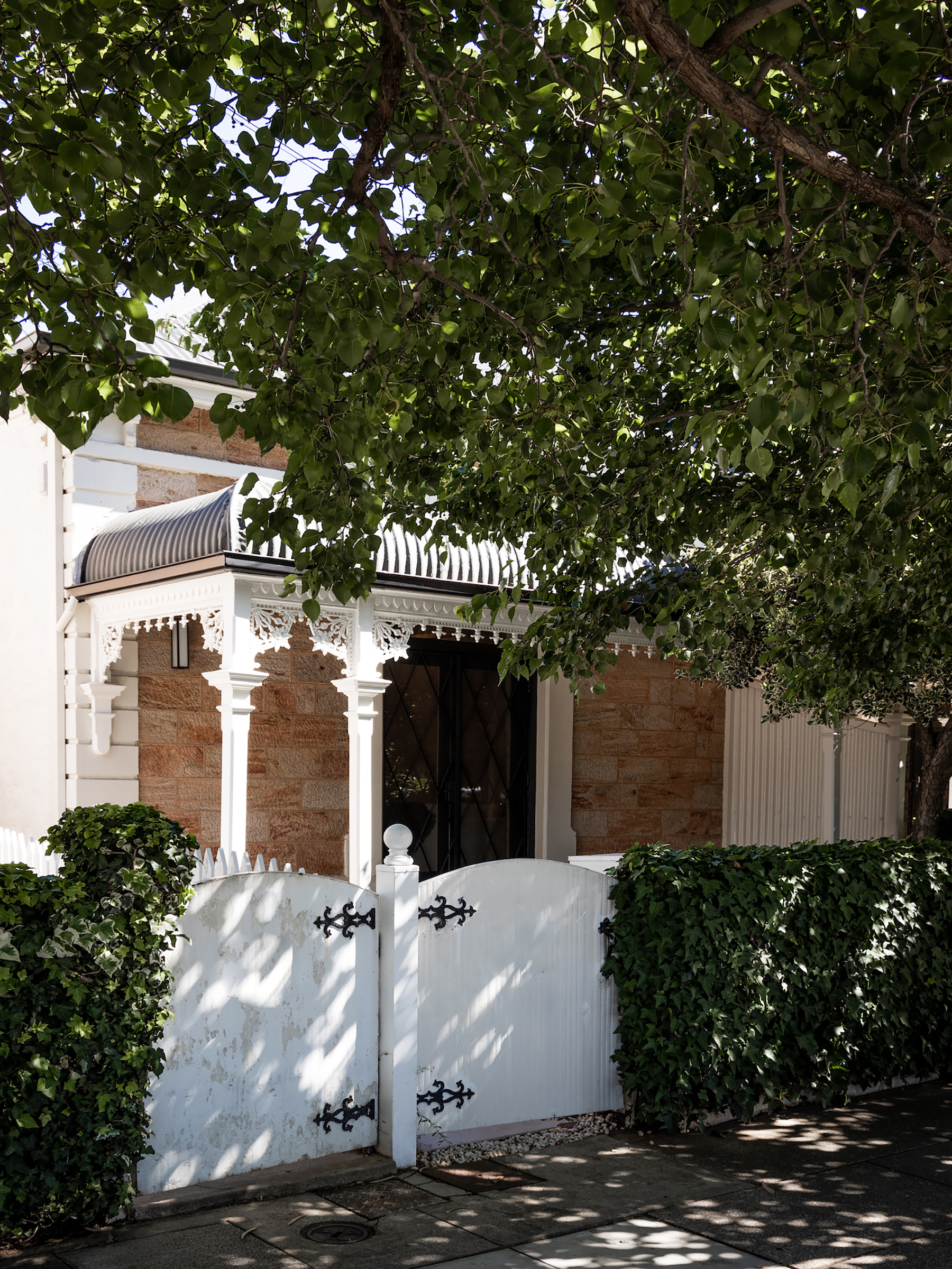
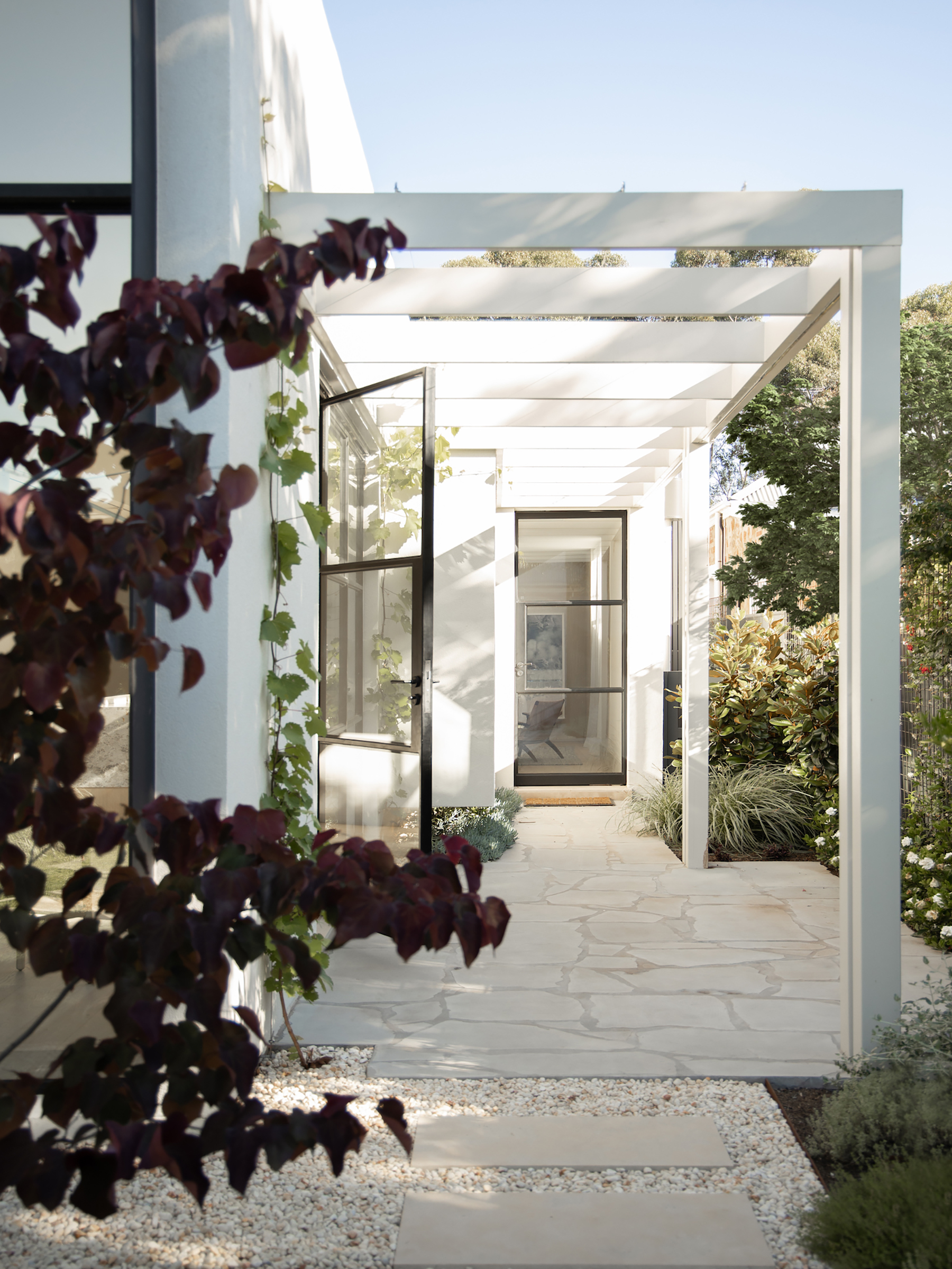
Located in Adelaide, Australia, this Victorian-era house sits among other heritage-listed dwellings in a quiet residential area. Award-winning architecture firm Williams Burton Leopardi transformed the home with a redesigned wing that preserves the footprint of a 1960s-1970s lean-to, yet completely transforms the entire residence. The studio recreated the level of craftsmanship and attention to detail that define the original house, but in a refined, contemporary design language. An unusual side entrance pushes the central hallway that connects the living spaces farther back from the front of the house. As a result, this residence boasts a grand reception room opening to a verdant area that acts as a buffer zone between the building and the street.
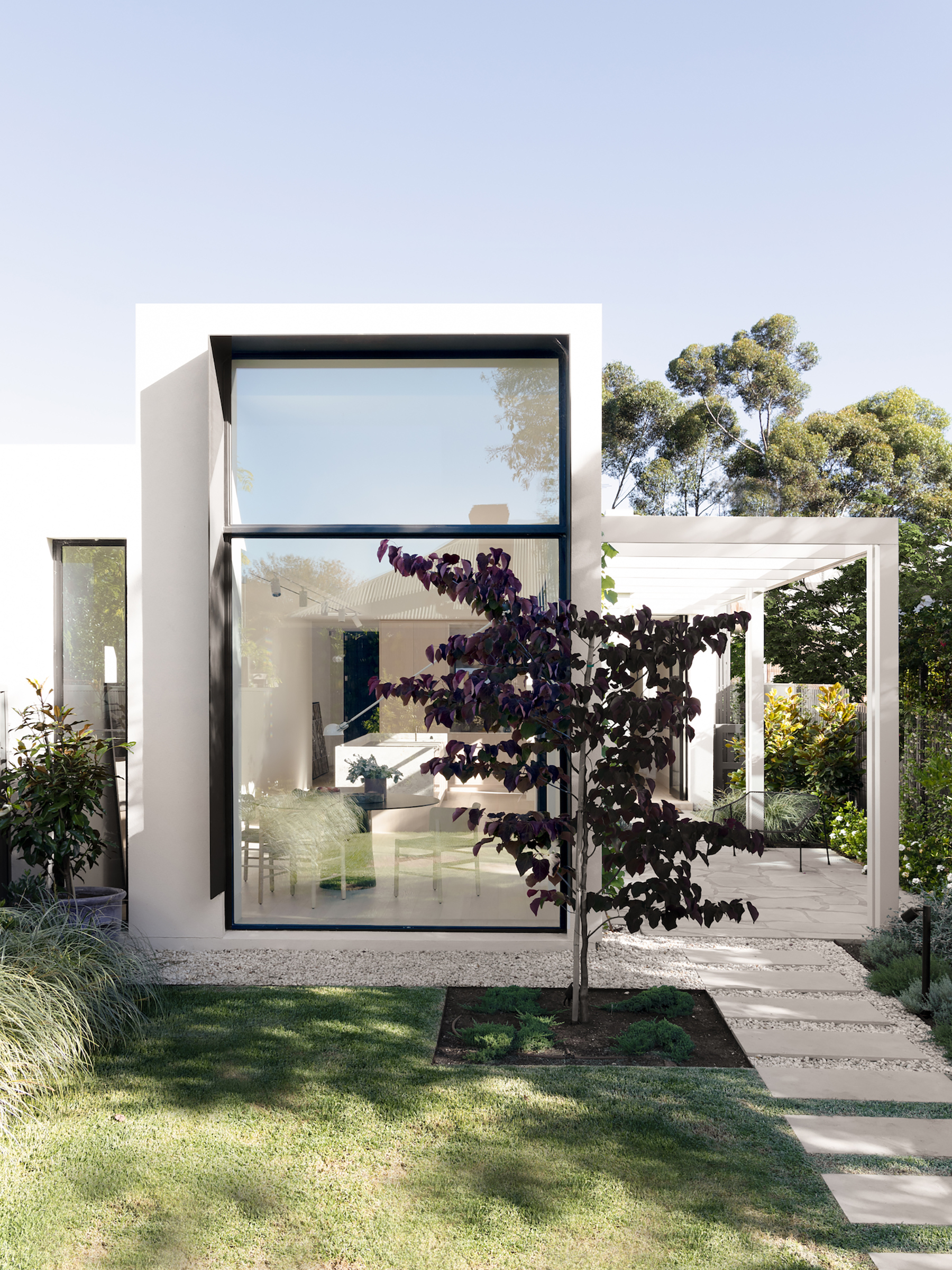
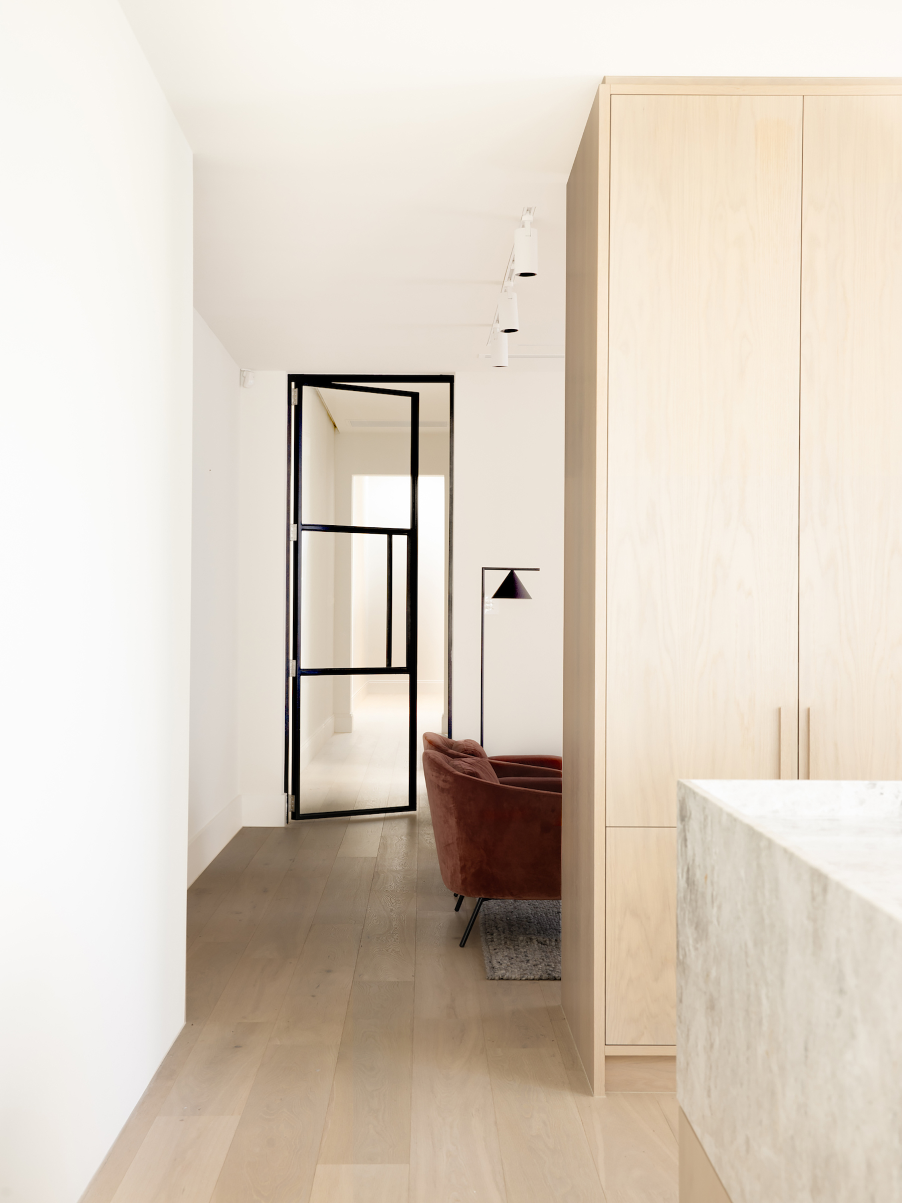
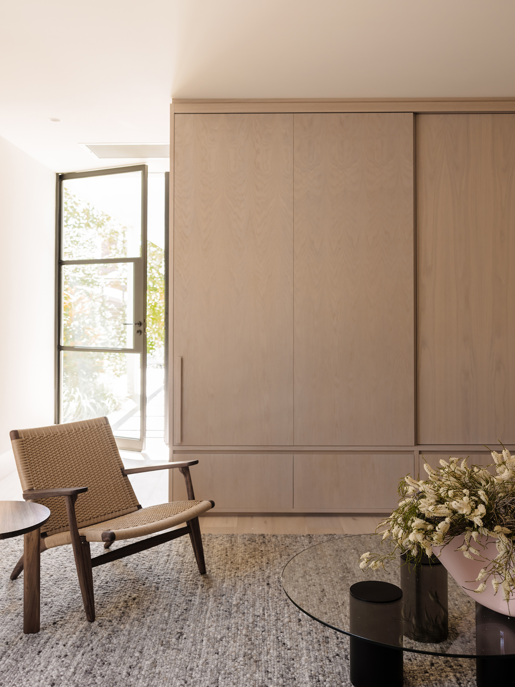
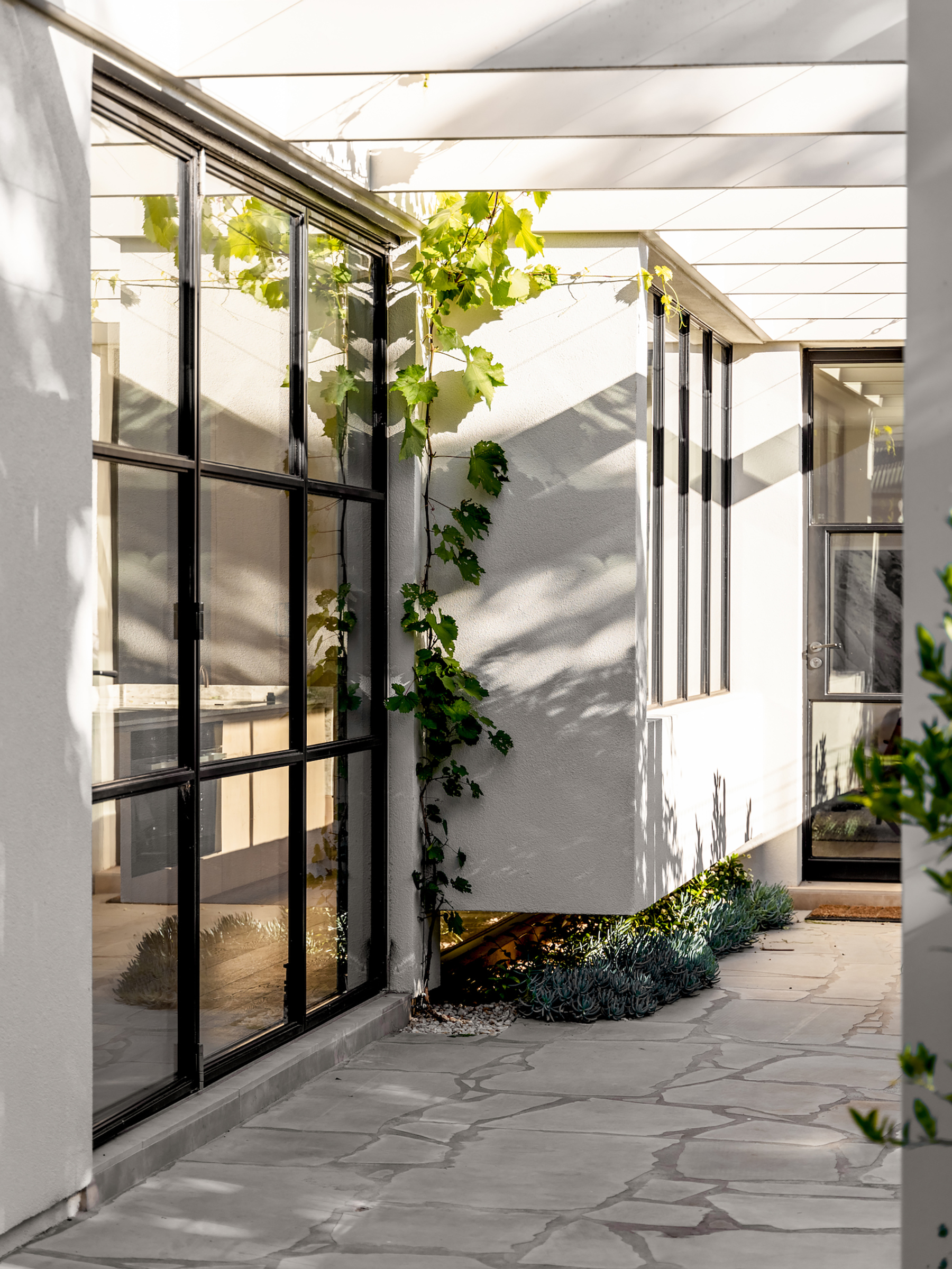
Since the clients’ brief didn’t request extra functional spaces, but instead focused on the need for comfort and tranquility, the studio removed one of the original three bedrooms and created a separate lounge area. In the long hallway, new skylights illuminate the space. This corridor links the original and redesigned parts of the house, demarcating the different eras. Instead of building a new volume, the architects turned the existing footprint of the lean-to into a modern volume that opens to the north via a glazed wall, filling the home with natural light.
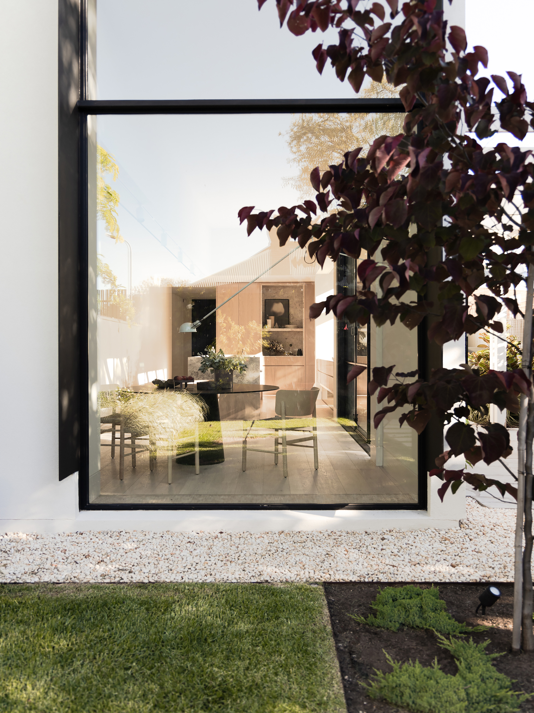
A refined, light-filled kitchen and dining space that cantilever to a garden.
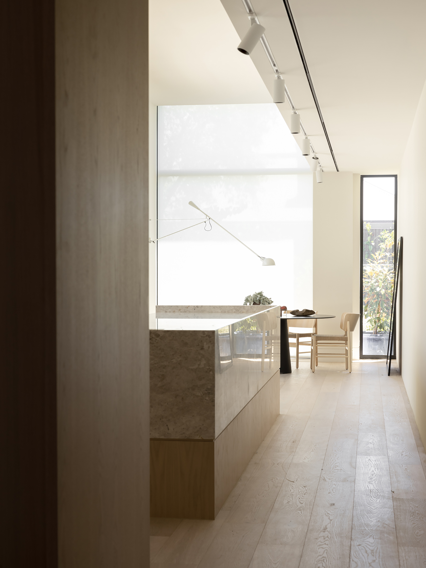
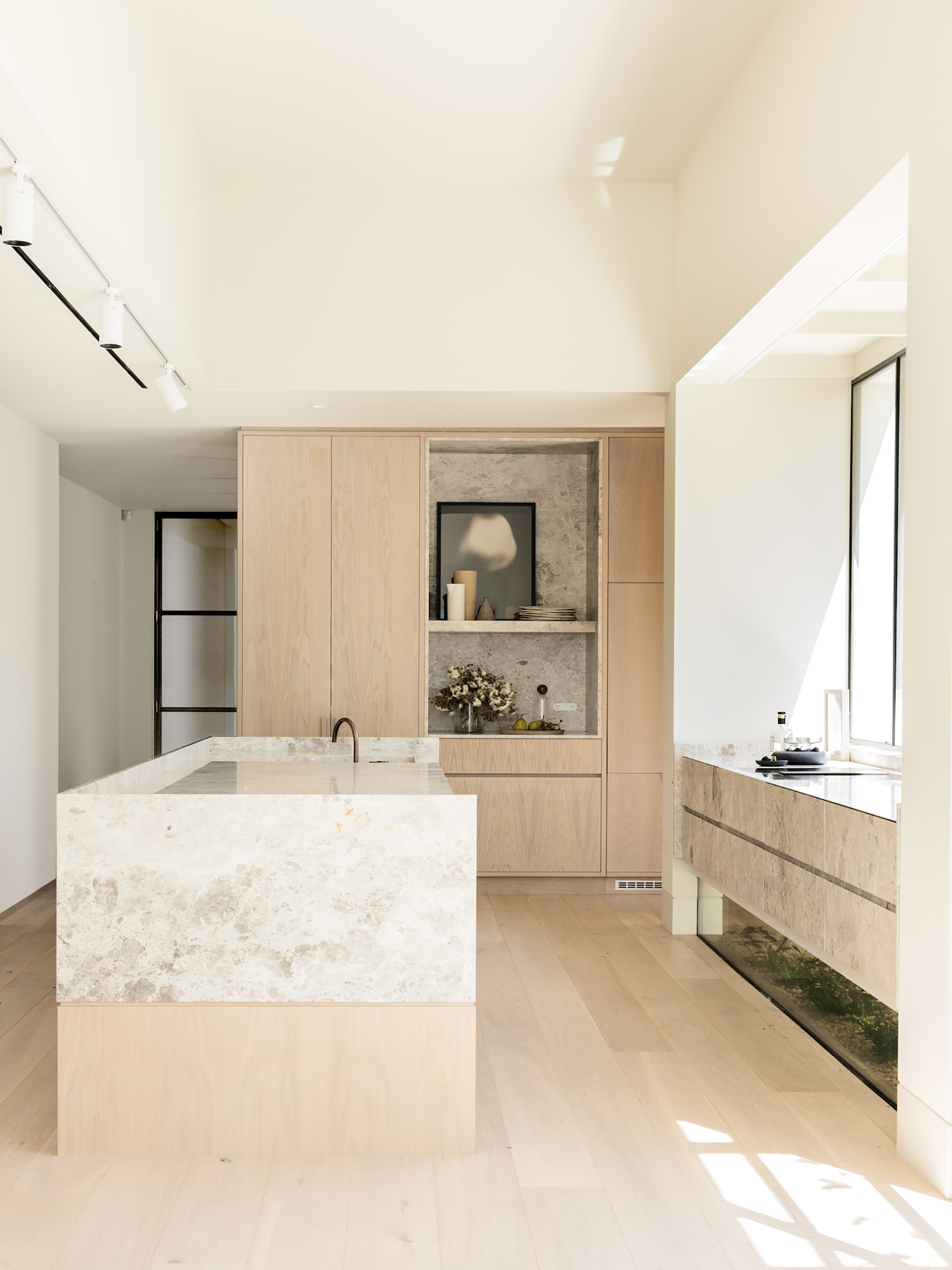
The drastically reimagined extension houses a kitchen that cantilevers toward the garden. Large windows placed both above and below the cooking area welcome light and views inside this space. Inspired by the handmade feel of the original house, the studio used carefully chosen materials and beautifully crafted elements for the redesigned volume. For example, handcrafted window frames still bear the marks of metal tools, offering a tactile counterpoint to the surrounding smooth, clean surfaces. Handmade doors fold to connect the kitchen and dining area to the terrace and garden.
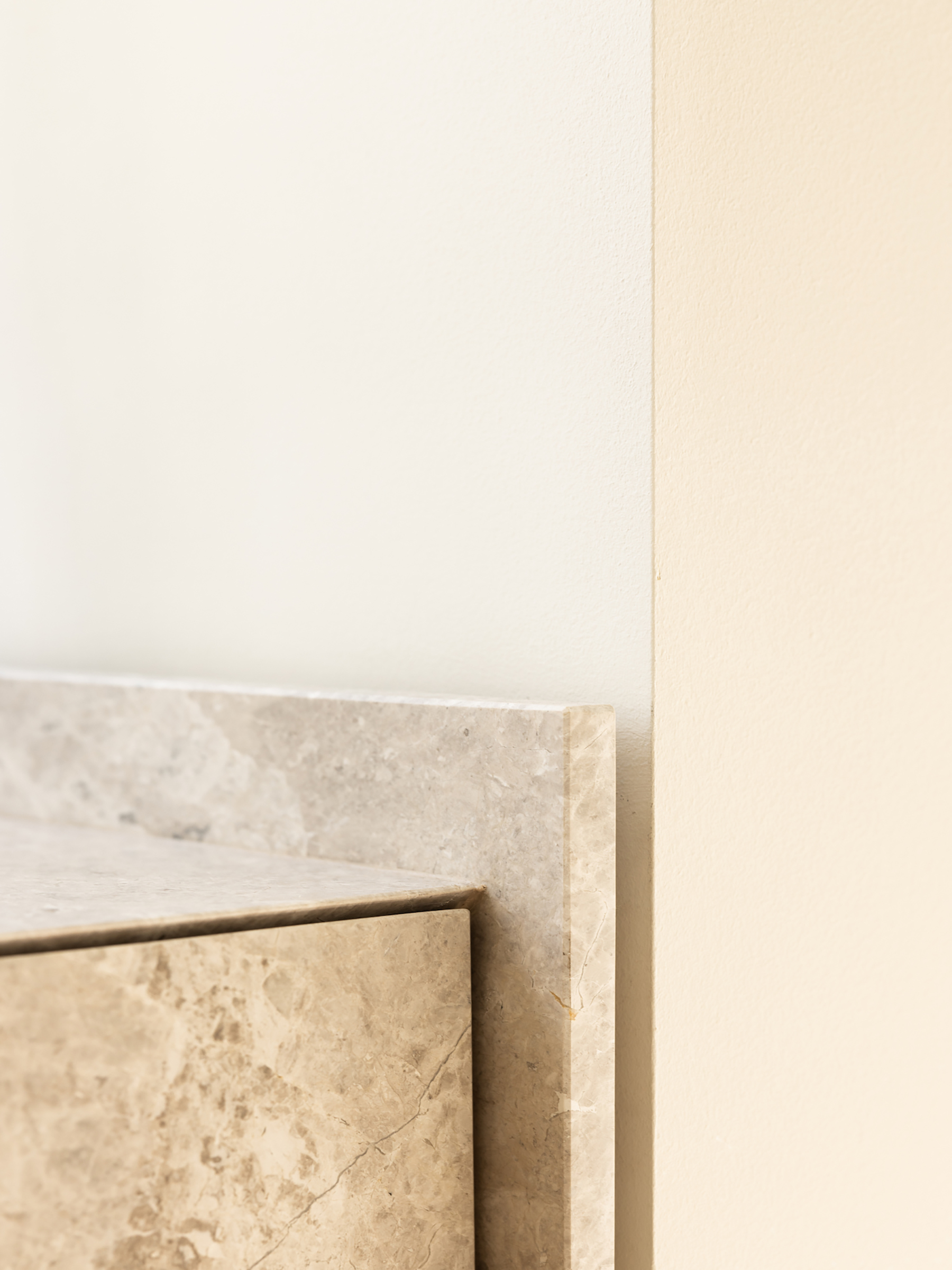
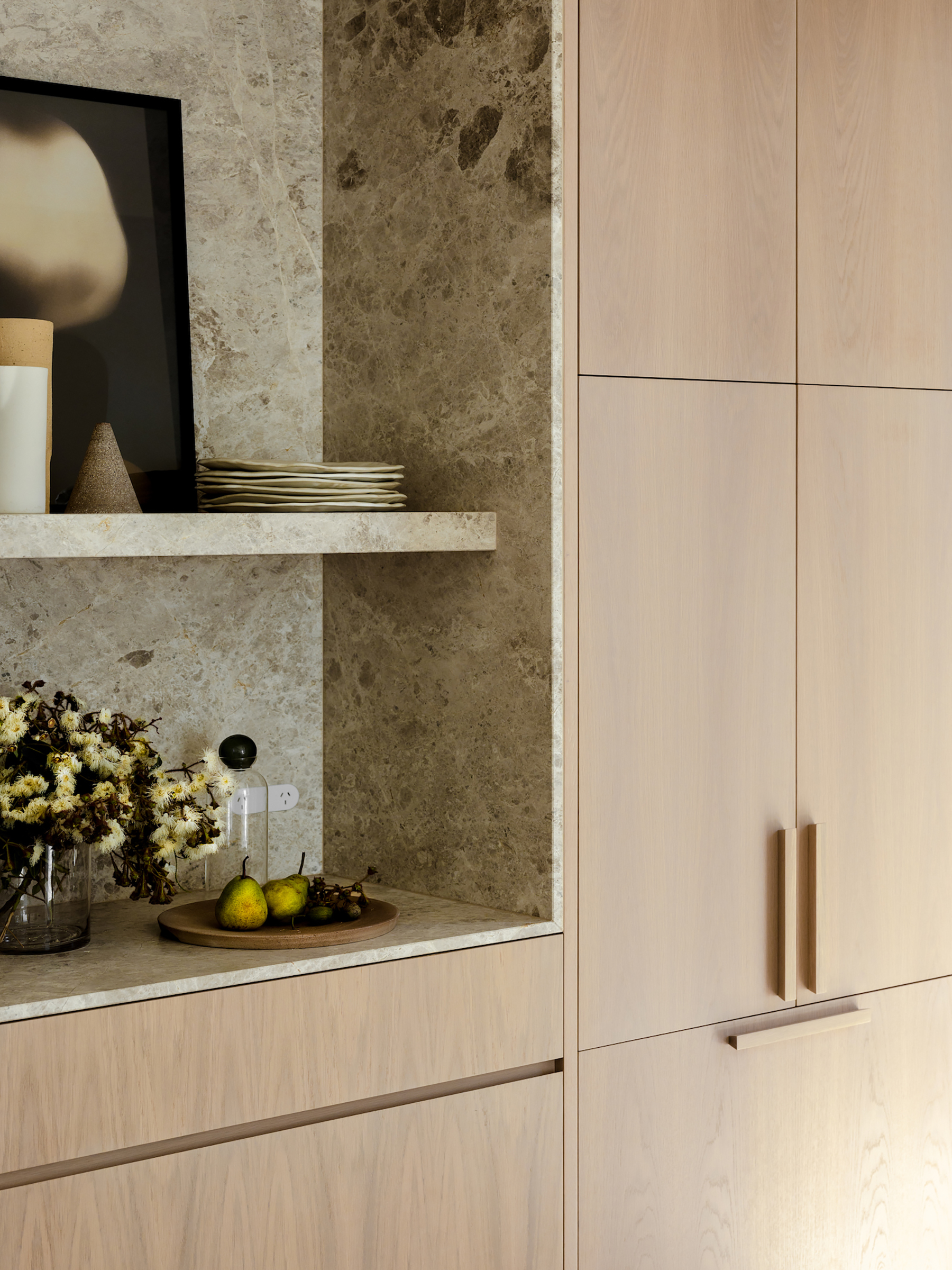
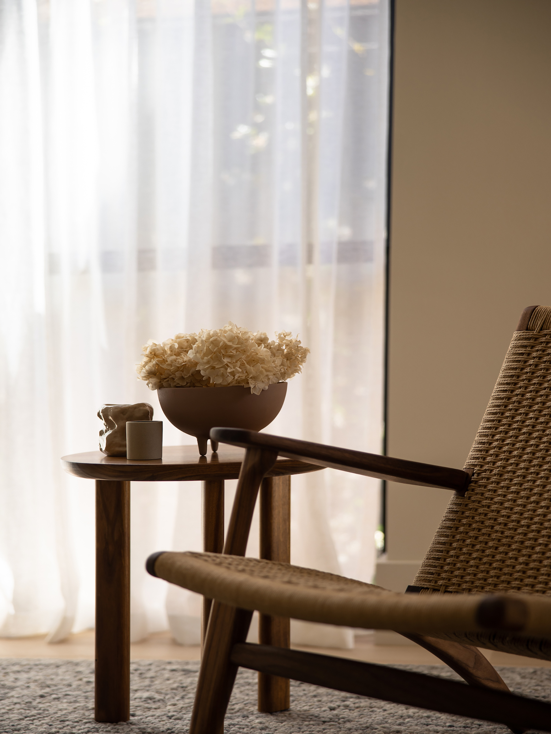
Light oak flooring adds an organic accent to the bright space, along with Turco Argento limestone and marble. A sense of calm and tranquility permeates the residence that now almost resembles an art gallery yet feels warm and welcoming. Throughout the redesigned wing, the minimalist design lets the gorgeously handcrafted elements, subtle details and bespoke finishes stand out. Photography © Caroline Cameron.


