An old brick factory converted into the base of a historical pastry brand founded in 1911.
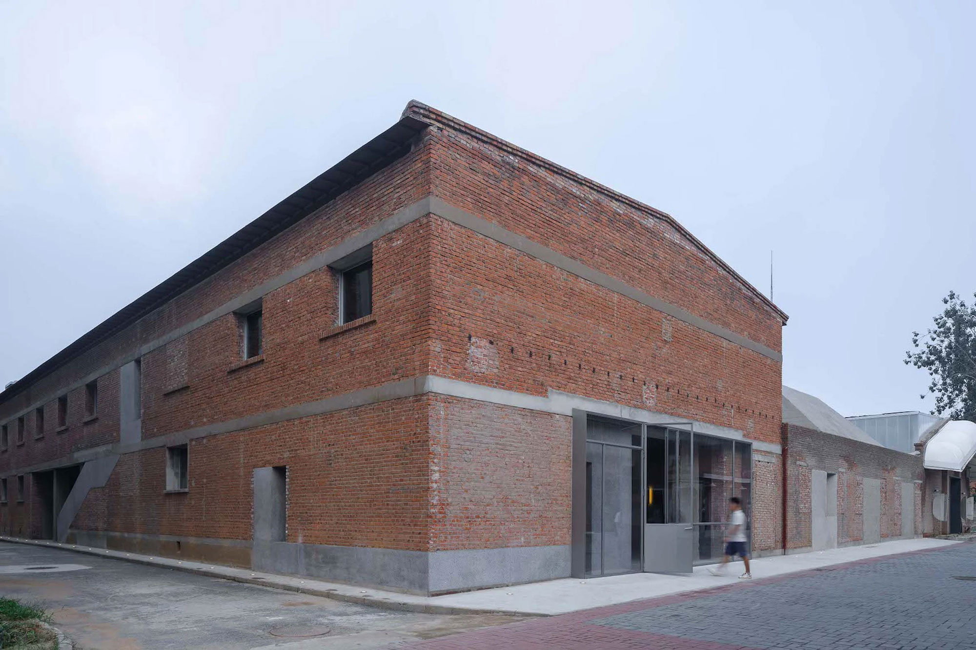
Located close to the northeast 5th Ring Road in Beijing, China, this former industrial area used to be a thriving hub with its own train station where goods moved in and out of the city. In recent years, however, development work transformed the region. This adaptive reuse project is a great example of a thoughtful redesign of a district with a rich history. Completed by Shanghai-based interdisciplinary architecture and design firm Neri&Hu, the project involved the conversion of an old brick factory into the headquarters and store of historical pastry brand Lao Ding Feng, founded in 1911.
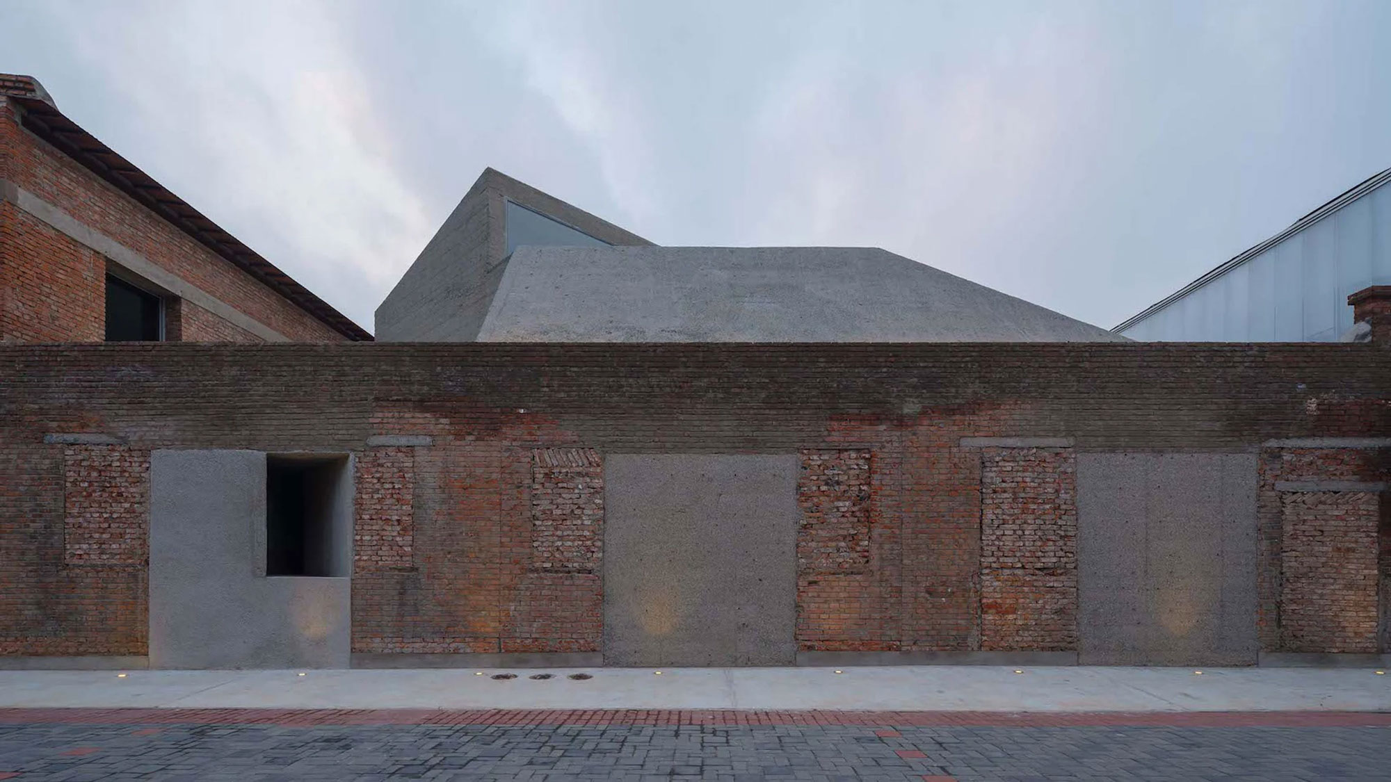
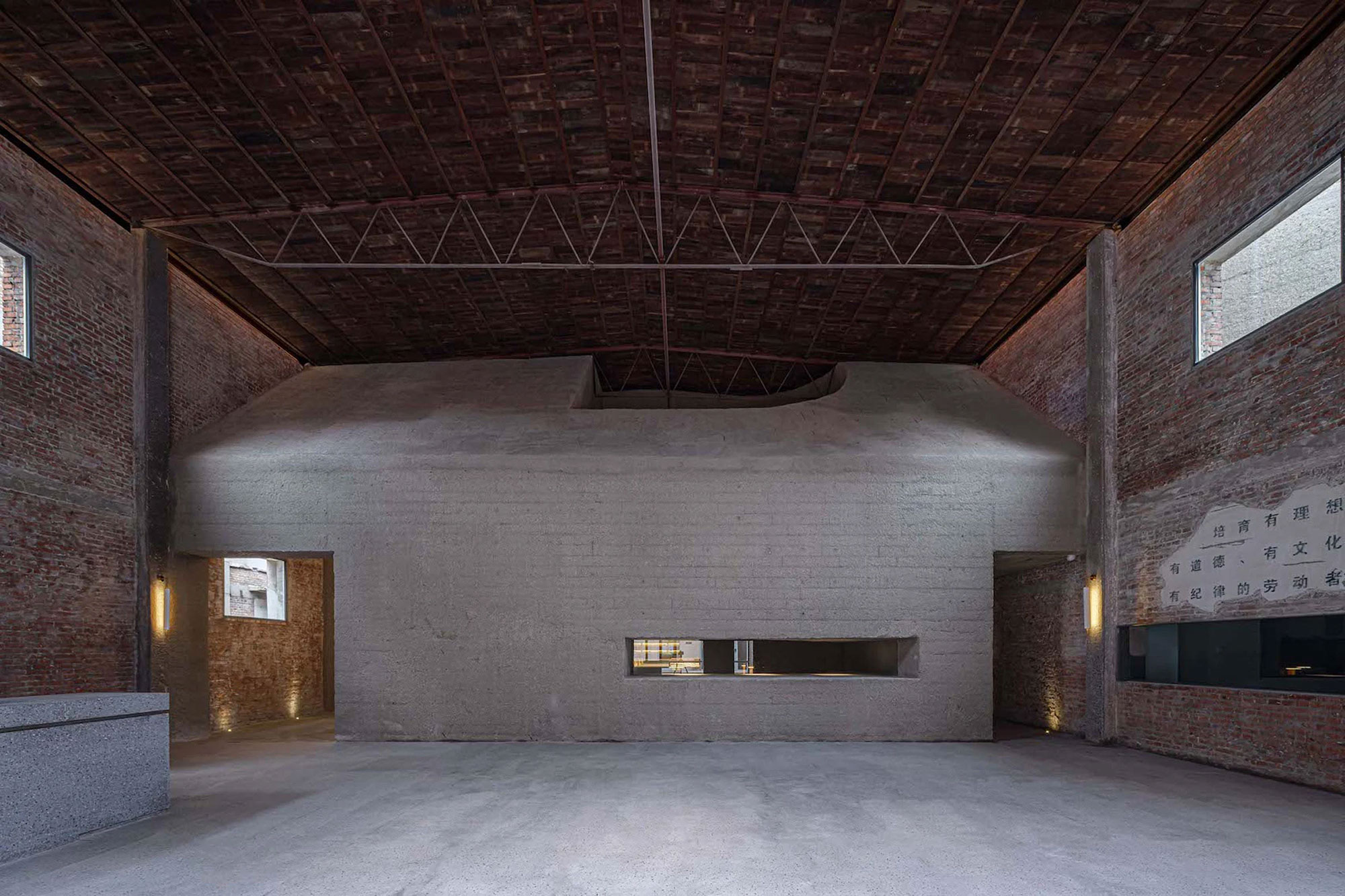
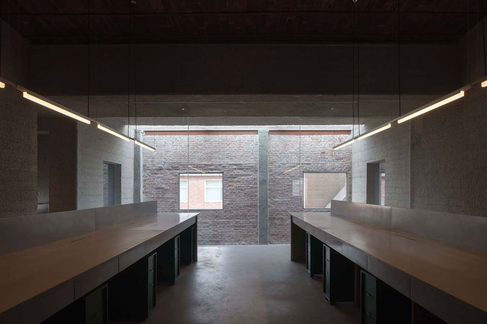
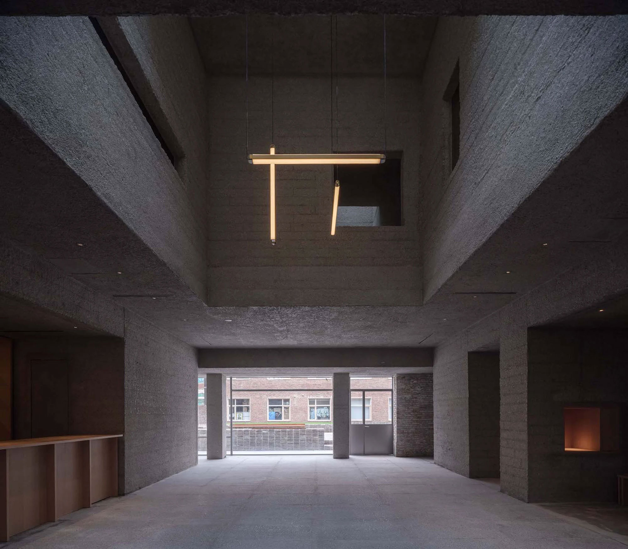
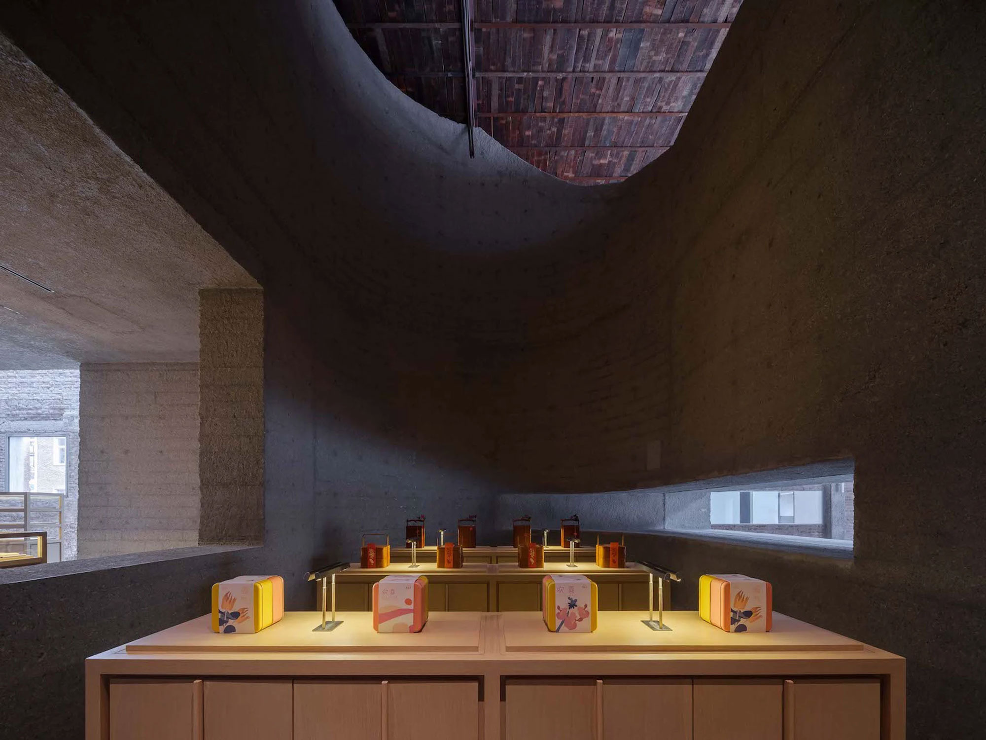
The original brick building comprises a main warehouse as well as three adjacent buildings arranged around a courtyard. The architects carefully studied which parts of the existing structures to preserve and restore. Additionally, the team created an intentionally contrasting design for the new volumes, to establish a clear distinction between the old factory and the modern volumes. Drawing inspiration from the pastry brand’s own products, the architects applied the concept of using molds to the architectural design. In the new complex, cast concrete volumes mold themselves onto the brick wall. The new additions house the company’s main offices as well as a retail store and a gallery space. Concrete also marks the position of new openings and entry points.
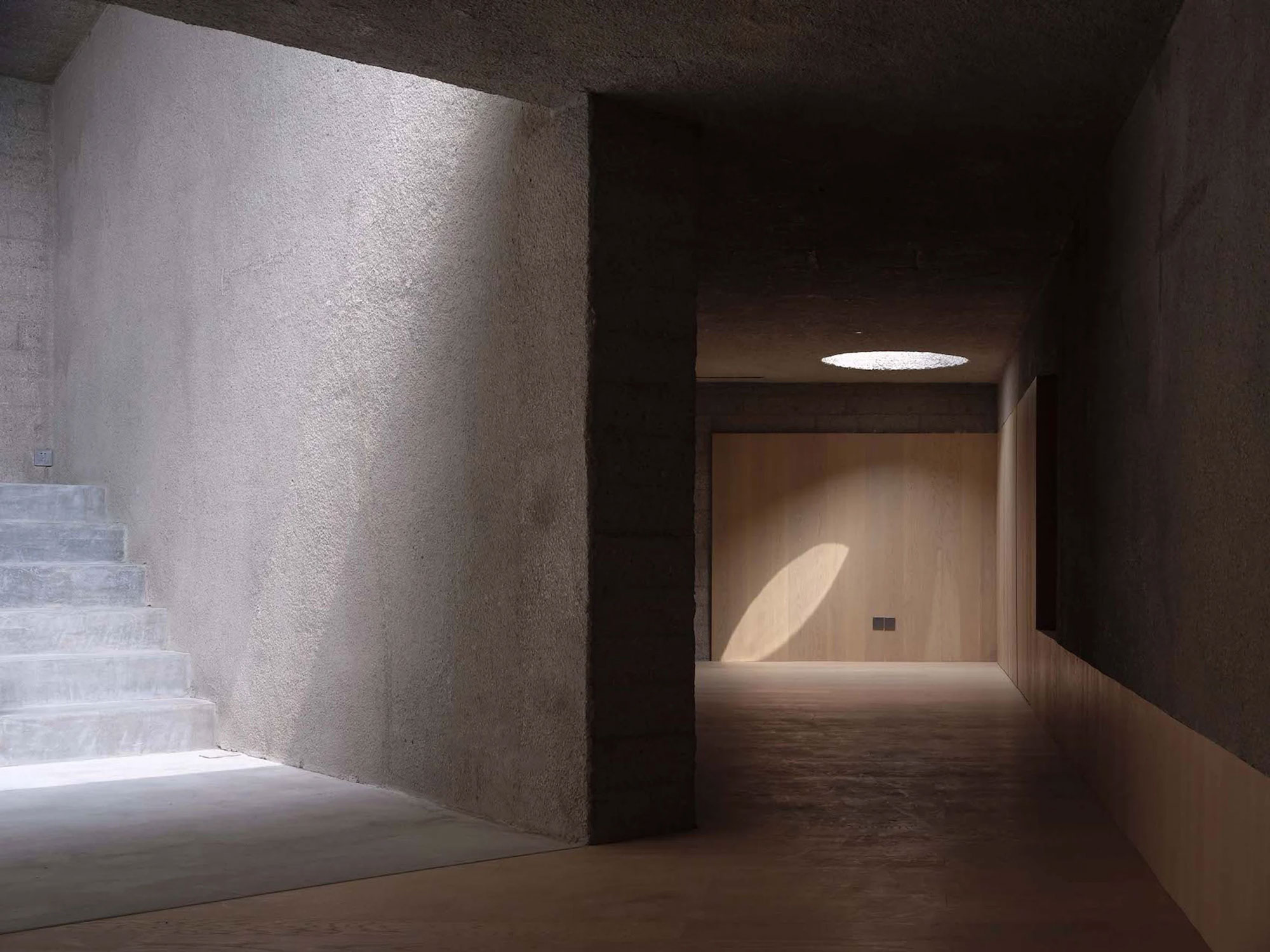
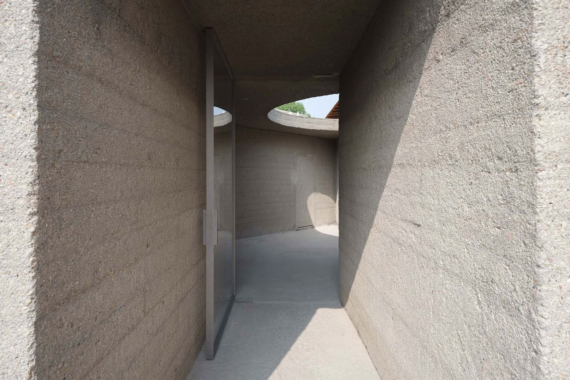
A special surface treatment that gives a soft texture to concrete.
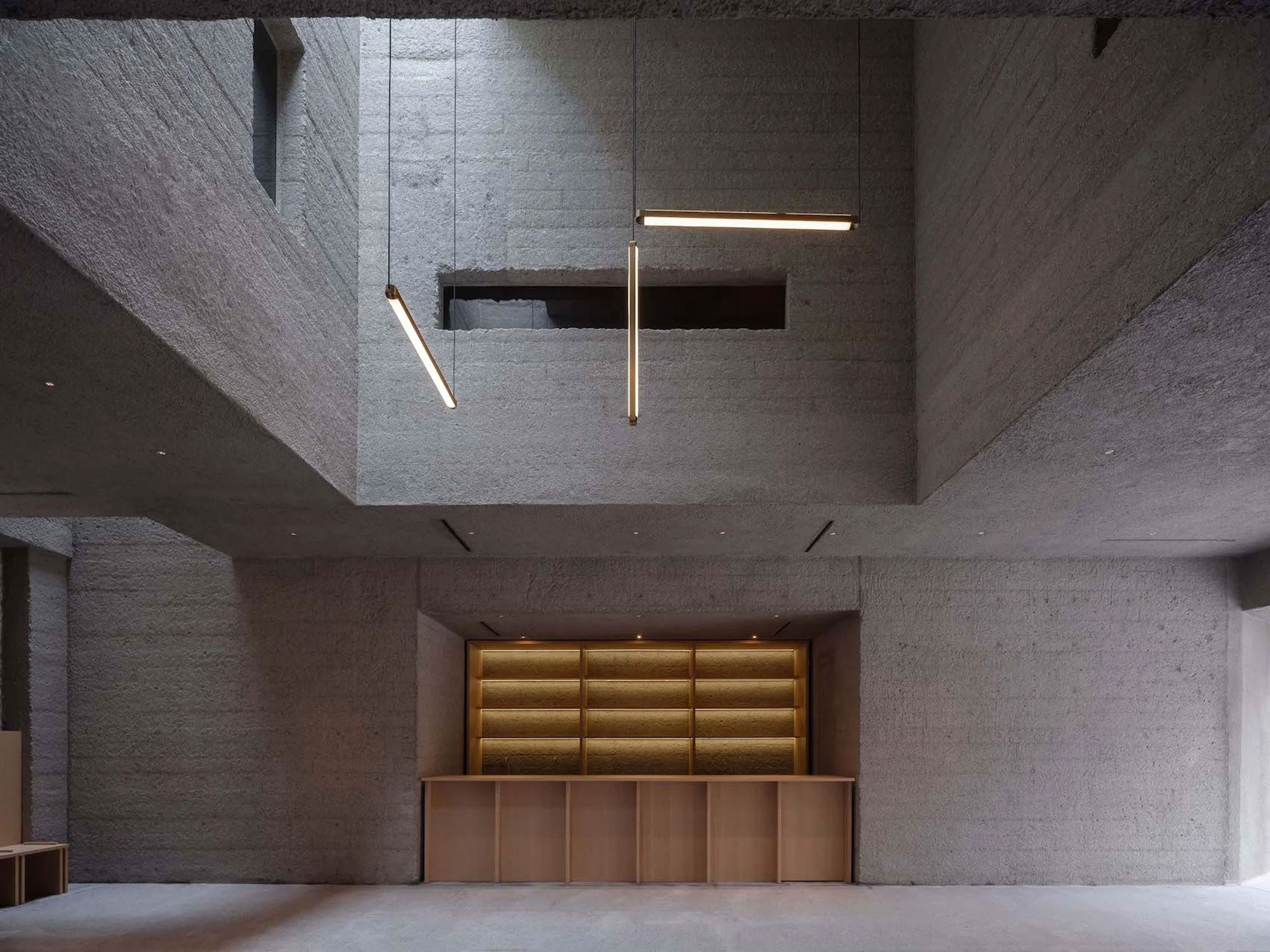
To highlight the connection between the contemporary insertions and the brand’s pastry products, the team collaborated with specialized craftsmen who bush-hammered the surface of the concrete to create a soft texture. This finish also complements the rugged and warm brick walls. Gap areas between the brick envelope and concrete volumes transform into flexible spaces for a multipurpose lobby and a café. On the ground floor, there’s a flagship store, the coffee shop, and an exhibition area. These ground floor areas also open to the courtyard with a garden. Upstairs, the studio placed the offices. Minimalist wood shelving and furniture along with simple lighting complete the interiors. Skylights bring more natural light into the heart of the building. Photography © Zhu Runzi.


