A 1962 house in California, stunningly redesigned with an open-plan central space that spills onto terraces and decks.
Built in 1962 in Mill Valley, California, this house required a drastic redesign to establish a better connection between different areas and floors on one side, and between the interior and nature on the other. San Francisco-based architecture practice Spiegel Aihara Workshop (SAW) completed the complex project called The Middle Half House for a family with two young children. Unusually for a refurbishment project, the transformative work focused on the center of the house. “Often when thinking about preserving a thing—a structure, an object, a landscape, a city—one talks about preserving its ‘heart’ or it’s ‘core.’ But in this case it was the opposite—we were trying to preserve the periphery, while completely reimagining the core,” says SAW co-principal Dan Spiegel.
The studio completed both the redesign of the home and the landscape design. The team used raw, tactile materials like rough-sawn cedar cladding, cast-in-place concrete, and galvanized steel. Originally spread across 2,746-sf, the mid-century home now boasts 3,457-sf of space. SAW completely redesigned the old congested center to create a flowing, open-plan zone that establishes a flowing movement through different areas of the house while maximizing access to striking vistas. One of the homeowners, interior designer Kina Ingersoll, selected all of the furniture and also collaborated with the firm to complete the interiors, fixtures, and finishes.
Interiors that open to spectacular valley views.
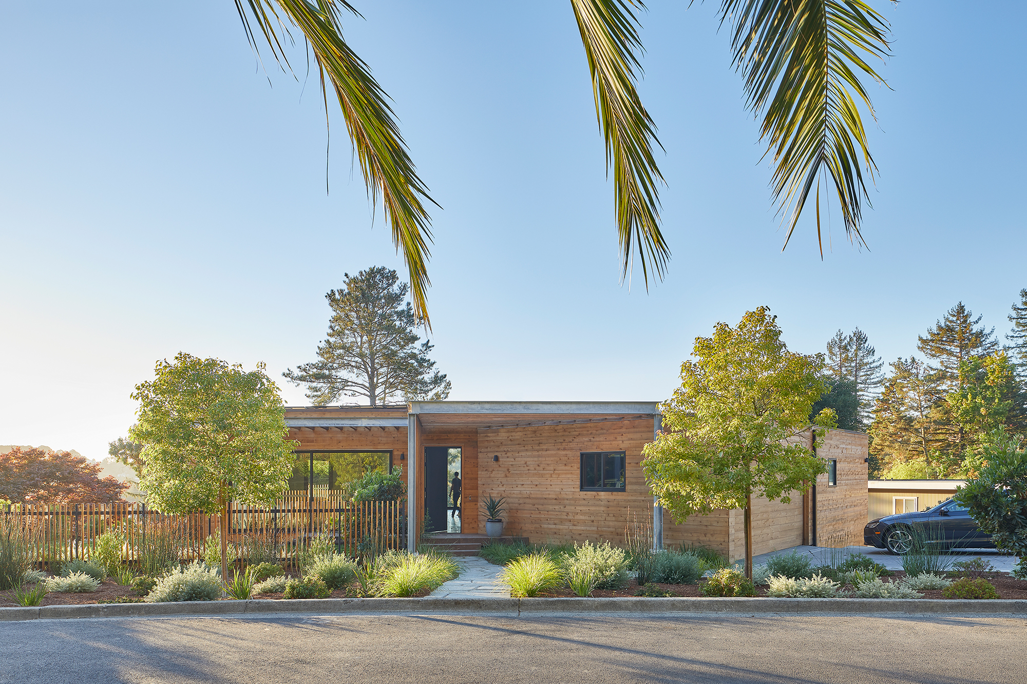
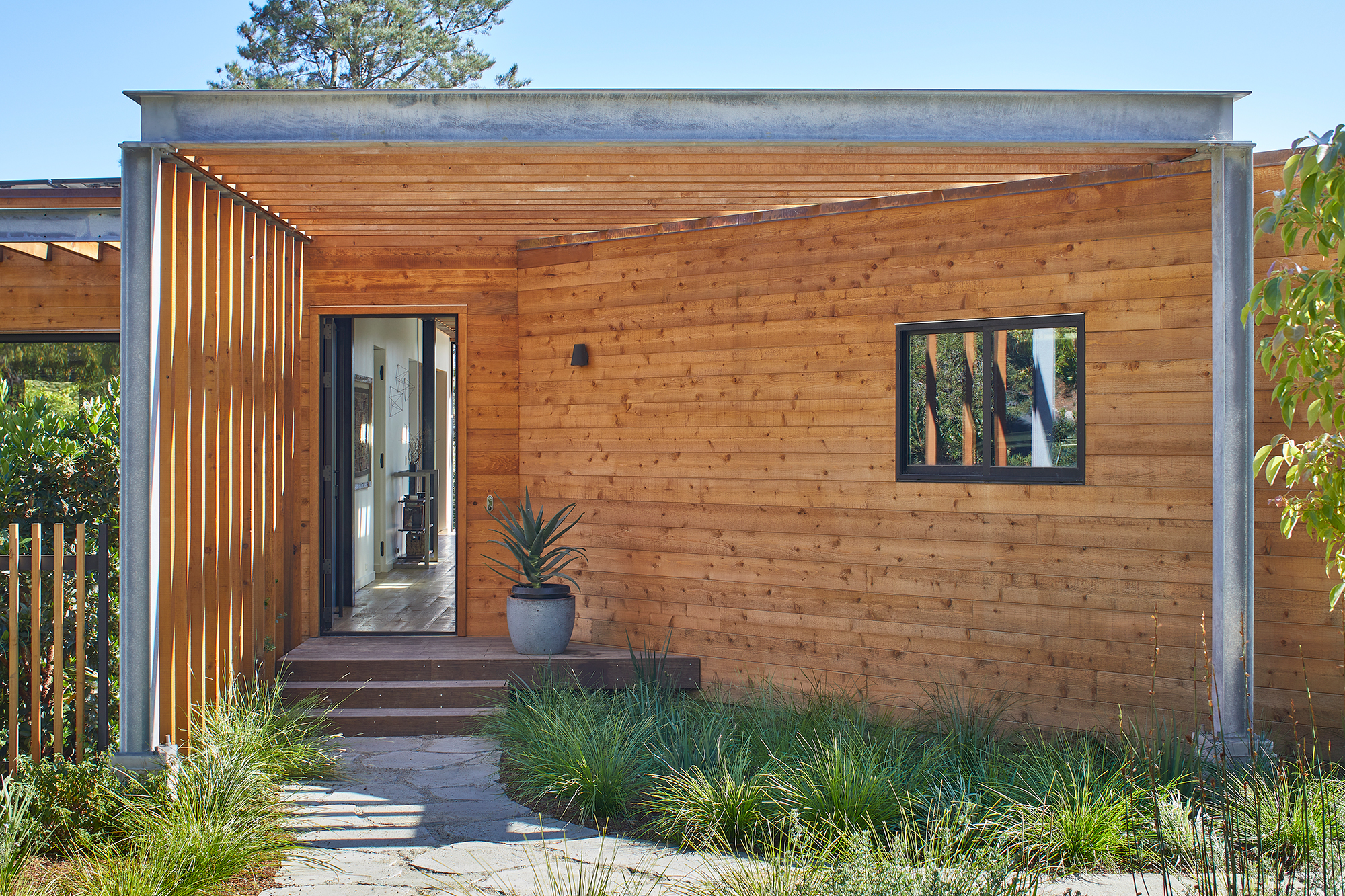
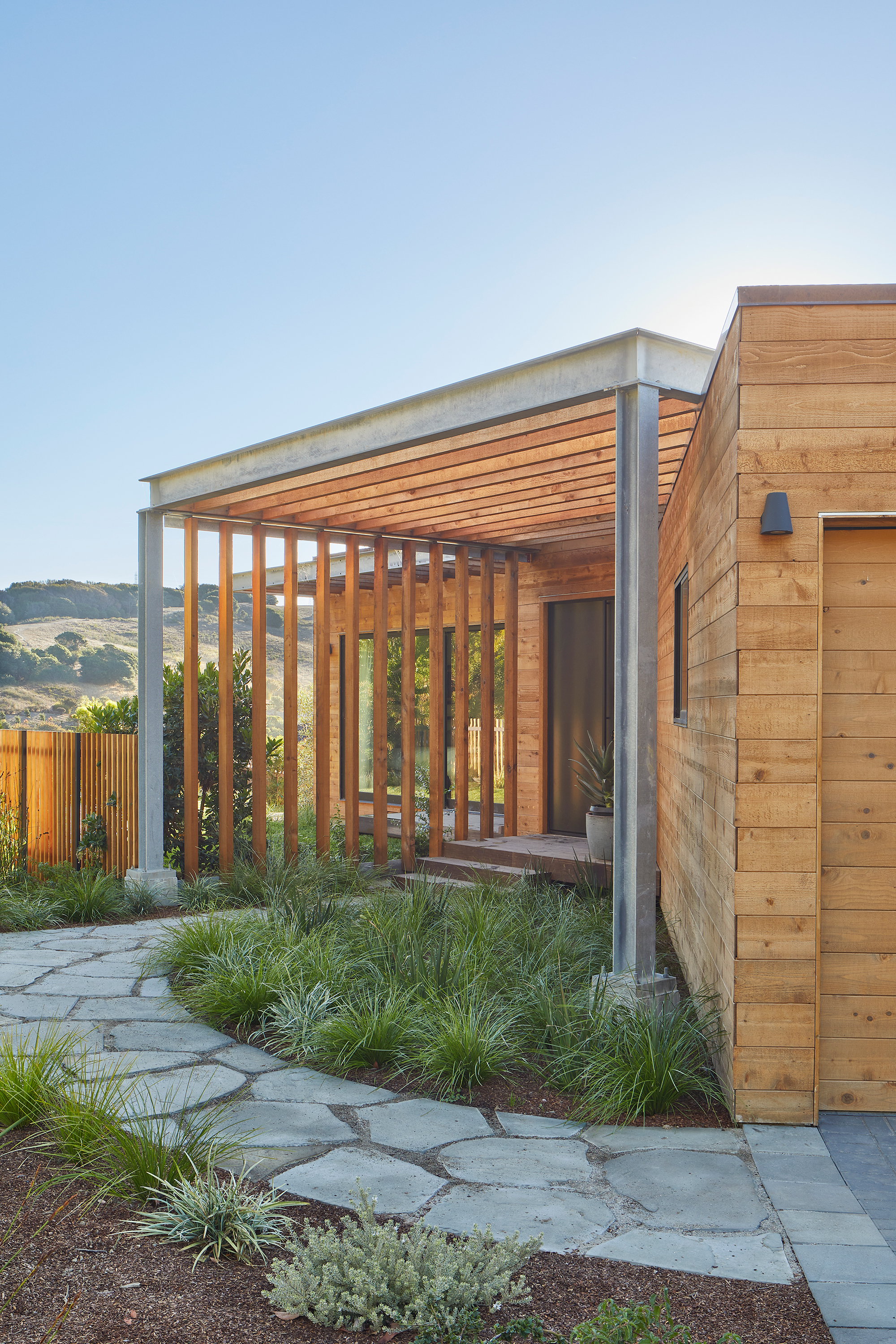
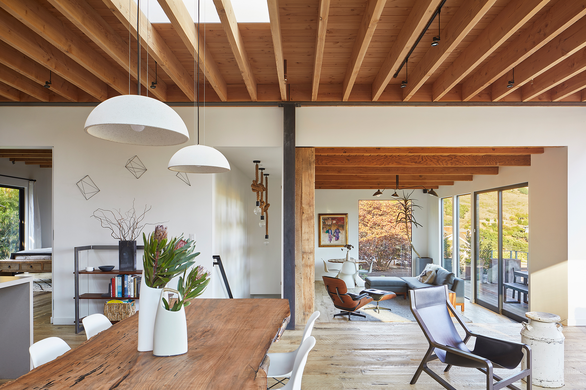
From the street, the house has a low profile, leaving the impression of a one-story dwelling. To the rear, however, the building cascades down the slope over two levels to embrace the views of the valley. The front facade boasts lateral rough-sawn Western Red cedar siding as well as slatted trellises. A new circulation path links the front door to the core and then to the suspended rear deck. “A basic premise of the design is to use a landscape gesture—a corridor between the front yard and the valley views—to resolve the tension between building elements,” says SAW co-principal Megumi Aihara. This path connects the kitchen, dining area, living room and deck along a central axis. It also provides access to the more private areas located to the left and right: bedrooms, bathrooms, an office, and a guest suite.
A seamless flow through different areas and then to outdoor spaces.
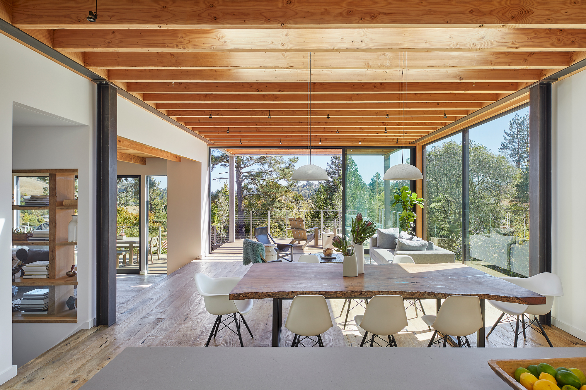
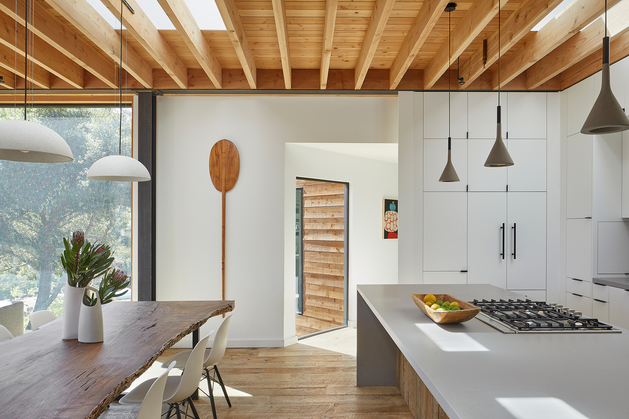
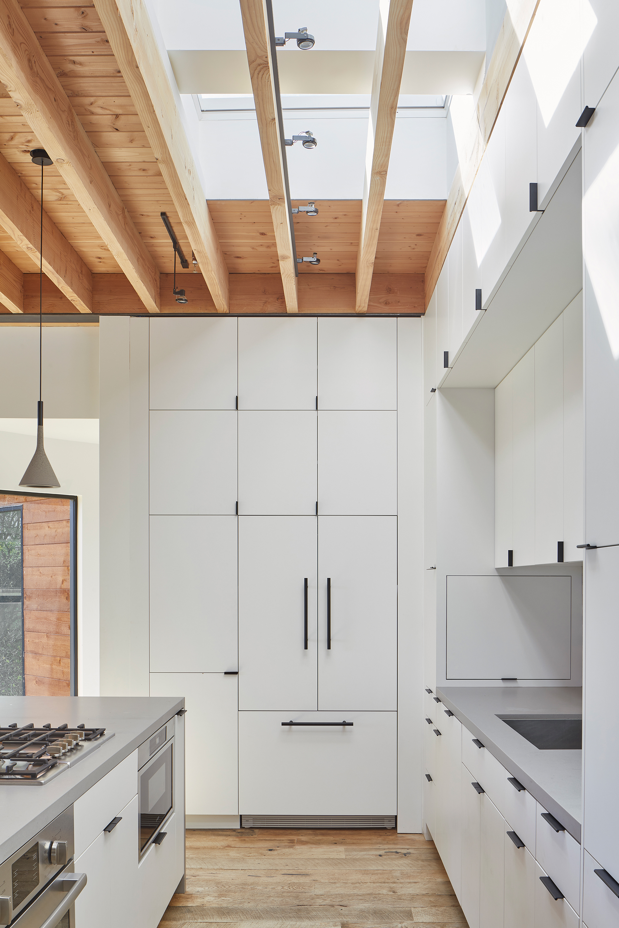
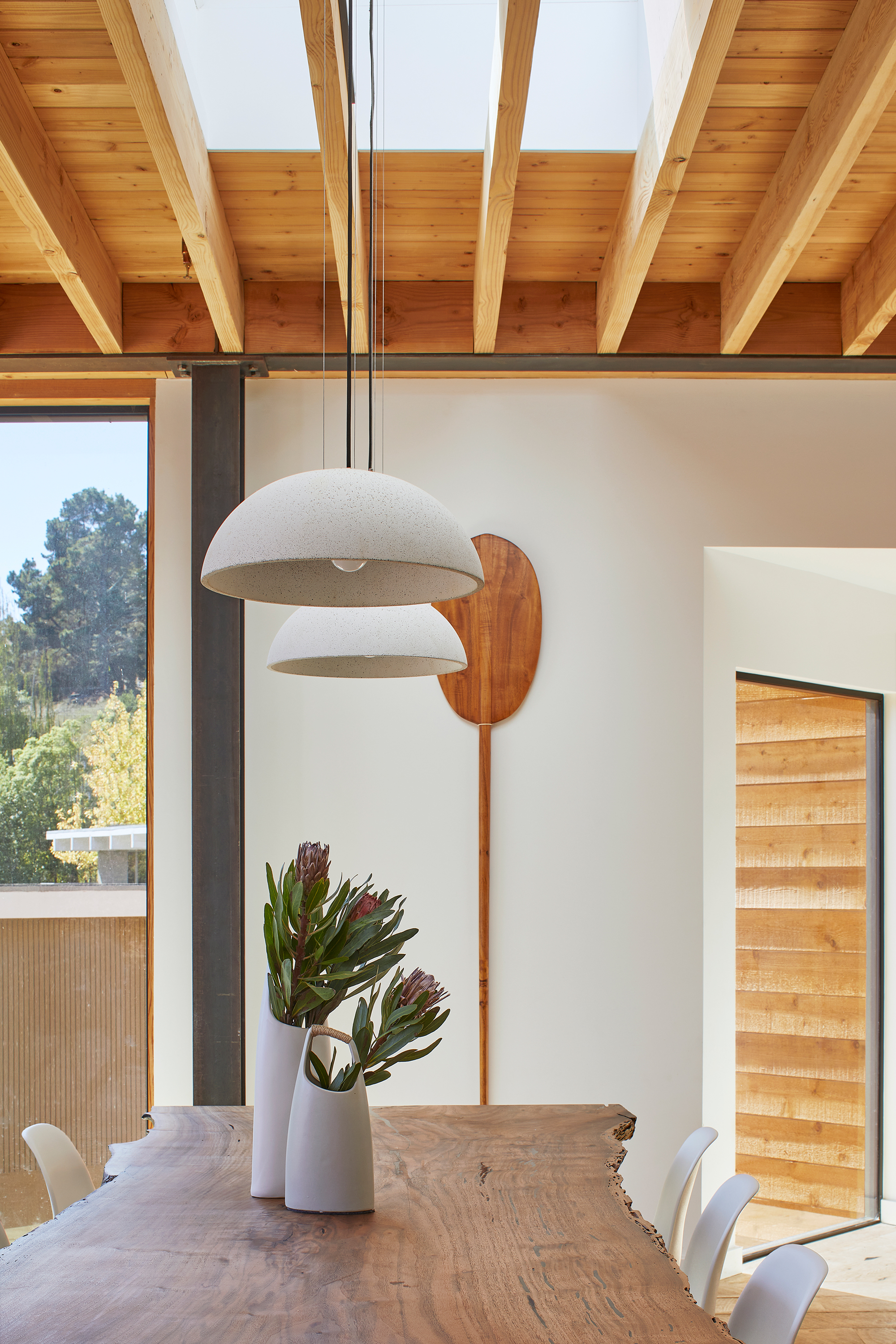
The central open-plan space brings together the communal areas. Here, the studio added floor-to-ceiling white millwork, tall pendant lights, and a gray kitchen bar volume. Kina Ingersoll designed the live-edge dining table, which features a striking black walnut slab top and custom raw steel legs. Skylights perforate the ceilings, bringing more natural light to the interior, along with floor-to-ceiling windows and glass doors. The latter also open the living spaces to the suspended deck. To highlight the flow between indoor and outdoor areas, the architects extended the exposed wood beams to the outdoor space. There, they create a slatted trellis.
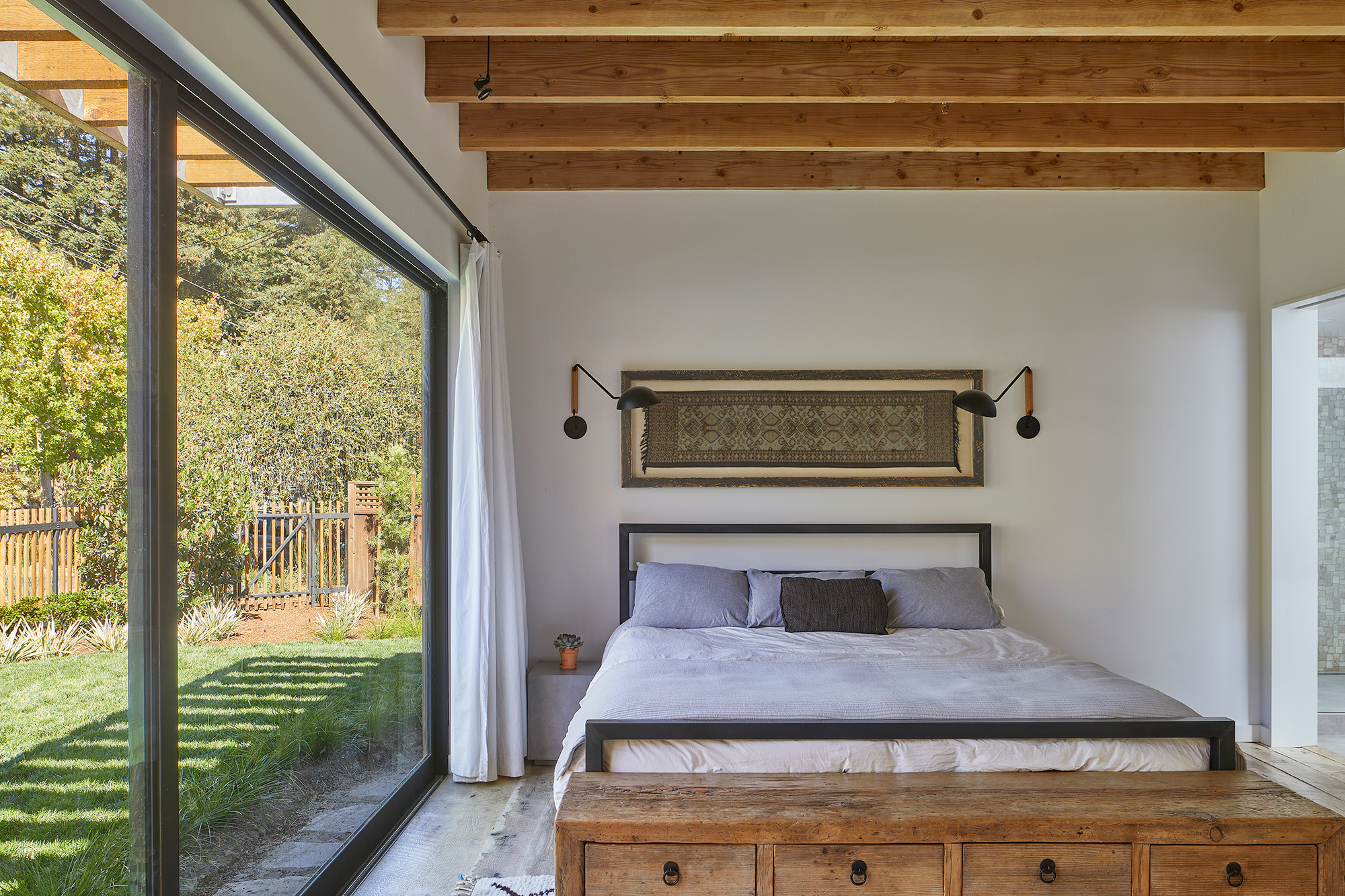
Large windows and glass doors link the bedrooms to the garden and front yard. On one side of the kitchen, a hallway leads to the children’s wing. On the other, a stairwell links this space to the lower level. This floor contains a bar and lounge, an office, and the guest room. An external staircase made with cedar wood and galvanized steel connects the upper deck with the lower terrace and the swimming pool. Photography © Mikiko Kikuyama.


