Since 2006, architect Johan Sundberg has been creating urban homes, summer houses and refined interiors with a holistic approach to design. Over the years, his eponymous studio gathered a team of some of the most talented architects and designers in Sweden. The firm’s work stands out thanks to a masterful use of space and voids, bold contrasts between shadows and light, a symphony of textures, and a blend of angular and sensuous forms that come together in stunning architectural designs. We had the privilege to talk to the architect about his work, the future of Scandinavian architecture, the importance of gardens and light, current projects, and much more.
Grab a cup of coffee and read on, as we go Beyond the Blueprint with Swedish architect Johan Sundberg.
Was there someone in your life that inspired the generational appreciation that you weave into each final product? What are some specific examples?
I grew up in a family where seeing and interacting with the cultural arts was as much a given as it is for most families to do some type of sport. Especially my mother and grandmother always encouraged me to be creative and to express myself. During my studying years, I had a few mentors, the most important being the Swedish architectural theorist Finn Werne. He taught me to look at architectural work with the eyes of a sociologist – seeing trends and traditions as parts of the interaction between agents on the social stratum. This idea that our aesthetic choices are shaped by our place in the complex system of economic and cultural capital and not by abstract and absolute values was an incredible revelation. Social studies should be taught in all schools of architecture.
Could you elaborate on your holistic approach to the design process? What do you often find yourself eliminating or adding to uphold such standards?
Our design studio has the privilege of being able to work with most aspects of design projects, from the first analysis of the site to the curtains and mailboxes in the end. We do this by staying close to our clients and their dreams and desires, or in the case of public buildings, both to clients and other users. We try to do this unobtrusively, we try not to make it too formal or theoretical as that would kill the mood. The mood of the design process is essential. Therefore we eliminate long boring discussions about anything really, but especially budgets, constraints, time-frames, and technical details. We can still care about these things; we just don’t let them rule. Our work is driven by the genuine desire to understand and interpret the needs of the project. We defend the project as a whole. Even if we are expensive and probably annoying too, our clients respect that.
Bring me into the light. What’s your secret to assuring good exposure?
By this question I assume you mean daylight. We are always consciously working with daylight. There is no secret to assuring good daylight and exposure to light; it’s just all a part of the work to make sure that the experience of the spaces we design can be as good as possible. Not everything has to be light, and lately, I’ve been trying to create bigger contrasts between dark and light in the spaces I design. This is an overall ambition of ours; trying to create more friction and more texture in what we do.
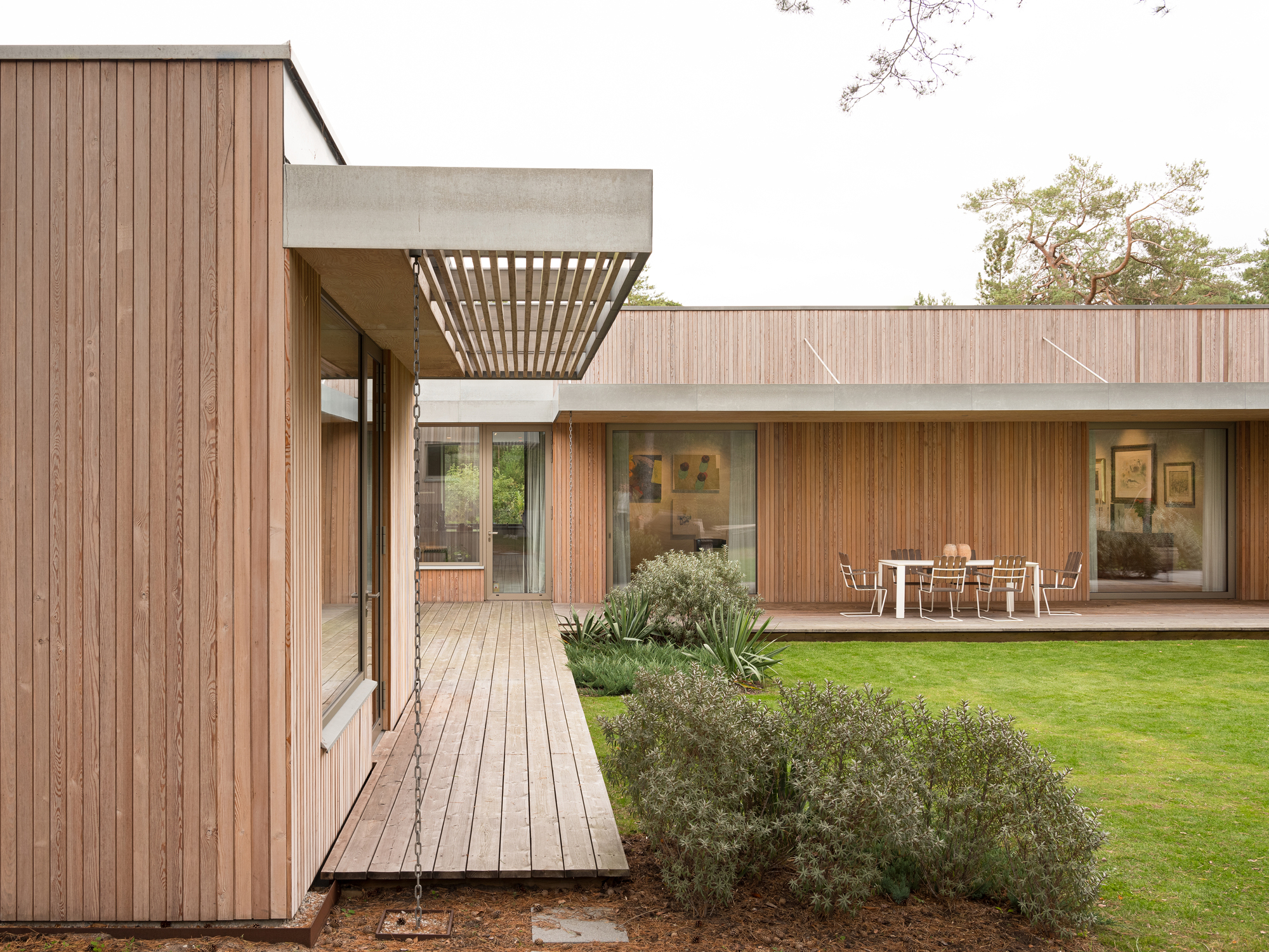
In the Villa Tennisvägen residential project the garden is touchable in every sense of the word, from any room it seems to call you to engage. How did you first discover your passion to knit together both outdoor and inside spaces? We’re curious, did you design the landscape choices as well?
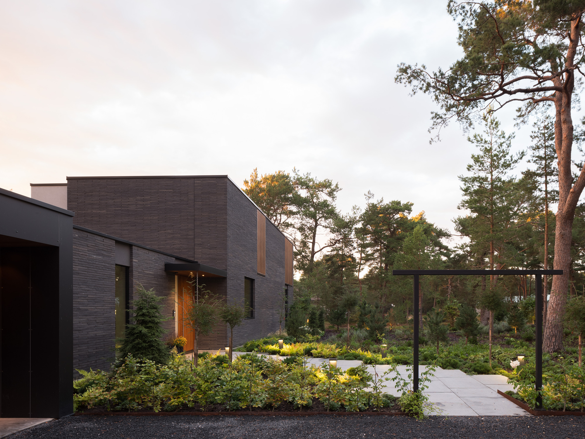
In Tennisvägen I wanted to make sure this black, almost fortress-like house was contrasted by an incredibly soft and lush courtyard garden interwoven with the interior spaces. We made the spatial design, and the client teamed up with a retired gardener who really made it lush and a bit over the top where she could. I think we reached a sort of halfway there. It was about here that I realized that this is the way and that this is what I want to do in all projects. But much more.
Tell us how much of your work is rooted in other cultures or is it more a reflection of a different Sweden. We are excited to dive into the layers of your designs’ unpredictable Swedish form as your work often pulls away from straight lines or resists the temptation to blend old and new.
First of all, I really want to stress the differences between architectural design in the north (Stockholm and Oslo) and the things that we do here in Skåne, which is very close to Copenhagen and continental Europe. We are rooted in the Danish-Swedish post-war tradition of low-slung houses, integrating garden spaces, horizontal lines and a low-tech approach. Interestingly, there are these striking similarities between Scandinavian and Japanese architecture, but also the shyness of the people, the idea of losing face, keeping calm and polite, and so on.
But anyway, in our latest one or two generations of work, I’ve started cutting off corners, twisting the lines of corridors, and punching holes in the structural logic of our projects. I also noticed this is what Aalto was doing in his best work, which is the early to middle period villas and small public buildings. I don’t want to drone on about organic architecture vs. the rigor of all of the building industry as I think Gaudi and Gehry have gone too far, but all the greatest masters (Fehn, Zumthor, Aalto, Jacobsen) were working with semi-organic forms, trying to soften and break the grid. In order to achieve truly great architecture we need to introduce compositions with organic and free flowing elements, with ambiguous rhythms and harmonies. Architecture has to endure years of interpretation. We shouldn’t make pop, we need songs that can be listened to a thousand times.
In recent history Scandinavian architecture has been channeling the Nordic interactions of limited sunlight and environmental sustainability toward dependable, simple, clean designs. What is your take on how Scandi Arch has evolved in the last century and what do you imagine its future direction?
Scandi arch is in a terrible state of confusion at the moment. Stricter regulations on every level, meaningless formalism, wonky color schemes, (and inhuman trends in the closed-off world of elite architects) have made the average architectural project in Sweden become even worse than the machine-like modernism of the 1970s. It’s as if we’ve learned nothing in 50 years. In the end, creating meaningful architecture in society is the responsibility of all the agents, not just the architects. The stratification and disruption of our Scandinavian societies as a result of the aggressive neo-liberal policies of the last 20-30 years have done us all so much harm. Admittedly, it has made the poor richer, but the rich richer by comparison. The real fault is the way that society has been divided up into separate entities that hardly even understand each other or speak the same languages. How can different agents of a crumbling and egoistic society build a meaningful physical environment together? It’s ultimately about trust. I hope the pendulum will swing back. It is perhaps our role of us as a cultural elite to strive to do our best to mend these social connections again. I know some of us are trying, but it’s ultimately a bigger issue. Architects can’t kill the algorithms and the corporations that are the larger cause of our disconnect. But we shouldn’t be making it worse.
Your most recent Insta post has us all on the edge of our seats with a pour in hand clinging to whatever you say next, because did I read “garden first” principle?! Please elaborate!
Haha! It’s interesting that you brought this up. As I tried to outline above, I’ve started to see the landscape, with it’s plants, spaces, different themes, as perhaps the main “other” in our designs. Once you truly understand the full implications of this order you see that the garden must be the first thing the user sees from the spaces inside the building. When I say “garden first” I mean that I want to see the green garden elements through our windows. I don’t want to stare at the ugly legs of garden furniture standing on massive decks. What is the point of blending the inside and outside if the outside looks like the tarmac of some airport, with the plants barely visible in the background? I’d rather put the garden closest to the house, and move the sitting spaces out or to the side. If we do have hard surfaces directly outside windows we place them carefully to makes sure we retain sightlines, create some level differences, introduce hanging foliage or something else.
What’s the next project on the horizon? Any sneak peek design elements you can tease us with?
We’re designing a large private house where we’ve divided the different areas of the house into different buildings, carefully placing them between existing trees. It’s all connected with glass corridors. The house has organic forms, uneven angles, cantilevers and lot’s of wood and glass. It’s going to resemble an art gallery integrated into a coastal landscape. We’re also doing some fun things with massive wood (CLT), enabling razor thin roof edges and great cantilevers. We have this awesome interior that we made for a Swedish rock star figure and his girlfriend, featuring lots of art, a lot of incredible marble works and generally spicy stuff. It will be fun to publish our work in the coming years. I actually mostly focus on the interiors and the gardens these days. I’m so proud of my 12 man team and what we’ve done so far. I hope I don’t die soon because we’re just getting started.


