A contemporary extension designed for a house built in the 1950s.
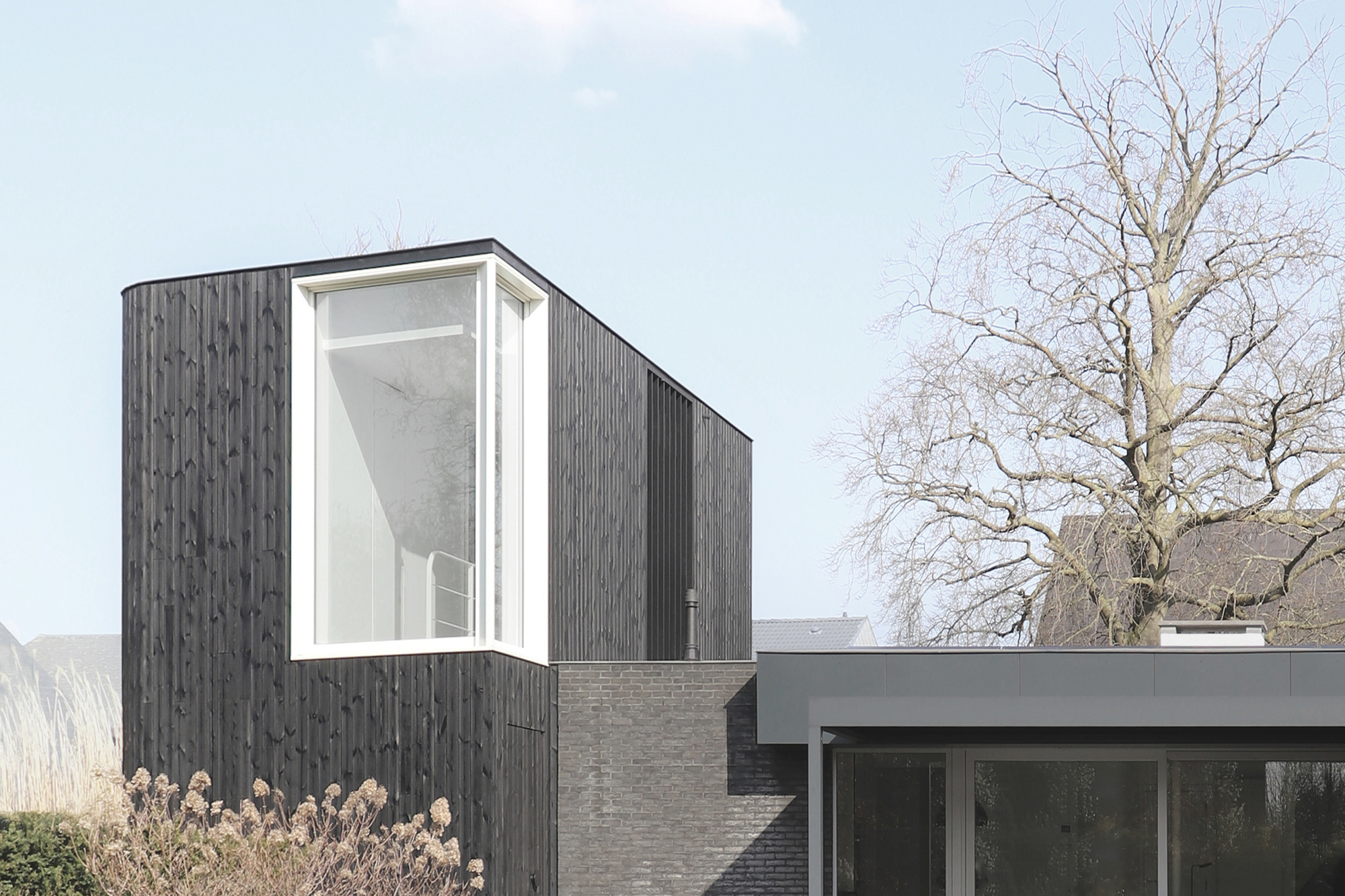
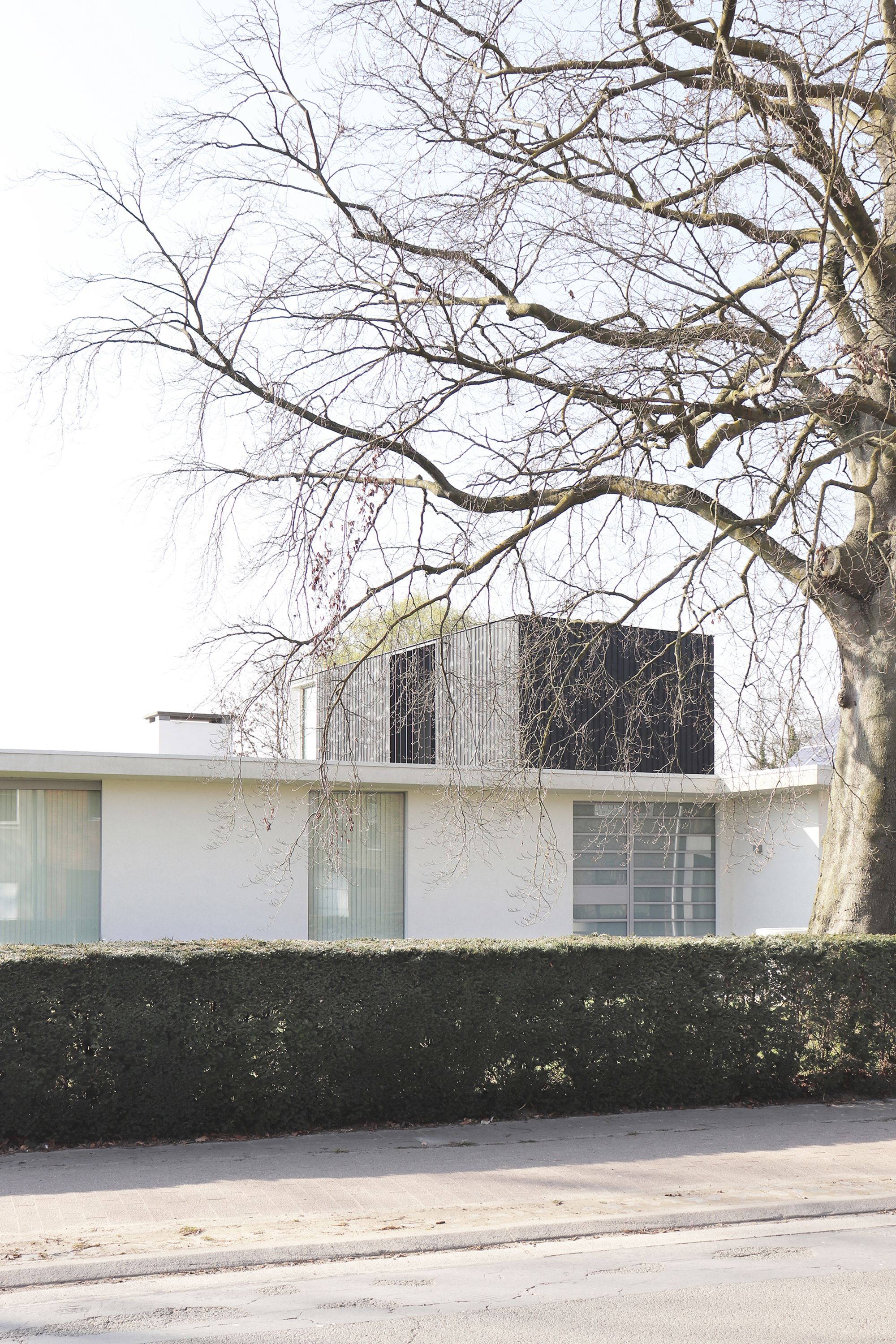
Dating back to the 1950s, this residential property in Lochristi, Belgium features three distinct elements that represent three different eras. Tall trees and vegetation surround the property in this quiet neighborhood. The clients asked architect Wim Heylen to design a new extension for the house, one that would join another volume added in the 2000s. The original bungalow and the older extension have their own character and style, but they complement each other. The extension from the ‘00s features dark gray brick walls, adding contrast to the bright bungalow at the front. At the same time they built the extension, the owners re-designed the exterior of the main house, choosing a white plaster finish with light gray aluminum window frames. However, they carefully preserved the canopy, a reminder of the original design.
Refined details link the three designs.
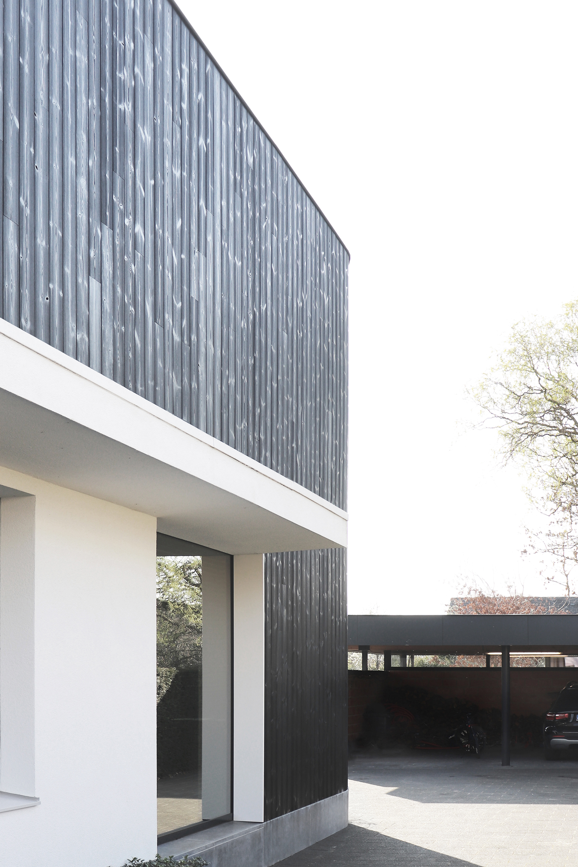
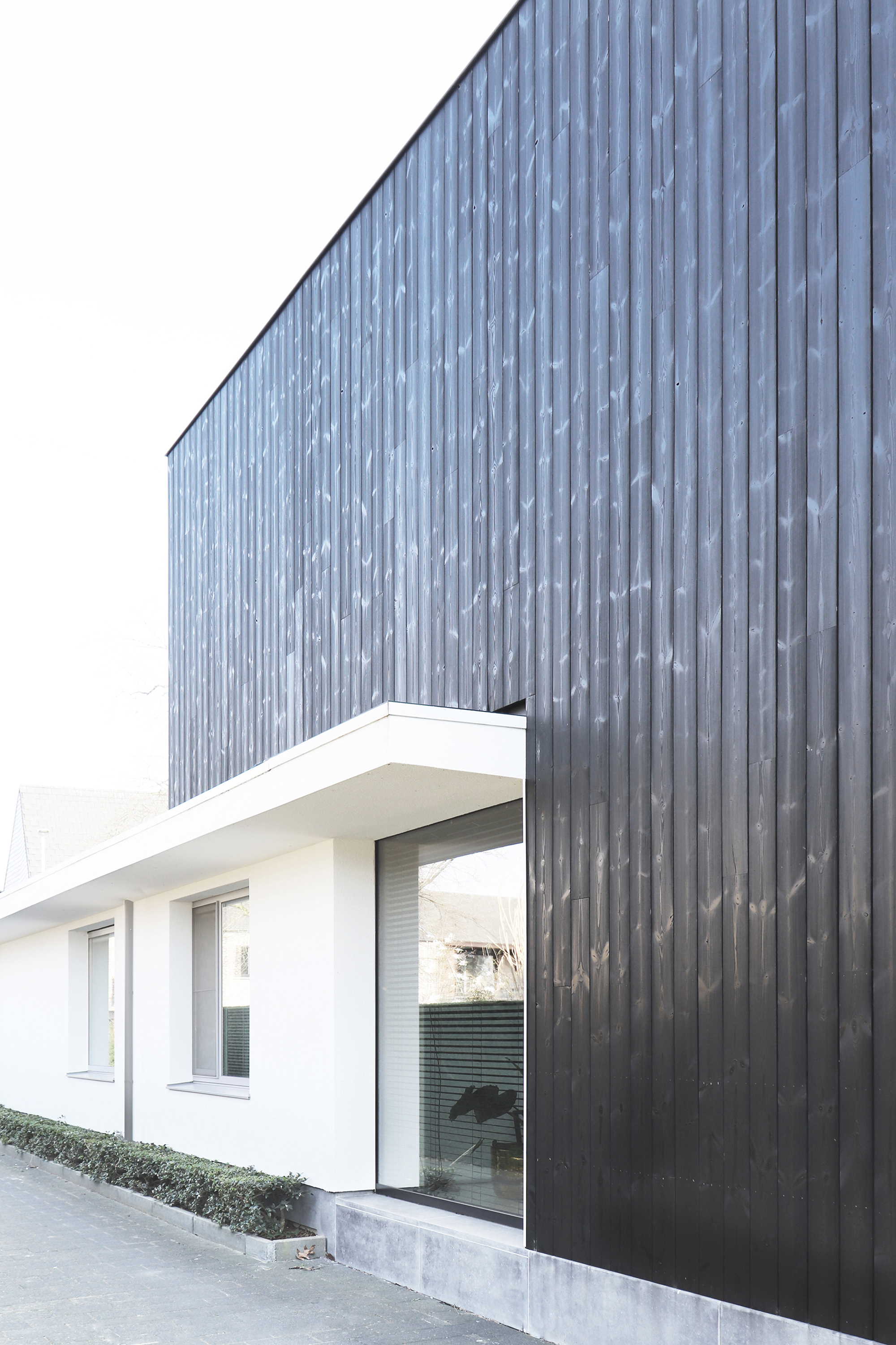
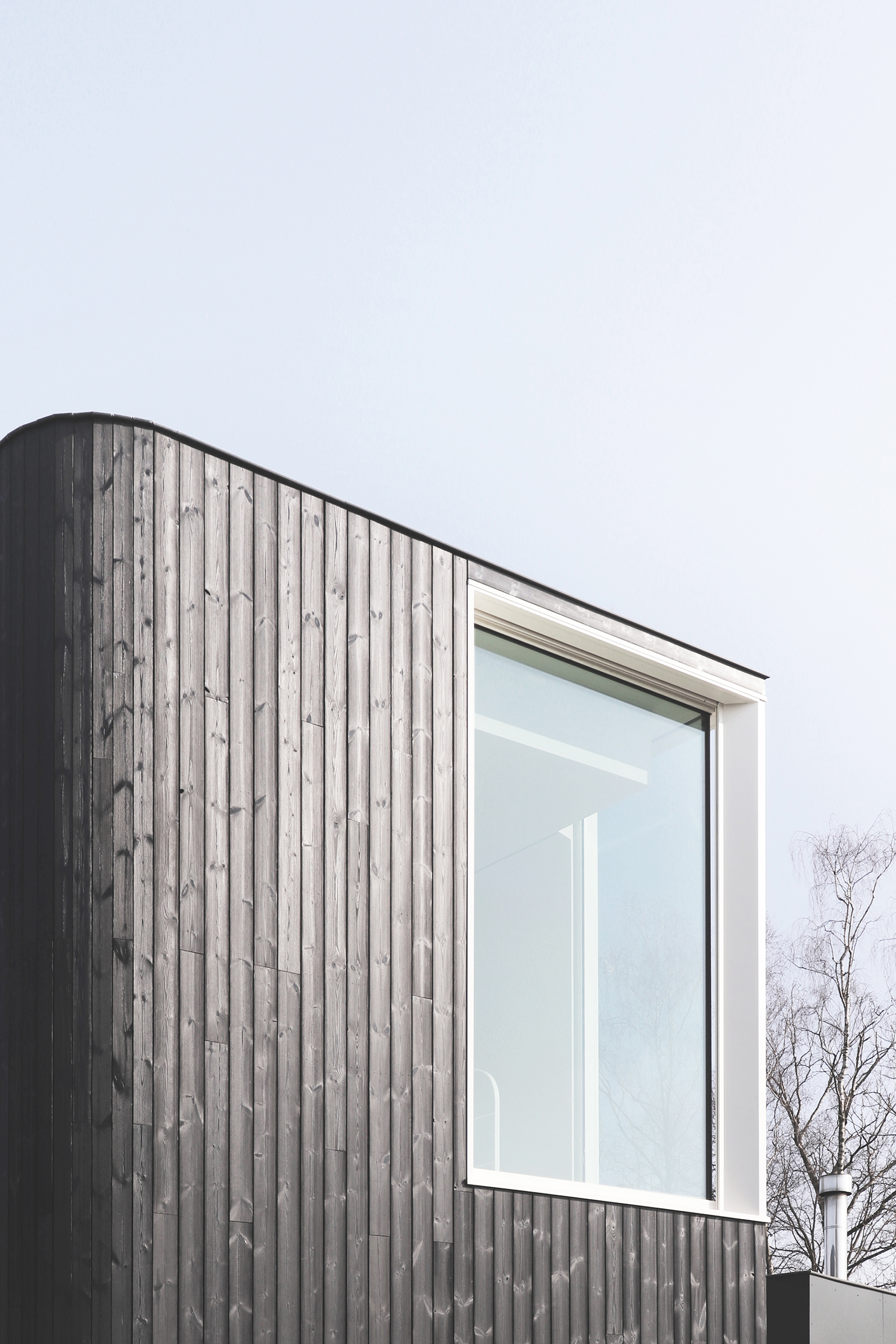
The horizontal plane of the canopy also creates a clear separation between the old and modern parts of the house. Bold and dark, the new third volume has a lookout tower-like presence as it rises from the back of the one-story bungalow. This volume also shares subtle details with the existing elements, creating a thread through time. Clad in black timber, the extension complements the dark brick walls of the ‘00s addition. A new window and the extended canopy make the connection between past and present on the side elevation.
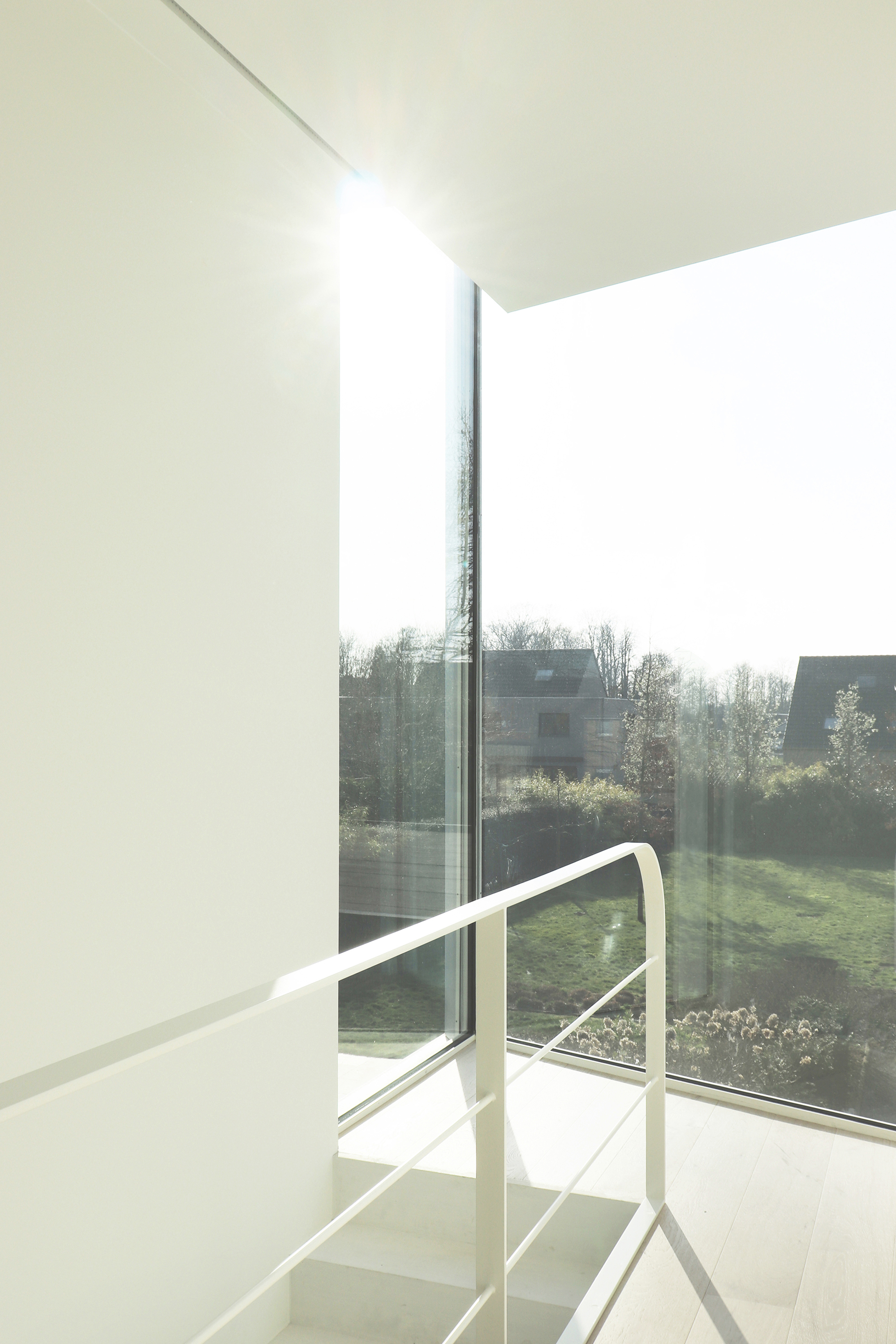
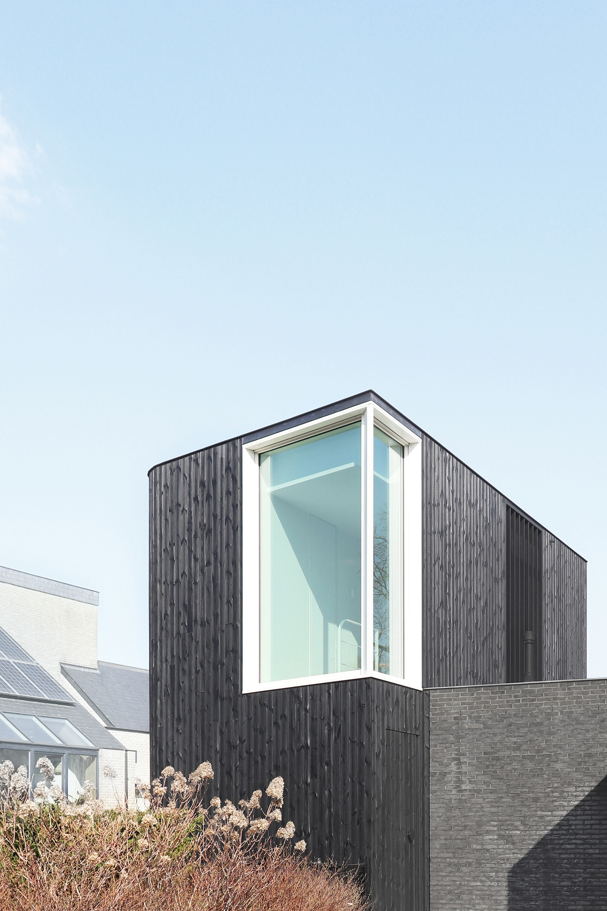
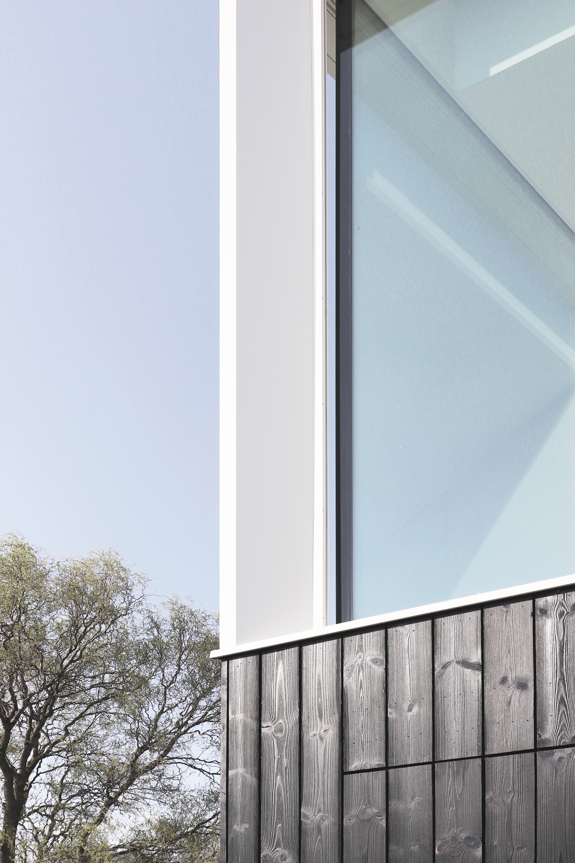
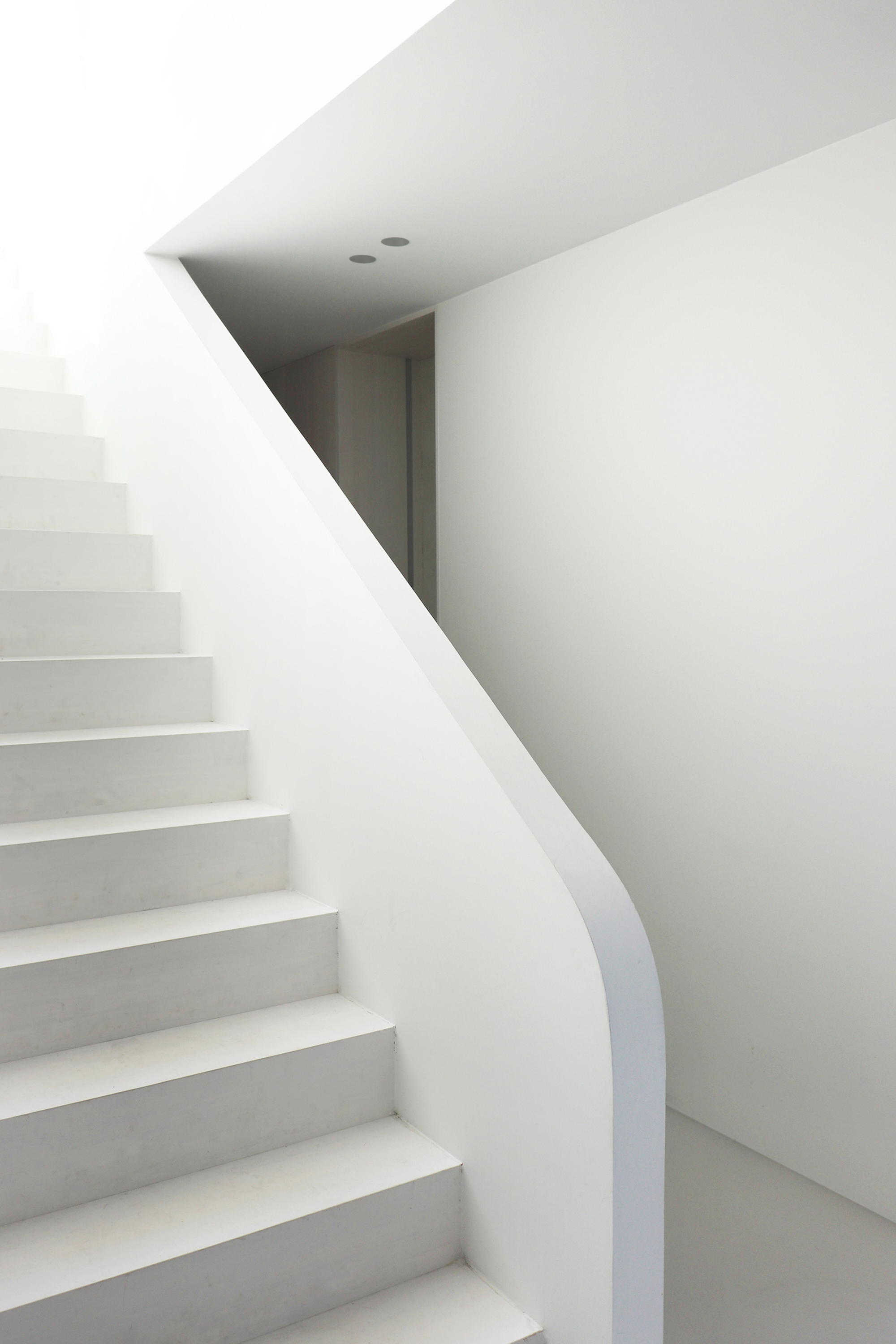
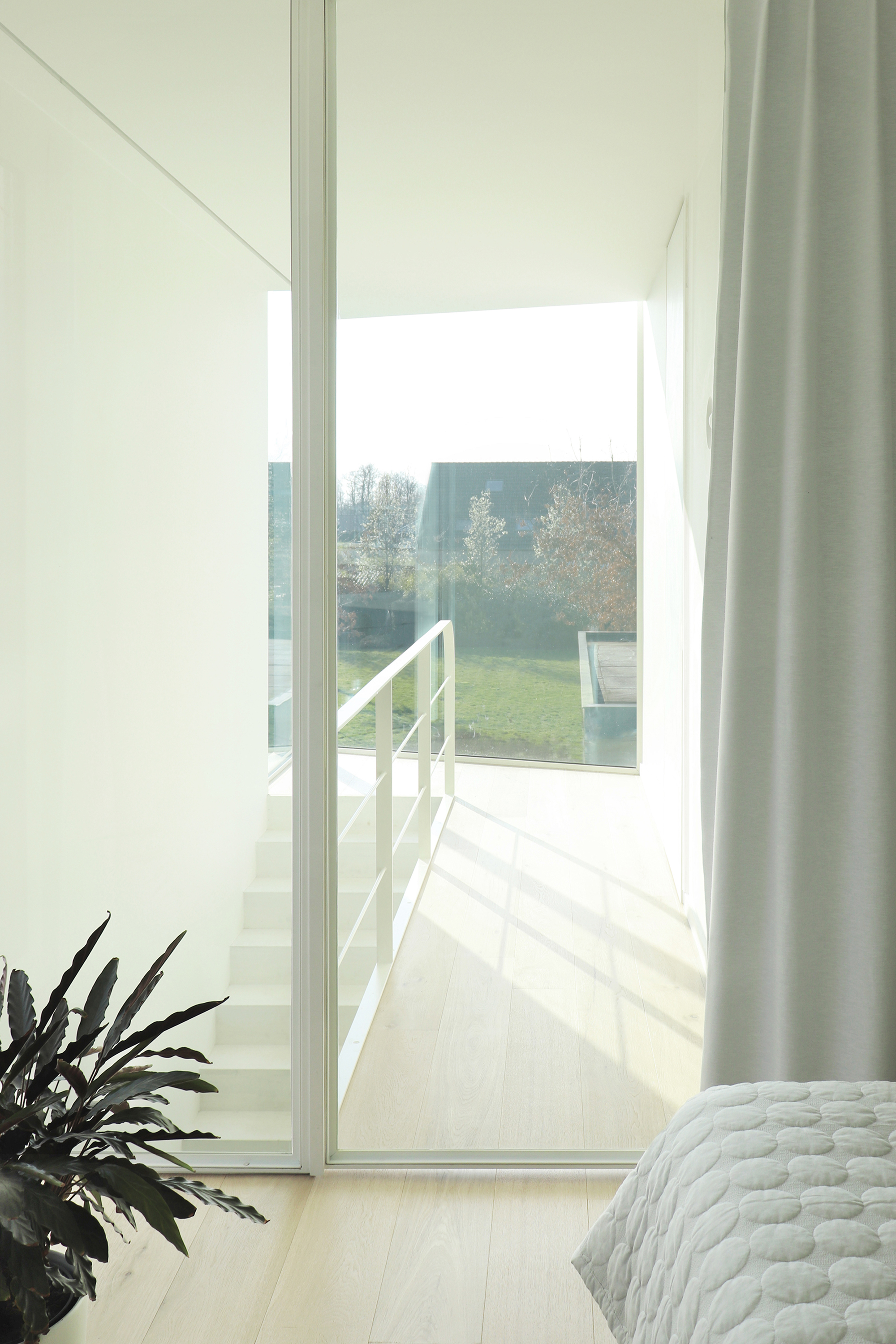
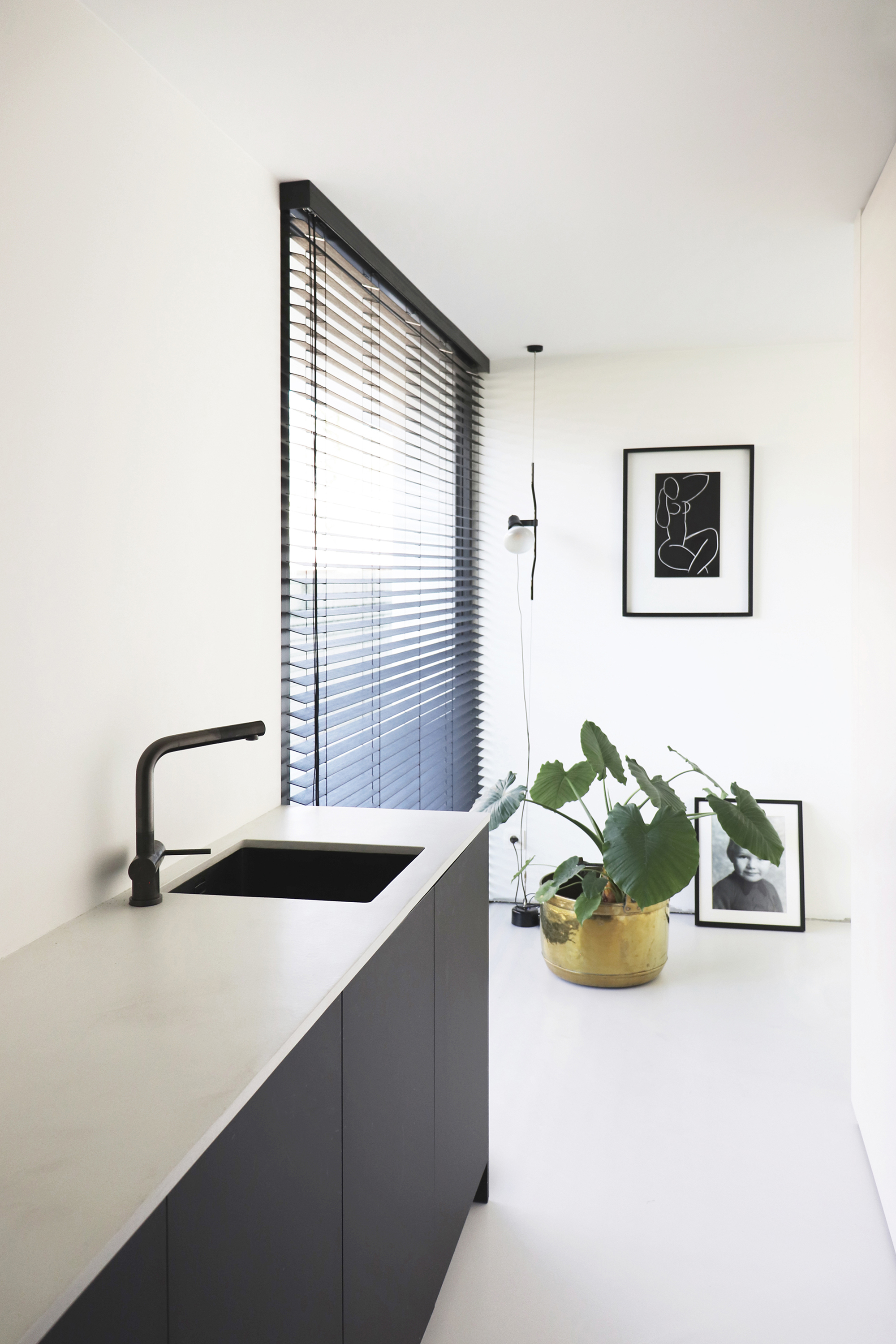
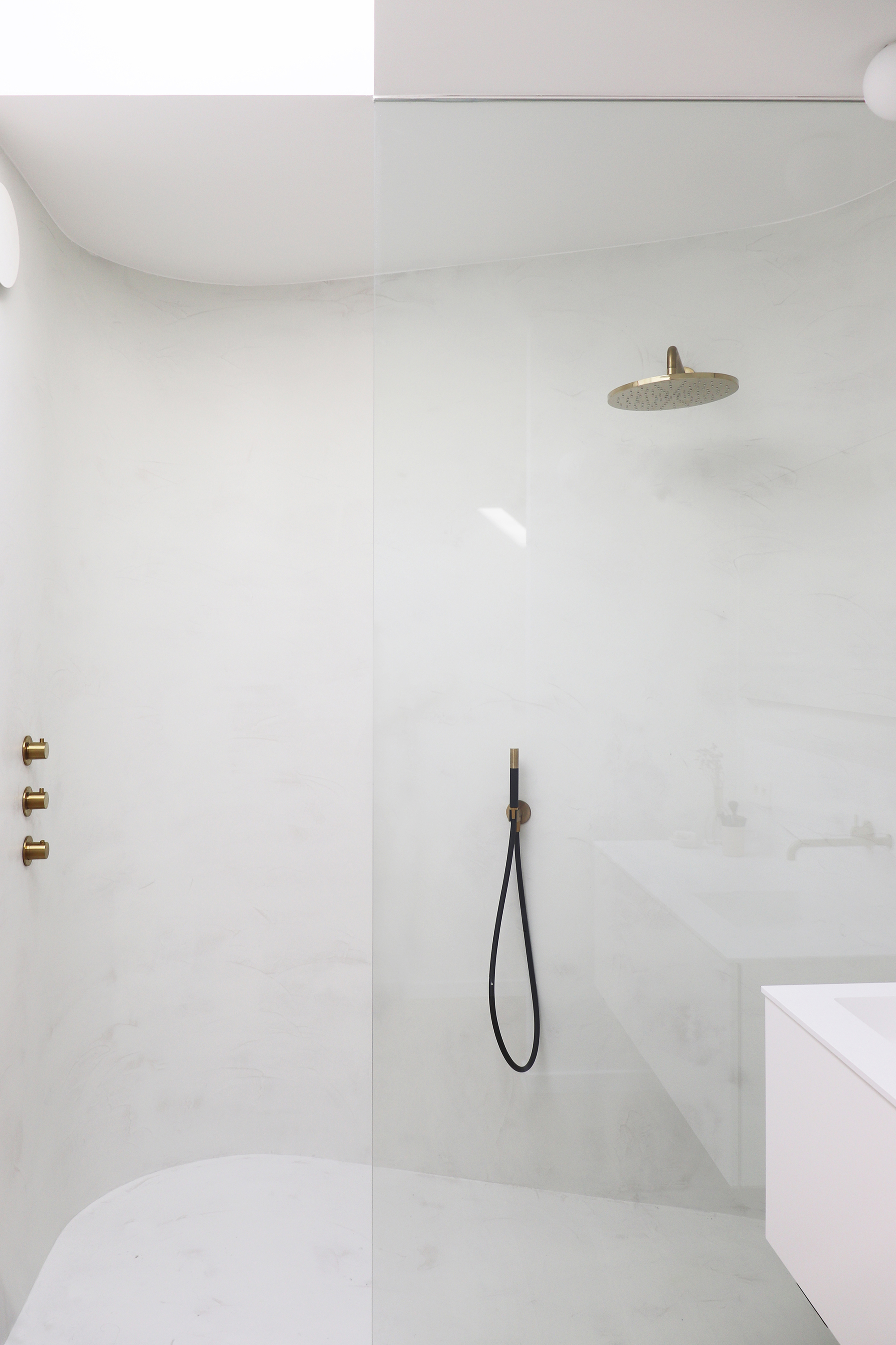
Curved to mirror the fireplace from the main house, the new volume also features a sloping plane that echoes the original front facade. The extension houses a bedroom with a bathroom, a laundry room, and a secondary entrance. A large corner window visually connects the bedroom to the garden and also floods the interior with light. On the side, the black volume boasts aluminum louvers that provide shade as well as privacy from the nearby street. Finally, the modern bathroom features a skylight and a curved wall that “embraces” the shower area. Photography© Wim Heylen.


