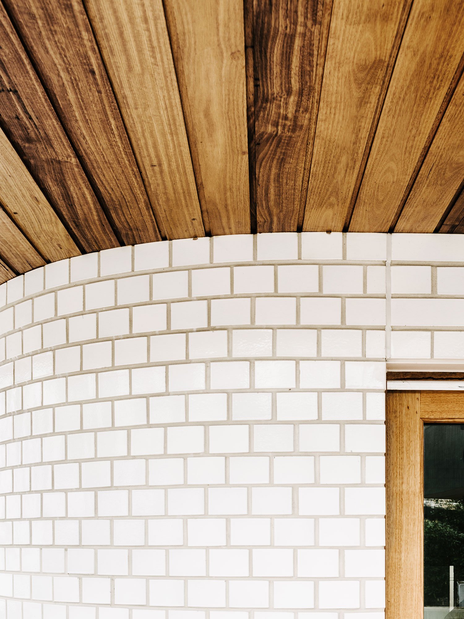
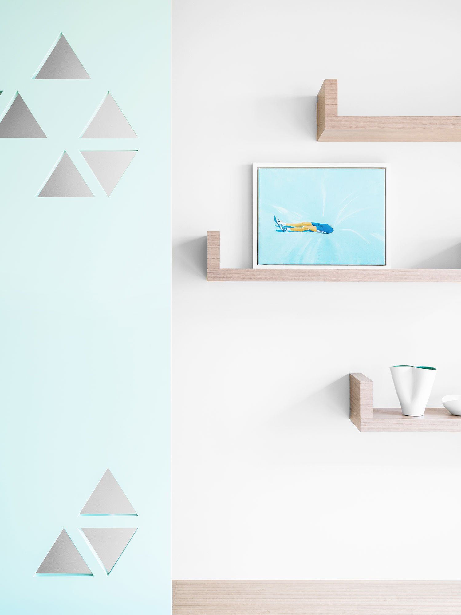
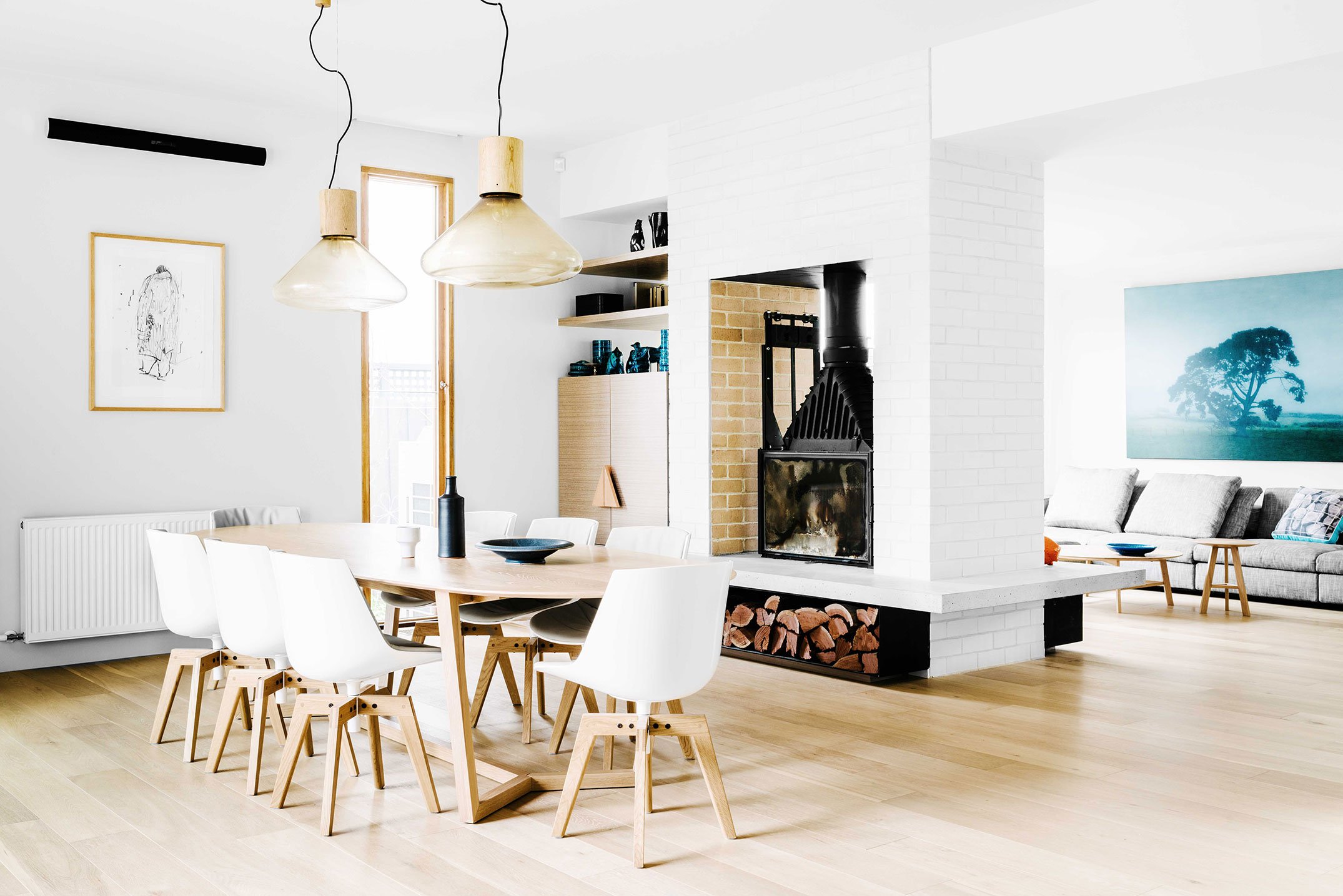
The Hawthorne East House by Fiona Lynch makes a subtle first impression. At a first glance, this renovation seemingly embraces a minimalist design approach. From the warm wood on the floor to the black and white walls , some occasionally graced with splashes of color and metal, there are many instances of retro influences in the house. Located in Melbourne, Lynch insisted on retaining the existing curved brick walls towards the front of the house as a homage to the architecture in Australia prevalent in the 80’s.
The transparency throughout the house is palpable.
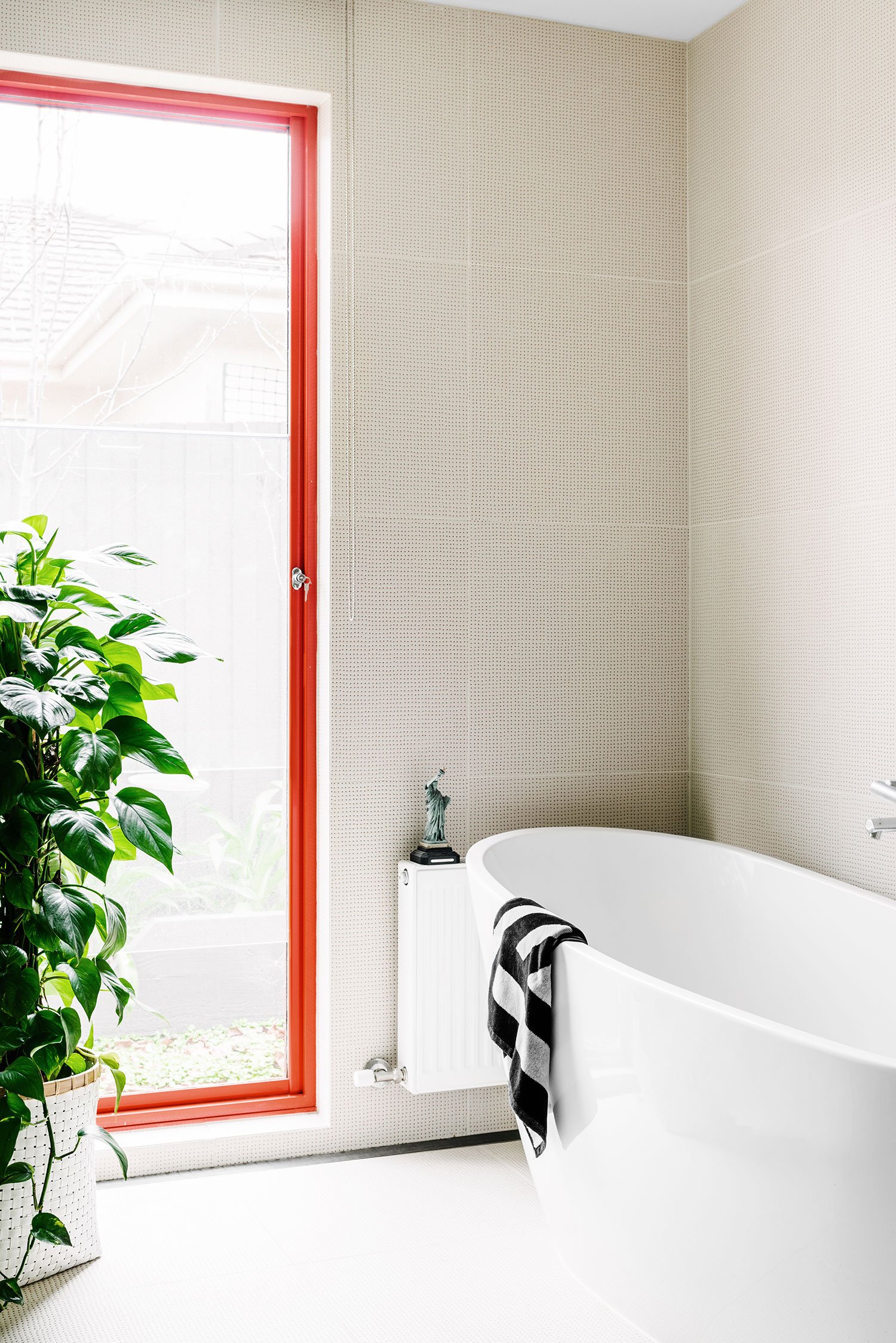
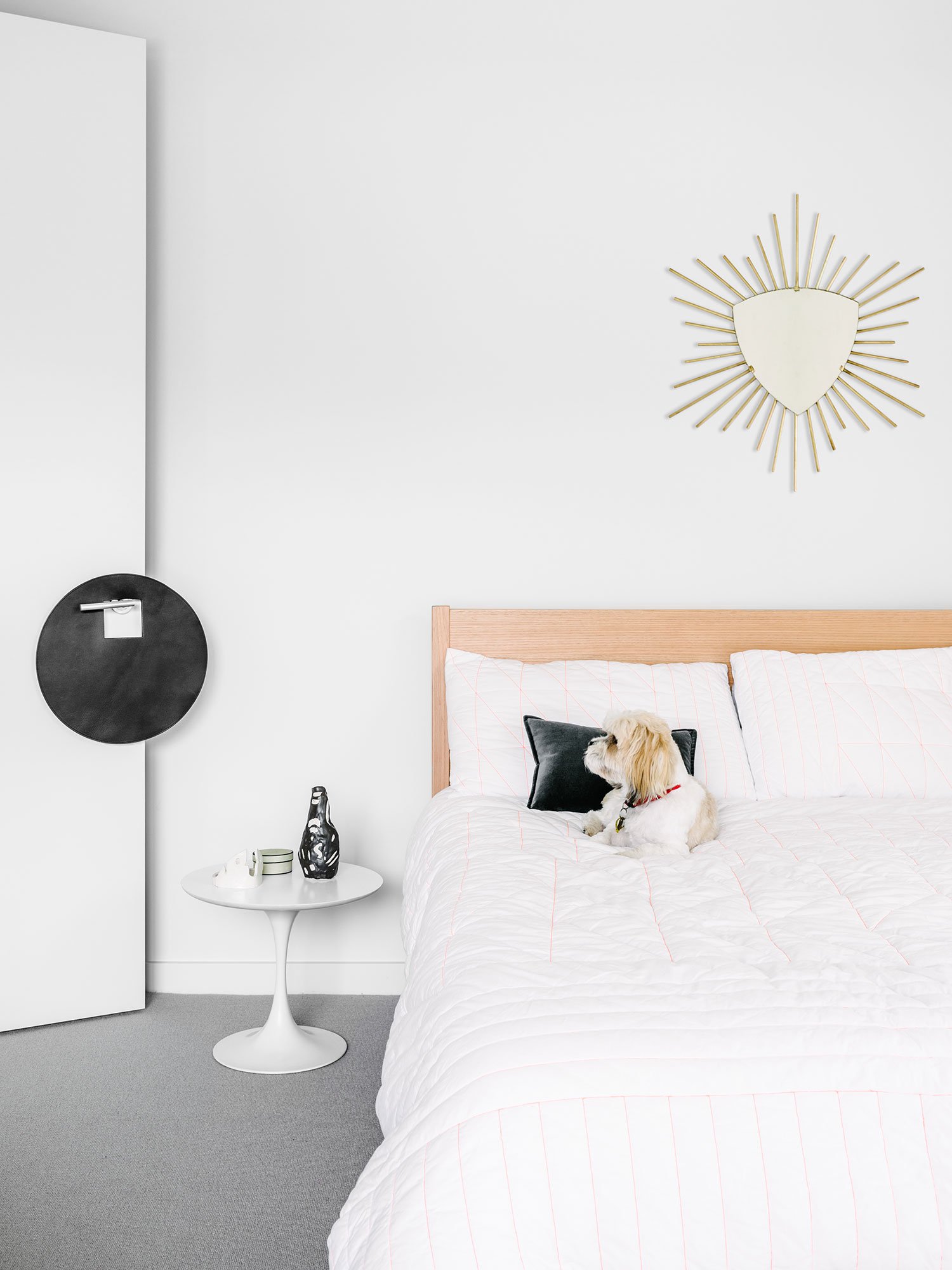
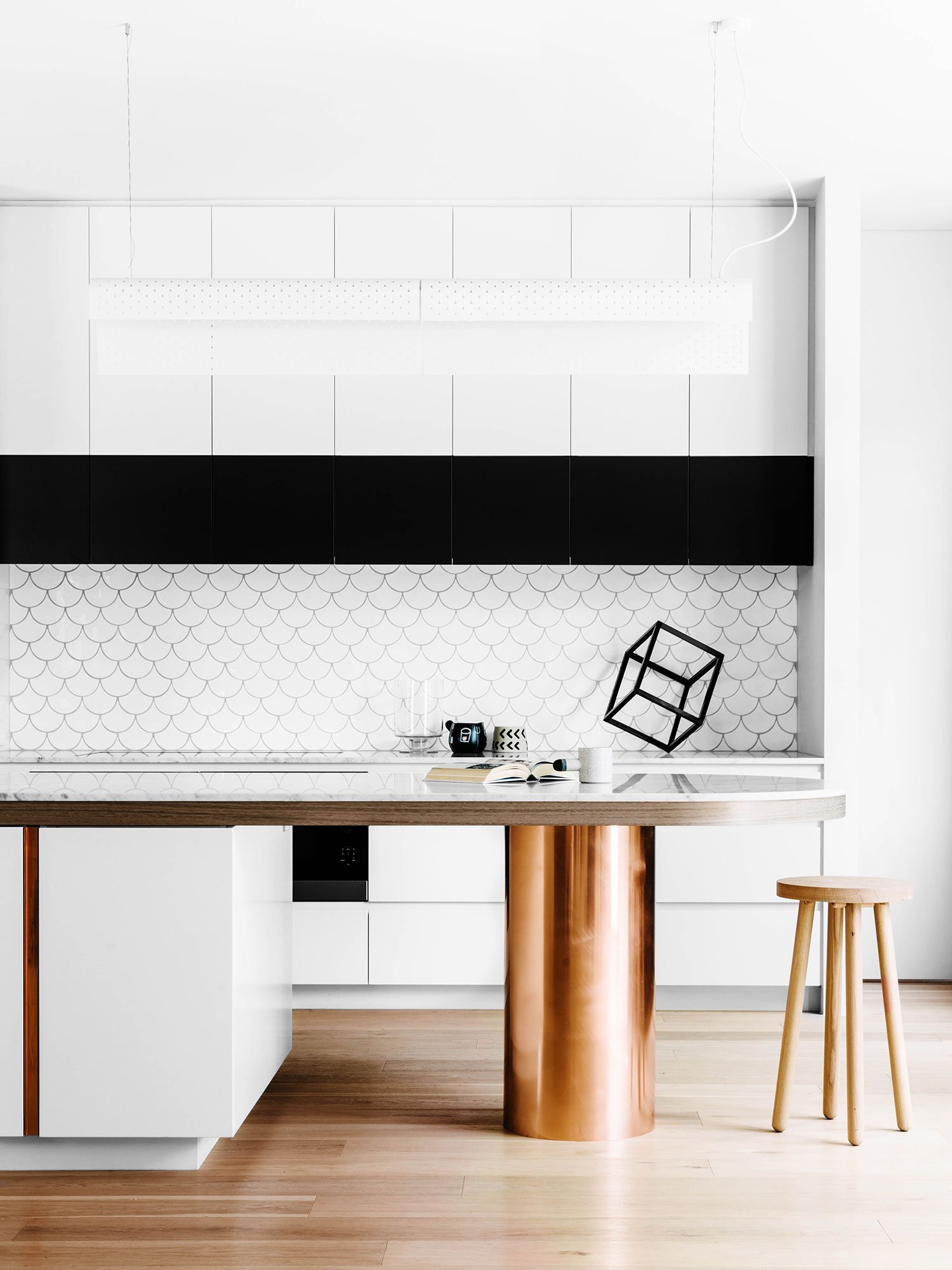
The transparency throughout the house is palpable. An open plan was encouraged while dividing the house into zones. The master bedroom lies in the front portion of the house while the study and rooms of the children are situated towards the rear. The common space in between becomes the living area which connects these two predominant zones. An open fireplace has been added to function as a visual link and as a screen between the dining and lounge area. Colorful metal finishes have been extensively used along window frames and along fixtures in the rooms and bathrooms. Colors have been used with restraint, creating a sense of playfulness that breaks the neutral palette in the rest of the house. The copper column that supports the kitchen counter adds an unexpected pop of visual interest , standing out from the interesting material range of stone, timber and metal. Details in the sleek furniture and even the tiling patterns used reflect the strong, angular lines created in the interiors.
Lynch is known for working with custom details to create spaces with a strong sense of individuality. What stands out in this project is the intent in evoking a distinctive design language through marriage of the different materials used. From the characteristic fish scale tiles used in the kitchen to square fluted glass panels which allow for a play with light and shadow inside the house, the pièce de résistance of the project, would have to be the details.


