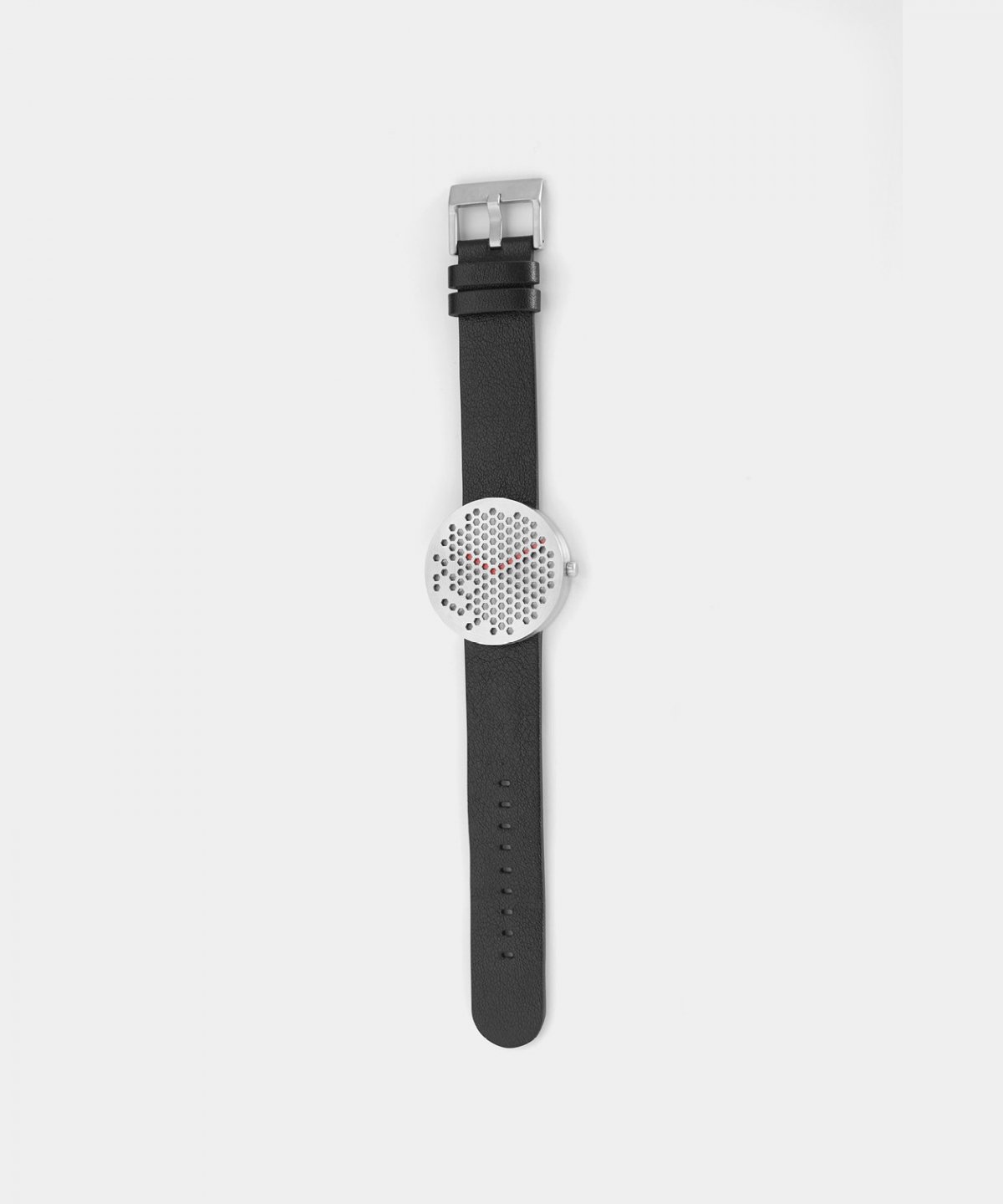
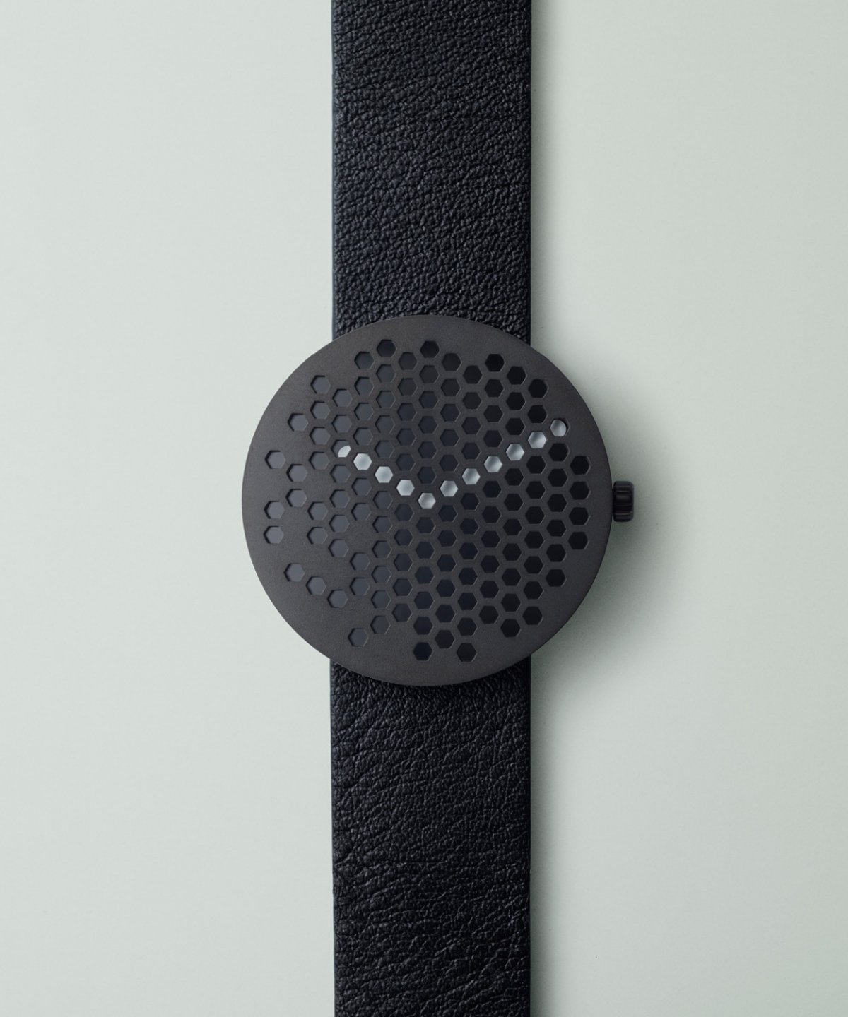
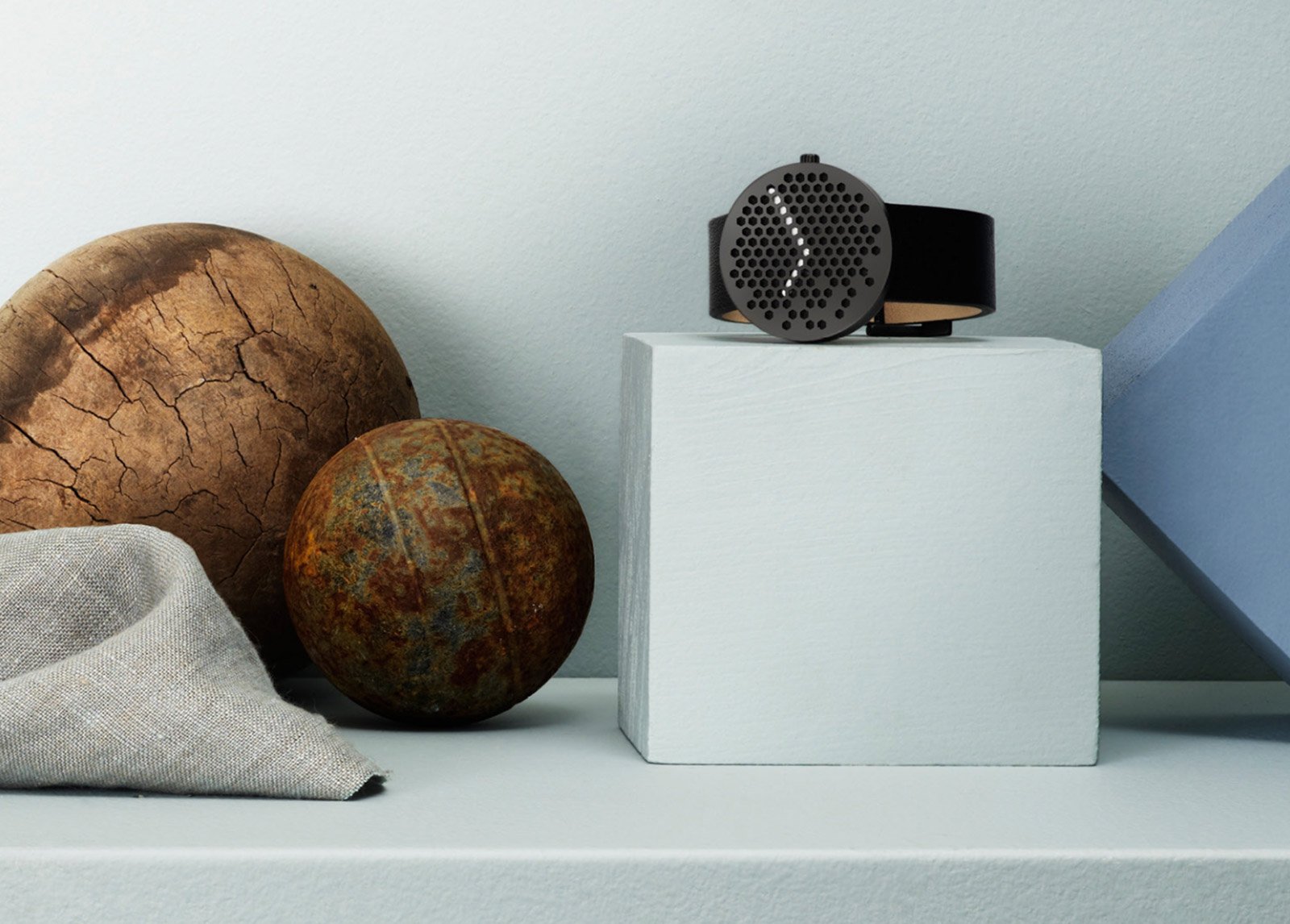
A year ago you couldn’t find someone with a watch on, now change is upon us. Watches are back and the challenge now is to make something that you would rather look at than your phone. If you want your watch to have a load of features, then you have to go digital. This would require a touch screen, and then you are competing with Apple. The alternative to make something as minimal as possible with only the necessary features. Alexander Lervik set out to make a simple and bold piece of jewelry, and the Bikupa watch was the result.
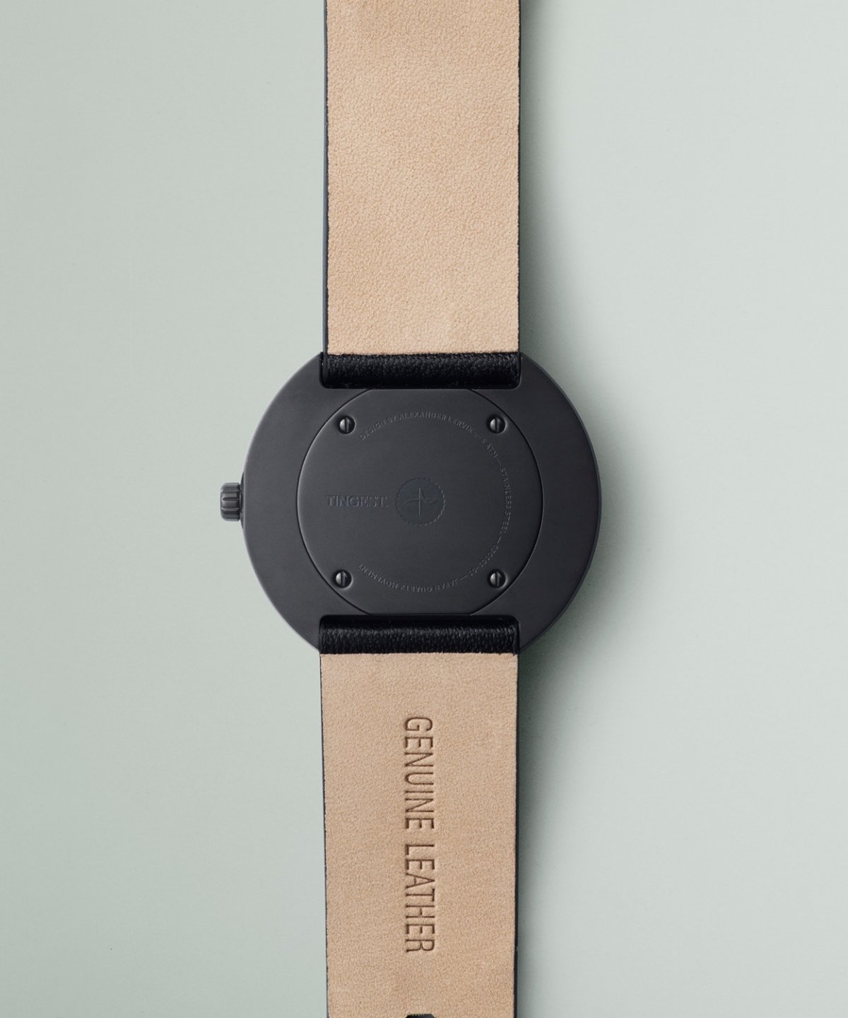
We notice things like the color scheme that has has a slightly different toned dot in the center of the face. Or the strap that hugs your skin with ease as the moroccan leather is wrapped around your wrist. Or even the raised grid from the face that casts a shadow on the hands as the day moves on. Here we also notice the semicircle on the end of the hand against the hexagons of the grid. Let us not forget the grid, the grid is made of hexagons and has no numbers to determine the time because it does not need to. When it comes to keeping time with a 12 hour system, the ideal shape is a hexagon. Without a number you are dependent on spacial awareness to know what the hour is, and with this grid you will easily spot when the hand is along the grid or askew to it. A user will find that in time they start to feel time based off alignment to these sides rather then the numbers we are used to. Towards the bottom left side of the watch; around the 6 o’clock to the 10 o’clock; we see the shape seemingly scattered around the face. This feature will add a level of identity to the time telling by revealing or hiding the hand throughout the day. A time piece is something that is amongst the oldest of our objects so it is remarkably refreshing to see something inventive that changes the way we tell time, and maybe the way we live our lives.


