Described by ForbesLife as ‘a living blueprint for the 21st century designer,’ Joe Doucet is in the vanguard of innovative design and technology. An alumnus of the august California-based ArtCenter College of Design, today Doucet is a formidable, enterprising and accomplished multidisciplinary designer. A man of varied creative talents, Doucet understands design as a combination of multifarious disciplines, including: communication, graphic, product, furniture, environmental, packaging and technology. Doucet’s clever capacity to navigate these assorted disciplines ensure he is much in demand.
More Behind the Design

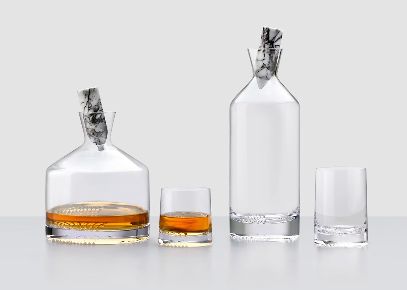
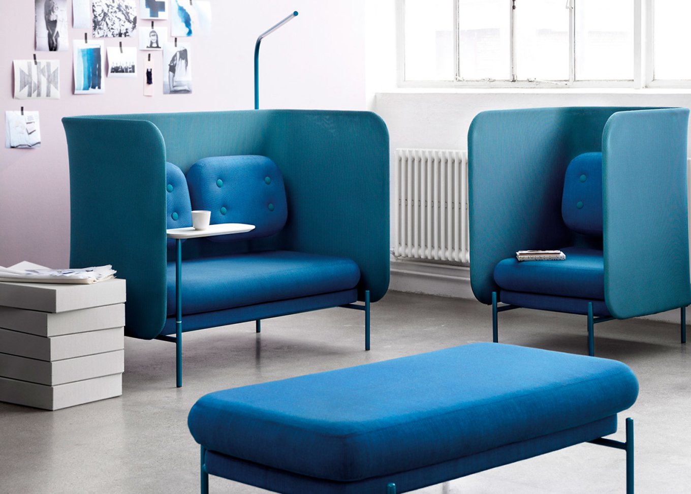
Originally from Texas, Joe Doucet lives and works in New York City. Affable and ambitious, he deftly balances family life in Brooklyn Heights with work at both Joe Doucet x Partners (JDXP) and OTHR. His designs are smart, handsome, focused, functional, environmentally savvy and free from any planned obsolescence. In one recent venture, Doucet offered his sharp take on a bicycle for tokyobike, assuredly blending functionality, elegance and playfulness. His refined and minimal decanter collection for Nude Glass—called Alba (the Gaelic name for Scotland)—features a skilfully deconstructed, hand-engraved tartan pattern. And Doucet’s Flexible Work System for Skandiform facilitates the now essential adaptability of the modern working environment, in a manner that is both practical and aesthetically pleasing. In every design endeavour, Doucet tells a complete and compelling brand story, one that combines beauty, craft and wisdom.


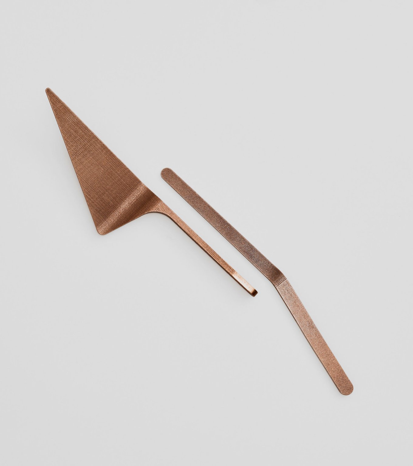
Lately, Doucet has plowed his creative and entrepreneurial prowess into OTHR, a brand utilising transformative technologies, such as 3D printing, to make unique objects. Working with a number of highly talented designers, OTHR addresses the problem of excessive waste, making on-demand products that are useful, artistic and individual. In his own astute way, Doucet is shaping understanding around the potential of transformative technologies and their destined place in the design world’s future.
Gessato gets behind the design with Joe Doucet.
What are five words that best describe you?
Stubborn, kind, curious, ambitious, terrible-speller (counts as one word when hyphenated).
When I scroll through your work, I am struck by the aesthetic nature of your various designs and their elegant, minimal quality. How do you approach design; what is your creative process?
I never start with sketching, nor with a hunt for ‘inspiration’. I always begin a project by writing what I would like to achieve with it, or rather what I would like the project to achieve. I try to distill this into one sentence, almost like I’m writing the headline for the project. I then work through very rough thumbnail sketches, which no one other than myself can read—and a few people who work for me. I have always been able to turn around fully formed shapes in my head; therefore I’m not afraid to jump straight into 3D software to create the final form.
I really focus on getting back to the heart of the idea: the clearest manifestation of that one sentence. All else just gets in the way, so I tend to remove it. That makes my work ‘minimal’ for some, but really it’s a search for clarity.
What drives you; what are you curious about?
I am a voracious reader, despite being dyslexic. I read around a dozen books a month. I achieve this by listening to audiobooks on my walk into work, at the gym, during lunch break, on my commute home, et cetera. [I enjoy] a great deal of non-fiction and one topic always seems to lead to another: a book on finance leads to one on the history of money, which leads to a history of the Renaissance, to a study of astrophysics and a biography on Feynman [the theoretical physicist Richard Phillips Feynman]. The journey of learning never ends. It feeds into my work in an intangible way, but I know my world would be far less interesting without it. It also makes me a bore at parties—I’m the ‘did you know…’ guy.
As a designer, you have a hand in many different areas of design (graphic, product, furniture, environment, packaging and technology). Nowadays, do you think designers require a diverse design toolkit in order to succeed?
I think technology has lowered the barriers to entry for any particular field of design. Designers have access to knowledge and tools which in prior times were the exclusive domain of ‘experts’. The downside is a general lowering of standards. Typography is a great example. If you’ve studied it in depth, you find there are few people who know or care about kerning [the process of adjusting the spacing between characters] and it breaks your heart. [But] it is a price of progress and I can live with that.
Forbes described you as ‘a living blueprint for the 21st century designer.’ What advice do you have for up-and-coming designers?
My advice to young designers is this:
1. Talent does not equal success: Talent is learned through hard work, diligent study and self-awareness. If you are talented early in life, without hard work you are at a disadvantage. Those who are more hungry will surpass you in time. Try to improve each day.
2. Your network means everything to success: Most creatives (myself included) are introverts and hate to hear this one, but you must build a support system around you. The best way of doing this is to help as many people as possible, never asking nor expecting anything in return. You will see a network of supporters assemble around you. ‘Givers’ receive much more out of life than ‘takers’. Help someone once a week without being asked to do so.
3. Set goals for yourself: Set an overarching goal for your life and write it down somewhere that you’ll come into contact with it. If it seems daunting and impossible—good; it is something worth pursuing. Make sure that every day you are doing something small to reach your goal. Adjust yourself yearly, as needed, to make sure you are moving in the right direction. You’ll be surprised how far you’ll come in ten years, with small steps each day.
In a design context, the word ‘luxury’ is often overused; indeed, its meaning is arguably meaningless. How do you define luxury?
Luxury is a refined selection of something, where there are more commonplace options. Luxury is a moving target. Flashback ten years to when Starbucks was a luxury: a $5 coffee was quite the indulgence, when one could pay $1 elsewhere. Now Starbucks’ ubiquity has deemed that same coffee commonplace, which is the opposite of luxury. Luxury is not a ‘thing’ or an attribute. It is a reaction to the ordinary and a desire to see oneself as beyond the ordinary. Marketers know this well.
In 2016, you launched OTHR (along with Dean Di Simone and Evan Clabots). What are your hopes for the future of transformative technologies—such as 3D printing—in design?
The genesis for OTHR came about in 2012 when I ordered a prototype of a fork in 3D printed steel (which was quite new and expensive at the time). In the click of a mouse, I had just circumvented the entire mechanism of traditional manufacturing. I knew then that in the very near future, designers would either become craftspeople or the creators of intellectual property. OTHR is, among other things, dedicated to giving designers the upper hand in the inevitable changes that technology is bringing to the world.
From a design perspective, in an increasingly global society, do you think we can realistically change the mindset of mass manufacturing and consumerism?
No. I believe technology will put mass manufacturing in the hands of designers. I hope we are responsible in how we behave, when we are more and more in control of what is put out into the world.
What do you enjoy most about working with JDXP and OTHR?
The two ‘jobs’ couldn’t be more different from each other. That is what I most enjoy about it.
What is your favourite design object and what qualities make it special?
I don’t think we have ever surpassed the Acheulean Handaxe, first made around 1.7 million years ago. Acheulean Handaxes are so perfectly formed, well beyond what is necessary for their function, and somehow they feel like something you would find in nature. In fact, they are a reminder that we are nature. [Yet] as a species we are so overachieving that we see ourselves as separate from nature. I feel like the Acheulean Handaxe should be the symbol of design—connecting us to our past and reminding us of what we can achieve.


