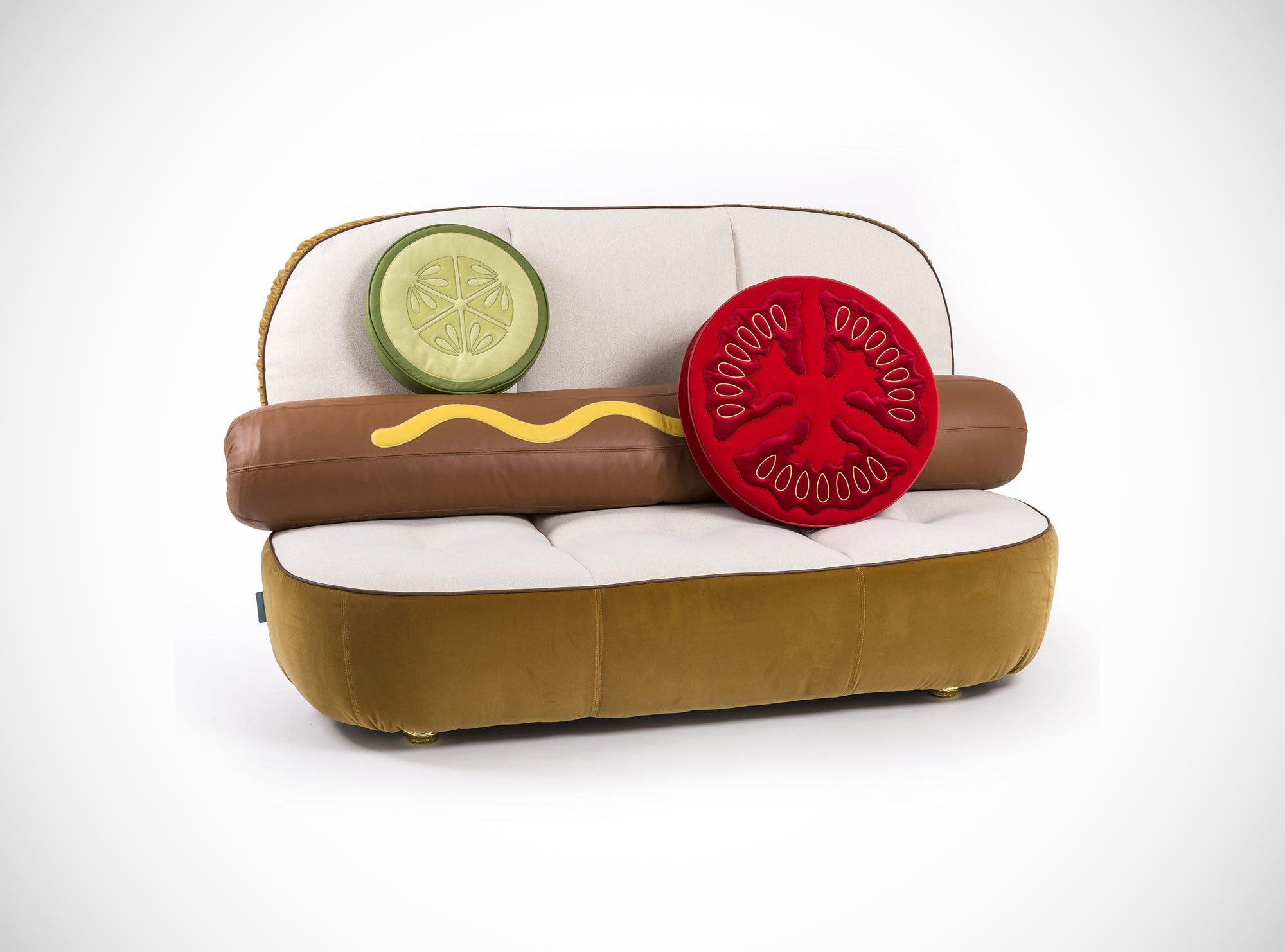
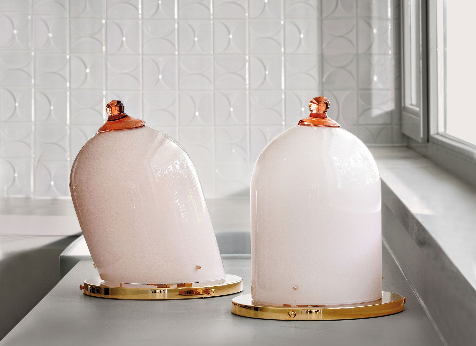
It is difficult to determine with absolute certainty what genre defines Studio Job (pronounced ‘yobe’), the fantastical Belgian–Dutch design venture founded in 2000 by Job Smeets and Nynke Tynagel. And perhaps that is the point. We might label Studio Job as pop art or radical (anti) design, Neo-Renaissance or Neo-Gothic. We might consider its work cartoonish, unconventional, ironic, surreal, highbrow and enigmatic. As creative provocateurs (this writer’s label), both Smeets and Tynagel are clever and shrewd operators: they won’t be pigeonholed. Indeed Studio Job has worked to transform common preconceived ideas on the discrete realms of art and design, its work occupying and reshaping the amorphous space between these two monumental domains.
Today, Studio Job is something of a creative powerhouse, with works that are mainly one-off or limited edition, individual (even eccentric), visually expressive and entirely collectable. Physical, decorative and undeniably impressive (if at times plainly odd), Studio Job creates objects that are both past and present, classical and avant-garde. One thing is for certain, Studio Job is serious about its work, mixing traditional craft with industrial design prowess in order to realize lavish pieces that speak for themselves. In Job Smeets’s own words: ‘It’s both ironic and sincere, but it’s never boring.’
More Behind the Design
Gessato gets behind the design with (the wonderfully frank) Job Smeets of Studio Job.
What was the original impetus for establishing Studio Job?
On the one hand, to create a certain freedom, stretching the horizon for myself and for design. On the other hand, it had a functional reason—nobody was interested in working with me at that stage. For this reason, I created my own opportunity.
Your work is wonderfully disruptive, unconventional and colourful. Is it pop art? Is it radical design? How would you describe it?
It’s radical, it’s pop art, it’s sensual, it’s funny, and it’s awful sometimes. It’s exclusive but also accessible. It’s cool, it’s expressive, it’s personal. And occasionally, it’s also very abstract and closed.
You recently created the highly visual Hot Dog Sofa and Burger Chair with Italian brand Seletti. Is such work meant to be ironic or designed in all sincerity?
It’s serious fun. Why does it need to be either a joke or be corporate? It’s both ironic and sincere, but it’s never boring.
When collaborating with a brand, what do you look for—what qualities and tendencies must that brand possess?
The brand must be able to give support to the creative process and not restrict it with various limitations and requirements, such as Excel worksheets and marketing targets made up by corporate people. Also, it should be the case that you feel welcome and have a generous relationship both ways. We don’t need to go on holiday together, but brand collaborations have to be more than figures on a sheet.
Good taste vs bad taste—it’s entirely subjective. What’s your view on the concept of taste?
Sometimes good taste is pretty bad; conversely, bad taste is pretty good. A good creative plays with the zeitgeist. Also, every now and then what appears as good taste is, with the passing of time, actually pretty bad. Furthermore, there are occasions when what seems really wrong turns out to be genius after a while.
When I look at works such as the ‘Tit’ Lamp, the Altdeutsche Clock (for Moooi) and ‘Punch a Wall’ (part of SuperGufram by Gufram), I wonder about the motivation or inspiration? How do you hit upon what are often novel ideas?
You always try to surprise and challenge the viewer or user: design gives you the liberty and you are limited only by yourself. But it can also be for a simple reason. For example, the glass-blowers at Venini [the Murano-based glassworks] have their workshop walls covered with posters of pin-up girls. So my motivation when I designed the Tit lamp was to create something they would be motivated to make.
Sometimes it’s about challenging yourself. I try to be brave and try to do the unexpected or even something ridiculous. In the field of art, this is completely accepted; design seems to be struggling with it.
Looking at images of the interior and exterior of the Studio Job House, there’s a mix of design minimalism and maximalism. Where are you on the spectrum of minimalism in design vs maximalism?
Well I’m not at all interested in either minimalism or maximalism—they’re just terms that someone invented to put the work into a type of context. I guess it’s all about reflecting your personality into the object or product. Each design you do is like a self-portrait.
Ximena Caminos, the Argentine curator and Chair of Faena Art, describes you as ‘contemporary cultural pioneers… [s]triving towards the creation of Gesamtkunstwerk’. Can you explain the notion of ‘Gesamtkunstwerk’ (making use of many or all art forms) as it applies to your work?
Well what we try to create with Studio Job and also with BLOW [a multi-faceted design brand established in conjunction with Seletti] is a strong and recognizable identity. It’s not only about one product or object—it’s about the brand identity. An identity can only exist when there’s a group of influencers or creatives who come together in one physical or abstract space.
Charles Eames once proclaimed: ‘Design is an expression of the purpose, and it may (if it is good enough) later be judged as art.’ Is it really that simple or clear-cut?
First of all, it doesn’t really matter if it’s art, design or literature, as long as it’s authentic. Second, we have to stop using quotes from designers who died a long time ago and do not directly contribute anymore to the times we are living in now. Truthfully, I think that when Charles Eames would have been a designer, now his work would be totally different.
Who are your heroes?
‘Heroes’ is a beautiful song of David Bowie’s.


