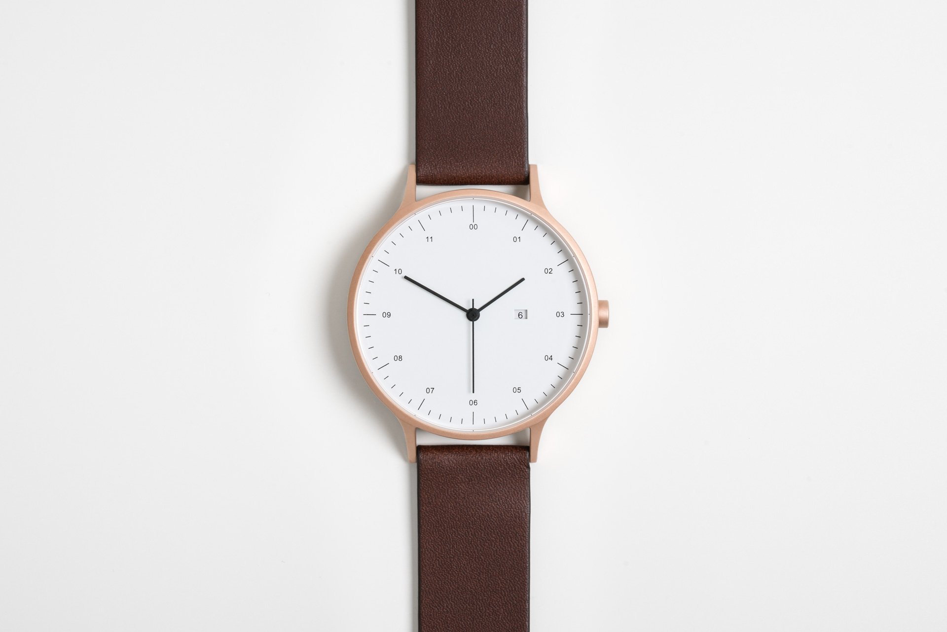
Written in short-form, the name ‘Instrmnt’ has a creative edge, its derivation both minimalist and confident. It is perhaps intentionally so, since creativity, minimalism and confidence (in the product and its ethos) are hallmarks of the Instrmnt brand. Established in 2014 by designers Pete Sunderland and Ross Baynham, Instrmnt is an exciting Glasgow-based multidisciplinary design studio. Clean, sharp, meticulous and polished, the studio and its products are both aesthetically and functionally designed. With a smart, minimal collection and a simple palette, Instrmnt adopts a utilitarian approach, its offer pragmatic and progressive.
More Behind the Design
When creating their first product—the Instrmnt 01 watch—Pete and Ross drew inspiration from mid-century industrial design. Together, they champion quality, simplicity and attainability as core components of the Instrmnt brand. With fine watchmaking, original collaborations and commissions, a store in Glasgow’s thriving Trongate area, global stockists and exhibitions at some of the word’s foremost design shows and establishments, Instrmnt is proving that good design, honestly made, is alive and well.
Gessato gets behind the design with Ross Baynham of Instrmnt.
What was the impetus behind the creation of Instrmnt?
Pete and I had studied together (product and graphic design respectively), sharing a university studio and ideas on what constituted good design. In our opinion, the products that inspired us were successful because their beauty came from function and pragmatic consideration, rather than ornament or unnecessary flourishes. We realised then that we had similar aesthetic values and about a year after graduating, we formed a plan to start a studio.
Our idea was to design products based around proven, well-known components that were already out there—a watch movement, a roller ball cartridge, a cigarette lighter mechanism etc. We’re not engineers and didn’t have the knowhow (or the cash) to develop those things ourselves. Instead, we believed we had a strong design language that would complement them. We settled on launching Instrmnt by creating a watch using a Swiss Ronda quartz movement as our starting point and things developed from there.
You note that mid-century industrial design inspired your first product (Instrmnt 01). What is it about this design era that you find especially appealing?
In terms of product, art, furniture and architecture, we believe the mid 20th century was the greatest period for design. The success of good mid-century design is twofold for us: firstly it lies in function, where things were built for a reason and their aesthetic was dictated by their primary use; secondly we have a huge appreciation for timeless design and in our opinion, the most successful buildings and products do not age. Look at a Mies van der Rohe building or a mid-century Braun shaver—they still feel fresh.
How do you set about tackling design projects—what is your creative process?
We’ll have long discussions and questions to and fro with the team about what to make, why we should make it, what it should do and who will want it. Once these questions have fairly firm answers, we move to sketching, quick visuals and physical mock-ups—we want to get an idea of form from the function identified. Material consideration is hugely important and comes early in the process—we consider materiality alongside form and function. If we’re working with manufacturing parters, we’ll start a dialogue with them. As things become focused and coherent, we move into sampling and testing in preparation for finalising a public-ready product. We continue to refine and update a product after its roll-out, adapting and reacting to feedback.
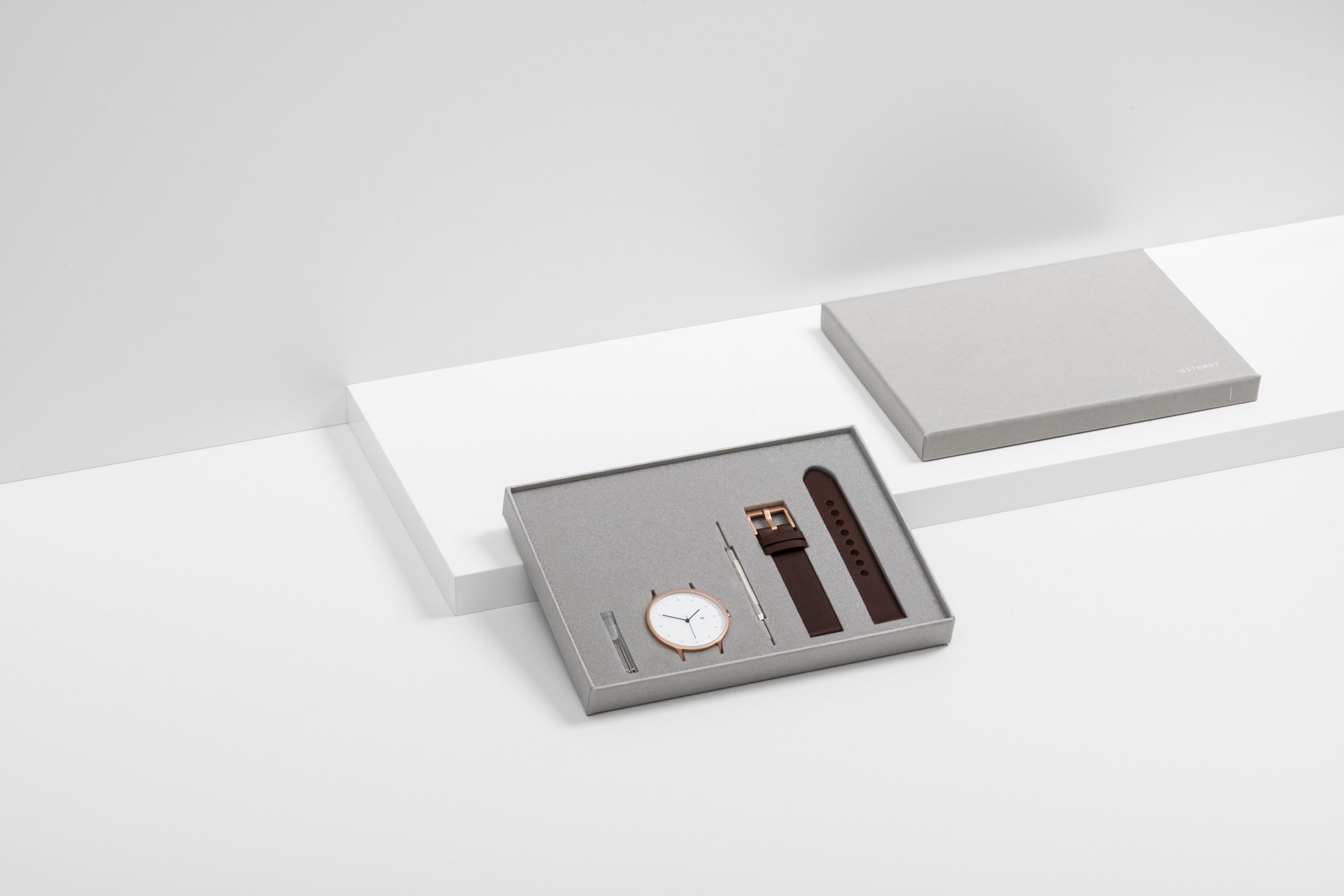
Instrmnt watches are unassembled and you provide the customer with the tools to build their own watch. What made you choose this approach?
I’m proud to say it came from a practical consideration. When we launched Instrmnt, we were poor graduate designers, but did not want to cut corners in order to save money. Instead, we tried to make cost savings on the less important things, such as postage and parcel packaging. By standardizing the size of our watch box (DVD casing size), we could buy mass-produced shipping mailers that cost pennies and would fit through any mailbox. Given the box dimensions, watch components had to be laid out horizontally. We loved the aesthetic and the reasoning behind it—literally making an instrument that the customer could construct themselves and thereby giving them more ownership of the product.
You’ve collaborated on the design of both a day bed (with Namon Gaston) and a city bike (with Freddie Grubb). Why these pieces in particular?
The day bed originated from a practical point of view: we wanted a focal piece for our studio/store, a space we knew would be a clinical white box. We initially considered purchasing a mid-century item, but this was an opportunity to show our design skills on a larger scale. And so we found Namon Gaston online and knew immediately that his style and attention to detail was what we needed.
With the bike, it was something we had wanted to make for some time. Without the technical skill to make it on our own, we partnered with London bicycle company Freddie Grubb. They’d contacted us about selling our watches in their London store and we struck up a conversation about working on a bike together. We launched the bike (as a limited edition of ten) at London Design Festival 2015.
Do you consider yourselves minimalists?
We are minimalists in the true sense of the word: stripping things back to their vital components and form. Currently there’s a trendy take on minimalism which we dislike. It’s trying to make things look simple for the sake of it, to the point where their function is reduced. A black watch with hard-to-read black markings is trendy minimalism.
I’m interested in the notion of luxury. From a design perspective, I believe there is often a misguided notion that ‘luxury’ equates to opulence and grandeur. What does luxury mean to you?
Luxury should mean using the highest quality components and materials possible. I agree this isn’t the case at the moment and may never be so. Luxury is not a word we use very often at Instrmnt and we certainly wouldn’t describe our products as luxury, because of the connotations of expense and grandeur. We would rather be seen as accessible, dependable and simple.
How do we champion useful, aesthetic, honest and long-lasting design in an increasingly throwaway society?
Sadly, I think ‘long-term’ products go in and out of fashion with society generally, making it hard to instil meaningful change. For the past five years, we’ve been talking about throwaway culture as diminishing and people becoming interested in things that last. And while a core part of society is signed up to this, in reality we see an increasing number of throwaway products on the market. Companies like Vitsœ are leading the way on changing mindsets, but in reality we need the involvement of massive companies. IKEA seems to be trying; Amazon, the big supermarkets etc., not so much. We need to pressure them because in reality they call the shots.
Reflecting on your own journey to date, what advice do you have for up-and-coming designers?
Just doing what you dream about is a massive step—you need make that jump or you’ll never know if it could work. Grappling with the real intricacies and implementing something in a real-life scenario will determine if you’re cut out for the job.
A depressing fact: many of the people you work with or rely on will let you down at some point. You need to be ready for this—trust yourself and the closest members of your team to pick things up and take initiative if things go wrong.
What are you currently curious about?
As a business we are curious about the legacy we can leave. This relates to everything we do, who we hire, the products we make, the people we work with, the direction we take. It’s exciting to think long-term.


